Sales Budget vs Actual Dashboard Power BI Template
Introduction to Sales Budget vs Actual Dashboards
What is a Budget vs Actual Dashboard in Power BI?
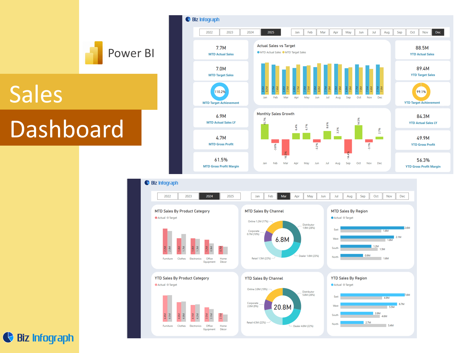
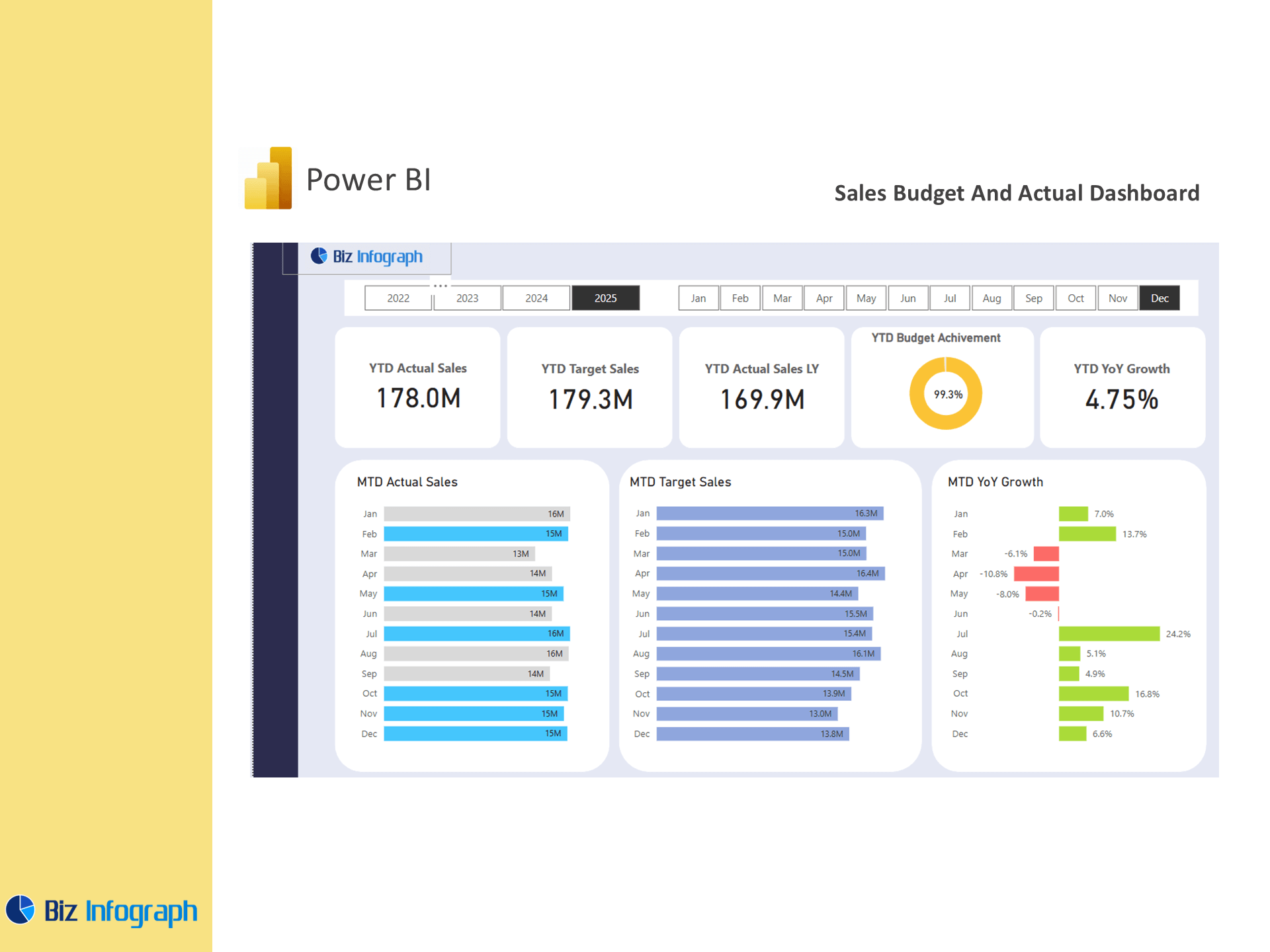
A budget vs actual dashboard in Power BI is a critical business tool designed to track and compare sales performance by comparing actual figures to budgeted expectations. This type of dashboard in Power BI allows users to visualize discrepancies, monitor trends, and understand the accuracy of sales forecasting over time. By consolidating data from various sources, the dashboard provides a comprehensive view of company performance, highlighting both achievements and gaps. Power BI enables real-time updates and interactive filters, which are especially helpful for sales managers, business intelligence, and sales representatives who need quick insights to adjust strategies on the fly.
Importance of Tracking Sales Budgets and Actuals
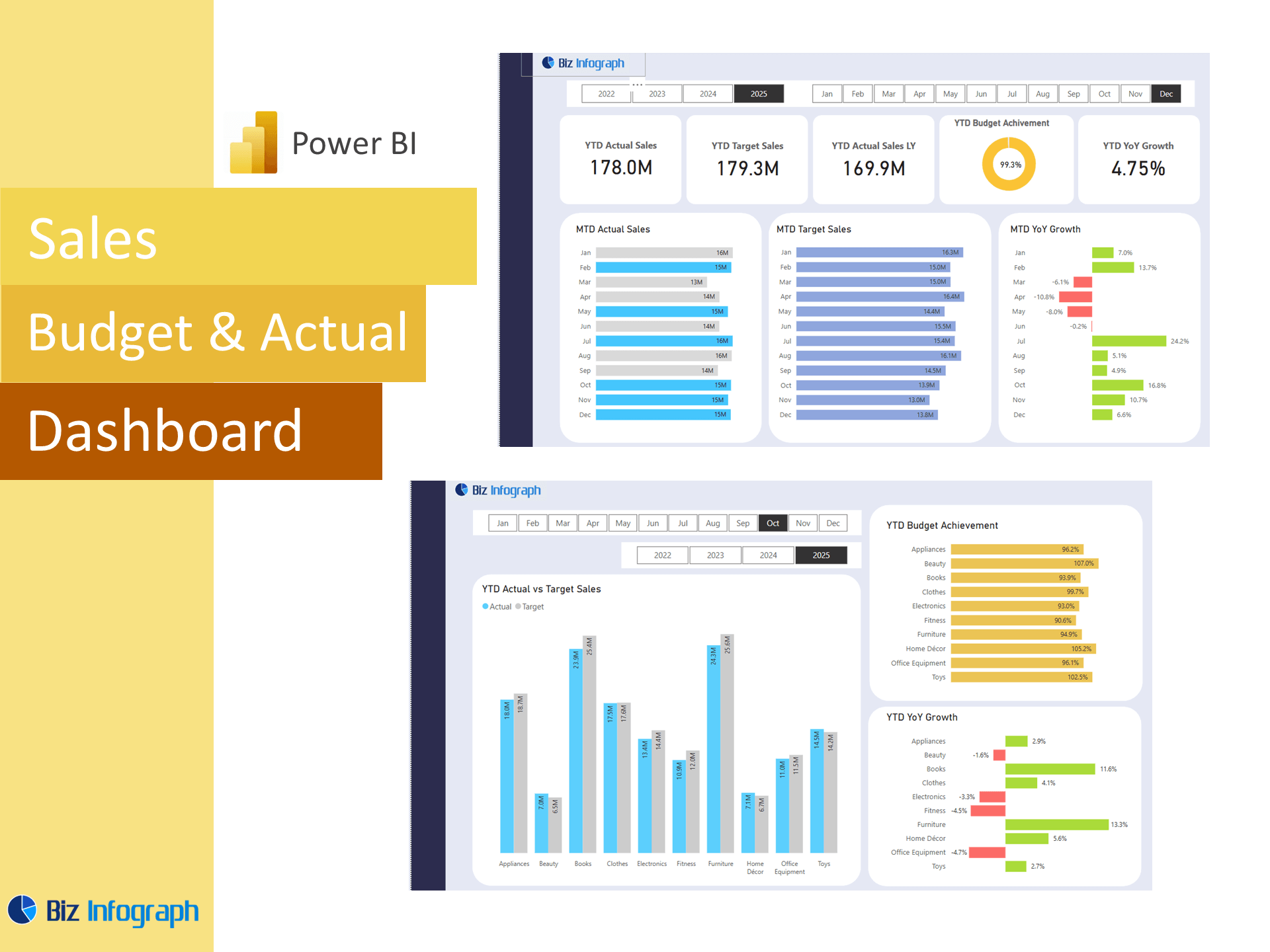
Tracking actual performance vs budget is essential for aligning sales activities with business objectives. A dashboard helps decision-makers identify areas for improvement, avoid overspending, and reallocate resources more effectively. For example, if the actual results fall below the forecasted sales amount, corrective action can be taken early. Moreover, variance analysis, graph offers insights into why such deviations occurred—be it market shifts, supply issues, or underperforming teams. With a Power BI solution, this tracking becomes more efficient, with data-driven visuals replacing manual spreadsheets. This transparency builds accountability within sales teams and supports forward-thinking financial planning.
Use of Power BI in Budget Dashboards
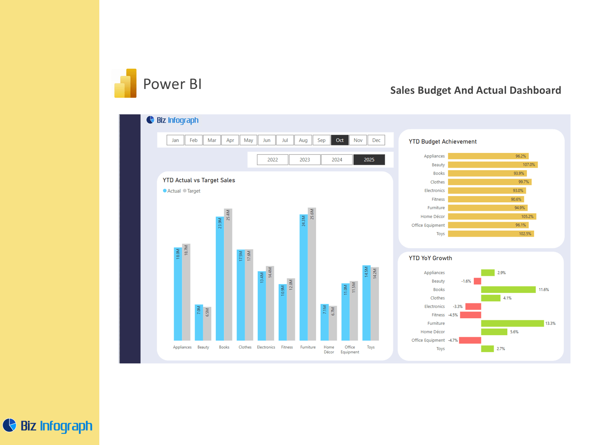
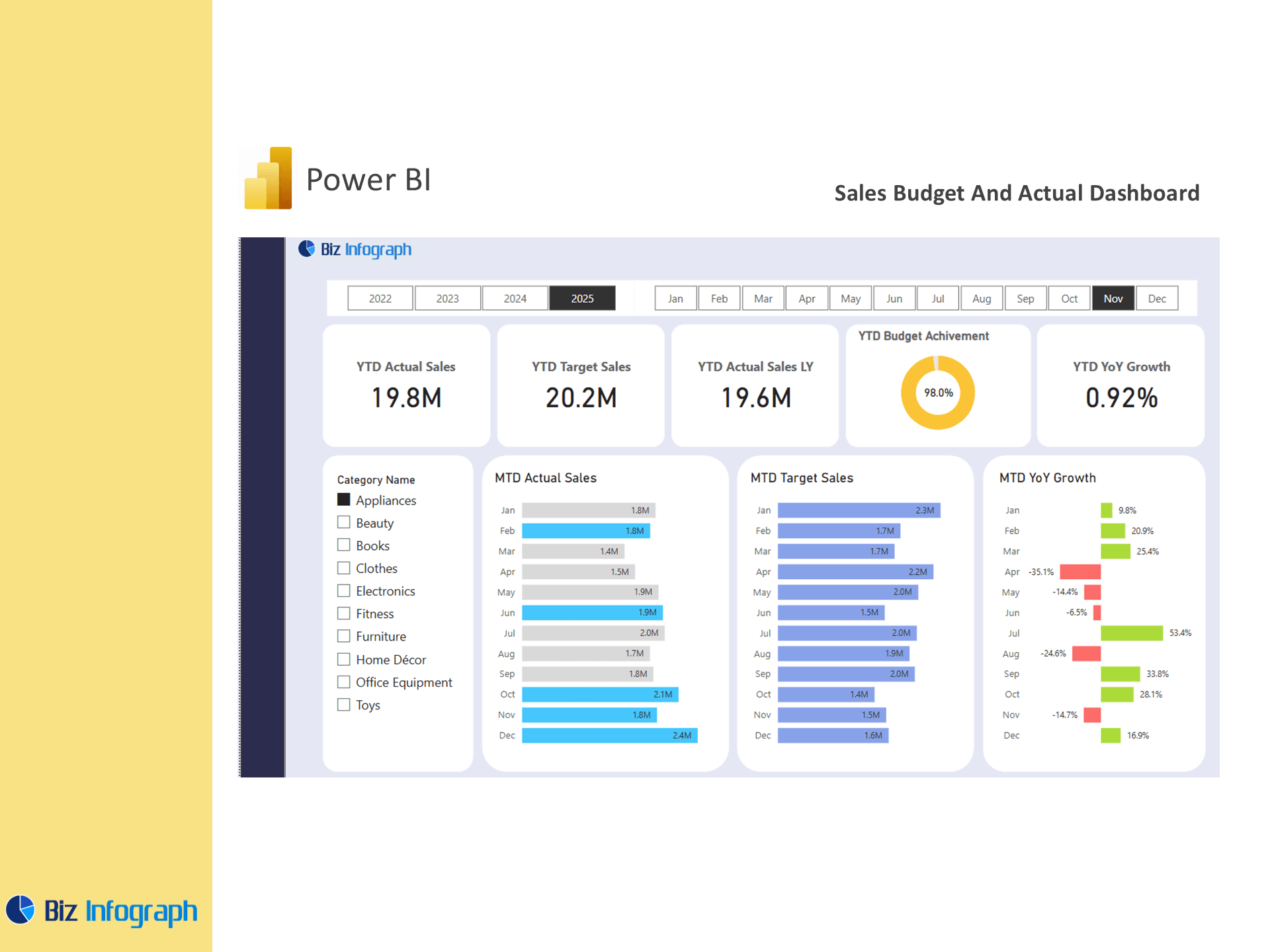
Power BI provides a highly flexible and scalable platform for creating sales budget vs actual dashboards. Unlike static tools, Power BI enables the integration of advanced data visualization techniques, real-time KPI monitoring, and seamless data refresh via cloud services. Dashboards are built to be interactive—users can slice by time period, product, region, or team to examine specific breakdowns. Additionally, the use of Power BI reports means that visuals like bar charts, trend lines, and comparison cards can display total sales, budgeted sales, and budget variance in context. Power BI's ability to handle large volumes of sales data makes it an ideal choice for dynamic, enterprise-level analysis.
Key Components of a Sales Budget vs Actual Dashboard
Essential KPIs and Metrics to Monitor
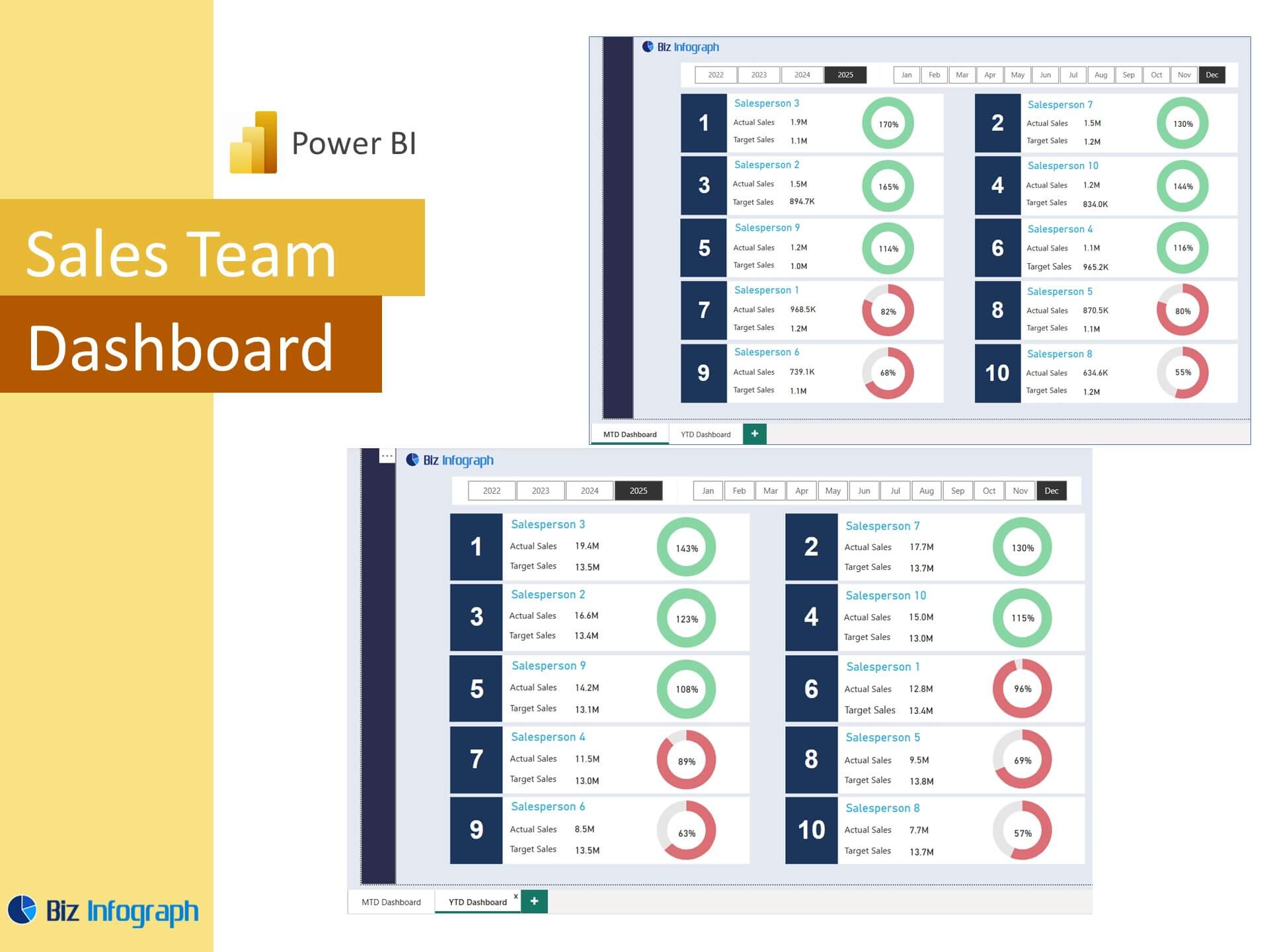
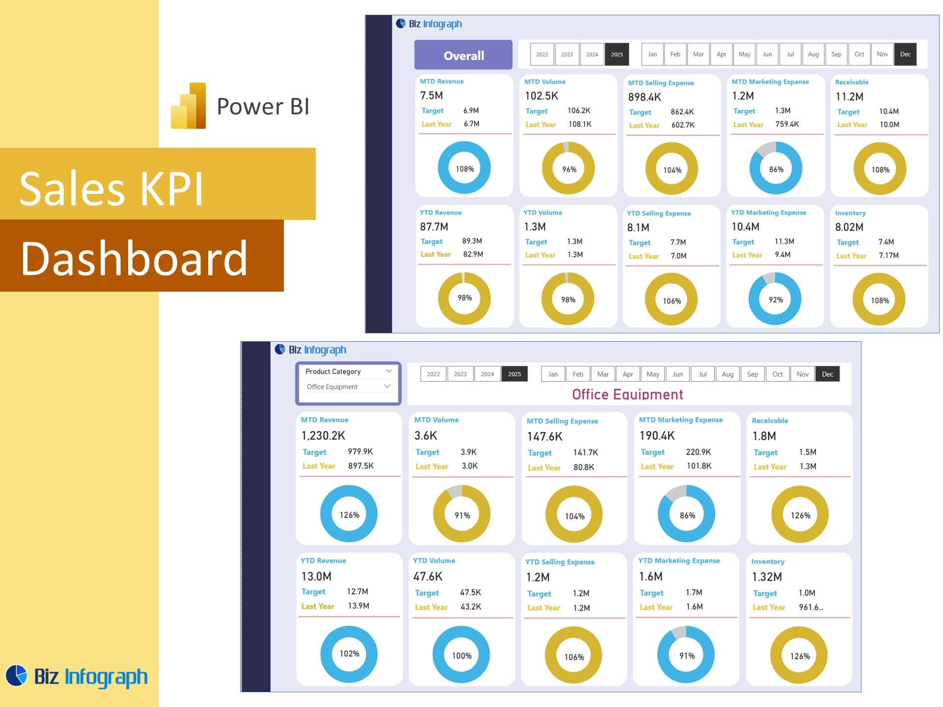
At the core of any sales budget vs actual dashboard are the key metrics and KPIs that reflect business health. Common indicators include sales amount, target sales, budget variance, gross margin, and product performance. These business KPIs should be monitored continuously to ensure that performance aligns with strategic goals. A strong Power BI dashboard can show how much of the total sales goal has been achieved and highlight areas where teams are falling short. Monitoring these KPIs in real-time empowers teams to act fast and keep performance on track throughout the quarter.
Role of Key Performance Indicators and Budget Indicators
Key performance indicators (KPIs) and budget-specific metrics are essential for tracking both progress and efficiency. These indicators may include actual-to-budget ratios, profit margins, cost of sales, and regional performance trends. For sales leaders, such insights are critical to managing expectations and motivating teams. The dashboard not only showcases static results but also tracks how those results evolve week-to-week or month-to-month. Power BI makes it easy to layer these metrics across dashboards, enabling sales managers to dig into specifics or get a high-level overview as needed. KPIs in dashboards act as both diagnostic and strategic tools.
Integrating Budget Data with Power BI Dashboards
Integrating budget data into a dashboard using Power BI involves connecting to various data sources such as Excel files, cloud storage, or enterprise databases. Once loaded, the data is structured and processed using Power BI’s data modeling capabilities. This integration supports accurate comparisons between actual results and budgets. Dashboards built in Power BI consolidate this data and present it using easy-to-understand visuals. The dashboard also includes drill-down features for specific line items or product categories, ensuring both macro and micro-level insights are easily accessible. Clean data integration is key to reliable, impactful reporting.
Designing and Building the Dashboard in Power BI
Choosing the Right Dashboard Template
When building a dashboard in Power BI, selecting a relevant dashboard template can save time and provide a professional structure. Templates come with predefined layouts for KPIs, visual elements, and filters that are ideal for budget vs actual analysis. Whether you’re developing dashboards for sales, logistics, or finance, having the right foundation allows you to focus on data interpretation rather than design. Power BI's marketplace and community also offer examples of Power BI dashboards which serve as great starting points. These templates are especially helpful for data analysts and new Power BI users looking to fast-track their dashboard development.
Customizing Dashboard Elements for Sales Budgeting
Once a dashboard template is selected, it should be tailored to fit your organization’s specific sales metrics and goals. This includes configuring visuals for budget variance, actual sales, target achievement, and sales amount over time. Use slicers for fiscal periods, product categories, and customer segments to enable deeper analysis. Conditional formatting helps highlight underperforming areas, while interactive cards can emphasize priority figures like quarterly variance. Power BI offers a wide range of customization options to create dashboards that not only inform but inspire action. Customization ensures the dashboard provides a comprehensive view that’s aligned with your business objectives.
Examples of Power BI Dashboards for Budget vs Actual Tracking
There are many real-world examples of businesses using Power BI to track budget vs actual data. One company might use a Power BI sales dashboard that shows total sales alongside budgeted targets for each product line. Another example might include an analysis dashboard where the focus is on comparing actual sales with projections across multiple territories. These dashboards often combine sales, finance, and operations metrics to offer a holistic view. By looking at these examples of Power BI dashboards, organizations can get inspired to develop their own unique solutions tailored to their reporting needs.
Best Practices for Data Analysts and Teams
How Data Analysts Use Power BI for Budget Dashboards
Data analysts play a crucial role in building and maintaining Power BI dashboards. They use Power BI’s data modeling tools to connect and clean datasets, apply transformations, and calculate key metrics like budget variance. Analysts also configure dashboards for interactivity—enabling business users to explore the data independently. Power BI enables real-time collaboration, meaning analysts can publish reports to the Power BI service for team-wide access. Their expertise in visual storytelling ensures that dashboards aren’t just technically accurate, but also intuitive and insightful—helping businesses draw conclusions quickly and effectively.
Ensuring Accuracy and Relevance of KPIs
Accuracy in KPI reporting is essential for making confident decisions. This begins with selecting relevant key performance indicators based on the organization’s goals. It’s important to verify source data regularly and set data refresh schedules that align with operational timelines. Dashboards must be flexible enough to evolve as goals shift—ensuring that outdated metrics don’t distort the narrative. Using built-in Power BI capabilities like variance analysis and dynamic filtering, users can always see the most up-to-date and relevant KPIs. Reliable KPI tracking is key to earning stakeholder trust and driving performance improvements.
Benefits of Power BI for Sales and Finance Teams
Power BI offers a unified platform where both sales and finance teams can align their goals and track progress in real time. The dashboard can help bridge departmental silos by presenting shared metrics and performance outcomes. Sales teams gain visibility into their actual vs budget performance, while finance departments can use the same data to manage cash flow and allocate resources. As a result, both teams are empowered to make informed decisions that support organizational success. The seamless integration, user-friendly interface, and robust analytics engine make Power BI an indispensable tool in modern performance tracking.
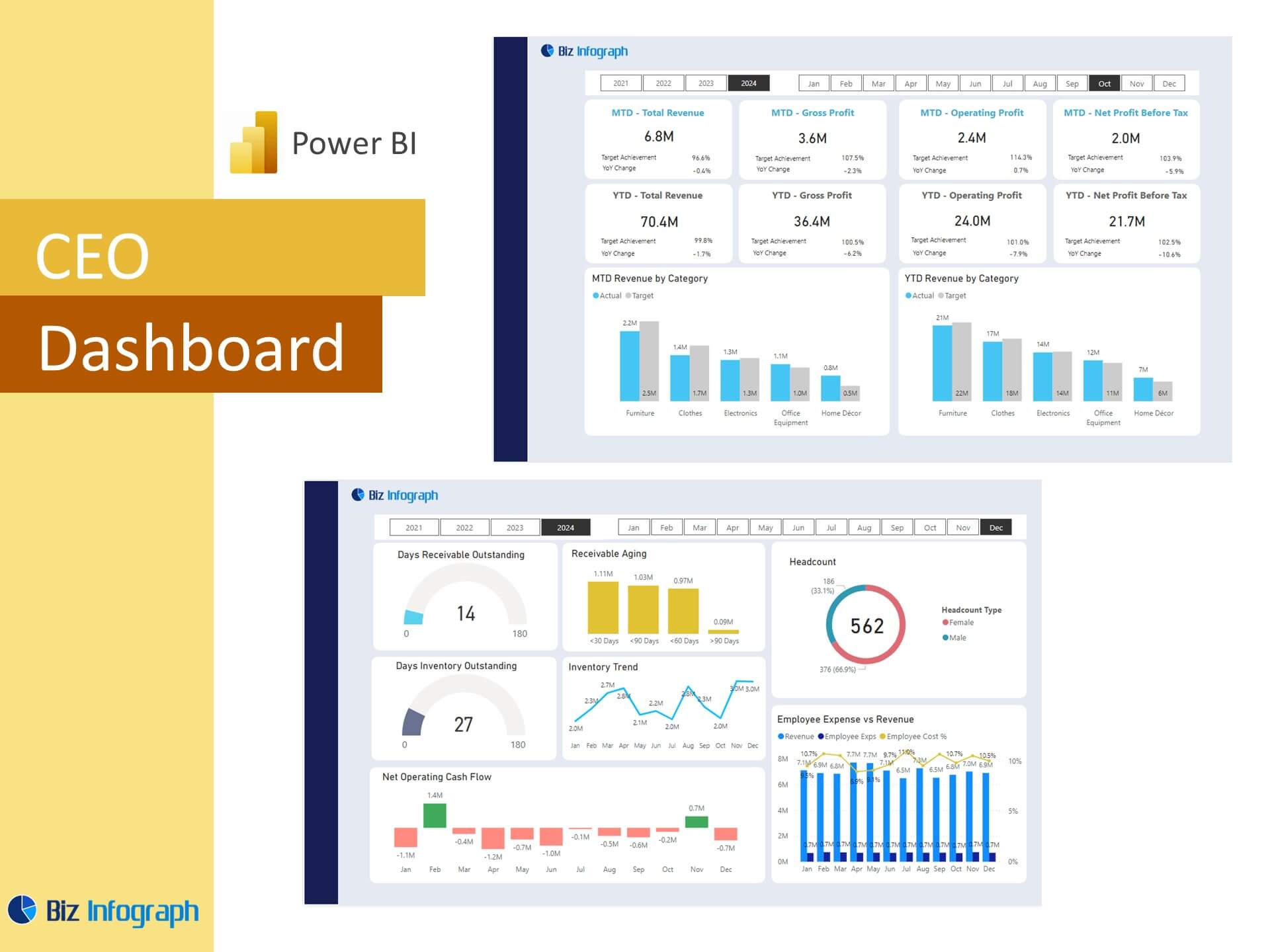
Using a Power BI dashboard template, a data analyst can transform a dataset into a comprehensive view with real-time sales data, decision-making, performance metrics, key performance indicators, KPI graphs, and analytics to help visualize, monitor, and enhance financial performance.
For ready-to-use Dashboard Templates:
- Financial Dashboards
- Sales Dashboards
- HR Dashboards
- Data Visualization Charts
- Power BI – Biz Infograph
- Automation – Biz Infograph