

Your next boardroom appearance shouldn’t be defined by the hours you spent wrestling with alignment tools or uninspiring default themes. In 2026, the most effective leaders aren’t designers; they’re strategists who know how to leverage high-performance tools to communicate vision. We’ve all been there, staring at a cluttered slide that fails to do justice to complex Excel data while the clock ticks toward a morning deadline. It’s frustrating when your insights are sharp but your visuals look dated and unconvincing. You deserve a presentation that mirrors the high-end nature of your strategy and your professional standard.
This guide promises to change your workflow by introducing you to the most authoritative executive presentation templates designed to command the room and reduce your slide creation time by 80%. You’ll discover how to seamlessly integrate data-heavy charts into sophisticated, minimalist layouts that reflect a premium standard of excellence. We’re breaking down the best-in-class options that allow you to stop decorating and start leading with confidence. By the end of this roundup, you’ll have the exact tools needed to transform complex data into a source of personal pride and professional impact.
Key Takeaways
- Learn why authoritative minimalism and data-first hierarchy are the essential standards for boardroom success in 2026.
- Discover how to select executive presentation templates using a 5-point framework that balances complex data scalability with total design flexibility.
- Identify the best template categories for your specific needs, from high-stakes investor relations to comprehensive company-wide operational dashboards.
- Follow a simple, professional audit process to ensure global font consistency and replace generic visuals with premium, industry-specific assets.
- See how shifting from manual design to curated, best-in-class tools can slash your slide creation time while boosting your strategic impact.
What Defines a True Executive Presentation Template in 2026?
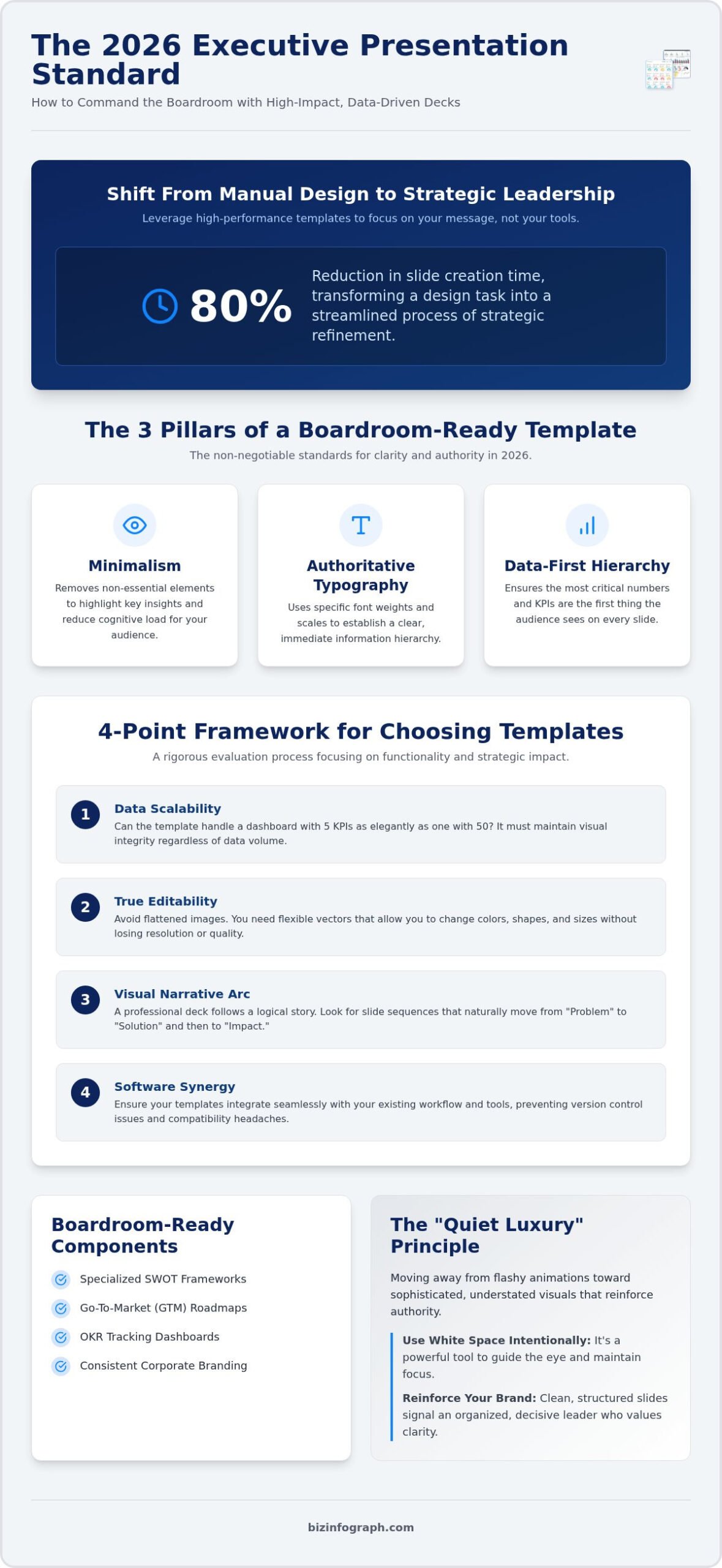
In 2026, the standard for a professional slide deck has evolved far beyond basic layouts. A true executive presentation template isn’t just a background; it’s a structural framework that prioritizes minimalism, authoritative typography, and a data-first hierarchy. While many platforms offer thousands of generic slides, high-level leaders require “High-Density Clarity.” This approach ensures that even the most complex elements of a presentation are communicated without visual clutter. When you’re presenting to a board, every pixel must serve a purpose. Creative templates often fail because they prioritize artistic flair over the core message. This leads to visual noise that distracts from your primary objectives. An executive template is a strategic asset that perfectly balances aesthetic prestige with deep analytical depth.
To meet the 2026 executive standard, your templates should embody these three pillars:
- Minimalism: Removing every non-essential element to highlight key insights and reduce cognitive load.
- Authoritative Typography: Using specific font weights and scales to establish a clear, immediate information hierarchy.
- Data-First Hierarchy: Ensuring the most critical numbers and KPIs are the first things the audience sees on every slide.
The Shift from Decoration to Communication
Professional design in 2026 has embraced the concept of “quiet luxury.” This trend moves away from flashy animations and neon gradients toward sophisticated, understated visuals. You don’t need loud colors to make a point. High-energy visuals can often undermine the seriousness of financial reporting or strategic pivots. Use white space intentionally. It isn’t empty room; it’s a powerful tool to guide the eye and maintain focus during high-stakes pitches. When your slides are clean and structured, you reinforce your personal brand as an organized, decisive leader. It tells your audience that you value their time and your own clarity.
Essential Components of a Boardroom-Ready Deck
To command a room, your deck needs more than just text boxes. It requires specialized visualizations for strategic frameworks like SWOT analysis, Go-To-Market (GTM) plans, and OKR tracking. These shouldn’t look like clipart. They should feel bespoke and integrated into the overall narrative. Consistency is your best friend here. Maintaining uniform corporate branding across every sub-slide prevents the “Frankenstein deck” feel that happens when mixing multiple sources. If you want to dive deeper into the technical side, consider mastering business presentation templates to ensure your technical execution matches your strategic vision. Using professional executive presentation templates allows you to focus on the “why” of your data rather than the “how” of the design. This efficiency transforms a stressful design task into a streamlined process of strategic refinement.
The 5-Point Framework for Choosing High-Impact Templates
Selecting the right executive presentation templates is a strategic decision that directly influences how your leadership is perceived. It isn’t just about finding something that looks modern. It’s about finding a tool that supports high-stakes communication and preserves your most valuable asset: time. To ensure your deck stands up to boardroom scrutiny, you need a rigorous evaluation process. This framework focuses on functionality and psychological impact rather than just visual appeal. Mastering these Presentation Skills for Effective Leadership involves choosing tools that enhance your clarity and authority.
- Data Scalability: Your template must be robust. Can it handle a dashboard with 5 KPIs as elegantly as one with 50? Premium templates maintain their visual integrity regardless of data volume.
- True Editability: Avoid templates that use flattened images. You need flexible vectors that allow you to change colors, shapes, and sizes without losing resolution.
- Visual Narrative: A professional deck follows a logical arc. Look for slide sequences that naturally move from “Problem” to “Solution” and finally to “Impact.”
- Software Synergy: In 2026, your slides don’t exist in a vacuum. Ensure your templates integrate seamlessly with your Excel and Power BI workflows for live data reporting.
- Lifetime Value: Software evolves quickly. Prioritize providers that offer free lifetime updates so your templates remain compatible with the latest AI-assisted features.
Evaluating Data Visualization Capabilities
Static charts are a relic of the past. For 2026 executive reviews, you need dynamic visuals that can be updated in seconds. When auditing a template, check the slide master for infographic flexibility. High-quality PowerPoint infographic templates are built to allow for rapid data entry without breaking the layout. If you find yourself manually drawing lines or resizing boxes, the template has already failed you. Our specialized dashboard tools are specifically designed to bridge this gap, turning raw numbers into boardroom-ready visuals instantly.
Typography and Color: The Psychology of Authority
The fonts and colors you choose send a subconscious message to your audience. Sans-serif fonts like Helvetica or Roboto imply modernity, stability, and transparency. These are far more effective for executive reporting than overly decorative typefaces. Similarly, your color palette should focus on “Power Colors” like deep blues, charcoals, and forest greens. Use these strategically to highlight critical data points or callouts. Avoid the generic template look by opting for sophisticated, muted palettes. This approach ensures your slides look bespoke and high-end, rather than like something pulled from a free stock site. It’s about creating a look of professional excellence that makes your strategy look bulletproof.
Top Categories for Executive Presentation Templates
Executives don’t usually search for templates by industry; they search by the weight of the decision they need to influence. Finding the right executive presentation templates means matching the visual tool to the functional requirement of the meeting. Whether it’s a quarterly board review or a high-stakes investor pitch, the category you choose dictates the rhythm of your communication. High-performance leaders prioritize function over generic decoration because they know that clarity is the ultimate form of persuasion. By selecting a category that aligns with your specific goal, you ensure that your message isn’t just heard, but acted upon.
- Investor Relations: These templates are built for absolute precision. They’re specifically designed for funding rounds and annual reports where clarity is non-negotiable. They help you present financial health with an air of global authority.
- Operational Dashboards: These provide a birds-eye view of company-wide health. They summarize complex efficiency metrics into digestible, high-level overviews that allow for quick decision-making.
- Strategic Planning: When you need to visualize 3-5 year roadmaps or competitive positioning, these templates provide the necessary structure. They turn abstract goals into a concrete, visionary path.
- Sales Performance: This category moves beyond basic bar charts. It focuses on revenue storytelling. It shows not just your current numbers, but the strategic trajectory of your growth and market penetration.
Strategic Roadmaps and Timelines
Visualizing project milestones often results in a “Gantt chart headache” that confuses more than it clarifies. High-impact roadmaps use tiered timelines to show how different departments align over time without the clutter of traditional project management tools. This clarity is essential for keeping stakeholders on the same page during high-stakes pitches. Using curated business presentation templates ensures these timelines remain readable even on large boardroom screens. It’s about showing the big picture while respecting the underlying details of the strategy. You can easily highlight departmental dependencies without overwhelming the audience with technical jargon or unnecessary visual noise.
Financial and KPI Summaries
This is where the bridge between raw data and executive insight is built. You shouldn’t have to rebuild your charts every time the data changes. Using professional Excel dashboard templates allows you to feed your slides with live, accurate data directly from your spreadsheets. This integration means your “Executive Summaries” can fit on a single, powerful slide that highlights the most critical KPIs. It saves you from manual entry errors and ensures your numbers are always boardroom-ready. This approach turns your reporting into a source of personal pride rather than a weekend chore. It allows you to spend your time on strategy instead of formatting, ensuring you always shine in front of your audience.
Customizing Your Templates for Maximum Boardroom Impact
Customizing your executive presentation templates is the critical phase where your strategy transforms from a draft into a persuasive narrative. It isn’t just about aesthetic adjustments. It’s about engineering a deck that stands up to the intense scrutiny of high-level stakeholders. To ensure your presentation commands the respect it deserves, follow this five-step professional audit. This process turns a standard tool into a bespoke strategic asset that reflects your leadership and precision.
- Step 1: Audit the Slide Master. Open the master view to ensure global font and color consistency. This prevents “font drift” that makes a deck look unpolished.
- Step 2: Upgrade Your Visuals. Replace generic, overused icons with industry-specific, high-quality vectors. These should feel like they belong in a premium corporate environment.
- Step 3: Eliminate Chart Junk. Simplify your data charts by removing unnecessary gridlines, redundant labels, and heavy borders. Your data should breathe on the slide.
- Step 4: Link Your Data. Integrate live data links from interactive excel dashboard templates. This ensures real-time accuracy and prevents manual entry errors during last-minute updates.
- Step 5: The Blink Test. Flip through your slides. Can you identify the main takeaway of each slide in under three seconds? If not, the slide is too complex.
Data-Driven Storytelling Techniques
Numbers alone rarely convince a board; it’s the interpretation of those numbers that drives action. Use call-out boxes to explain the “so what” behind a specific data point. This guides the conversation and prevents stakeholders from drawing their own, perhaps incorrect, conclusions. Your Power BI dashboard templates should directly inform your slide narrative, ensuring a single version of the truth across all reporting platforms. Try using subtle directional cues like small arrows or color highlights to lead the stakeholder’s eye toward the most critical insight. This subtle guidance keeps the audience focused on your strategic path.
Maintaining Brand Consistency
Adapting a premium template to your specific corporate identity (CI) requires a delicate touch. While you want the deck to feel like your own, there’s a danger in “over-editing.” Respect the template’s original grid system; it was designed by specialists to maintain professional balance. When adding your logo or specific brand colors, ensure all infographics still match the visual weight of your text. A mismatched icon or an off-brand shade can instantly break the “high-end” feel you’ve worked to establish. If you’re ready to elevate your reporting standard, explore our premium infographic and dashboard collections to find the perfect foundation for your next board meeting. Professional consistency is what separates a good manager from a visionary leader.
Why Biz Infographs is the Executive’s Productivity Partner
Choosing a partner for your high-stakes reporting isn’t just about downloading a file. It’s about securing a strategic advantage. While many providers focus on sheer volume, Biz Infographs prioritizes curation over clutter. We understand that an executive doesn’t need 50,000 generic slides; they need the right 50 slides that communicate authority and precision. Our executive presentation templates are built by data visualization specialists who understand business logic, not just graphic design. This ensures your charts aren’t just aesthetically pleasing; they’re analytically sound and boardroom-ready. We act as your expert facilitator, providing tools that bridge the gap between complex data and strategic influence.
- Curation over Clutter: We provide best-in-class tools designed for impact. You won’t waste time digging through thousands of irrelevant layouts to find one that works.
- Data Expertise: Every template is engineered to handle real-world business data. Our layouts respect the principles of information hierarchy and cognitive load.
- Lifetime Value: Your investment stays relevant. We provide free lifetime updates to ensure your decks remain compatible with the latest software versions and AI-assisted features through 2026 and beyond.
- Universal Compatibility: Experience seamless integration across PowerPoint, Excel, and Power BI. This ecosystem allows you to move data between platforms without breaking your design.
Empowering Professionals to Shine
We believe high-quality design should be accessible regardless of your technical skill level. Many leaders find themselves stuck in a design struggle that takes away from strategic thinking. Our mission is to transform that frustration into a source of personal pride. For instance, our sales dashboard templates help VPs win back their weekends by automating the visual heavy lifting. When you use a tool that’s already optimized for professional standards, you can focus entirely on your message. It’s an empowering way to work that turns a tedious task into a high-performance output.
Ready to Transform Your Next Presentation?
Imagine the relief of walking into your next board meeting with a best-in-class toolkit at your fingertips. You won’t just be presenting data; you’ll be commanding the room with high-end visuals that mirror the quality of your insights. Our commitment to premium, solution-oriented digital assets ensures you always have the right foundation for success. It’s time to stop wrestling with alignment tools and start shining in front of your audience. Browse our professional executive presentation templates today and see how easy it is to elevate your professional brand to a global standard.
Command the Boardroom with Strategic Confidence
You now have the blueprint to move beyond uninspiring slides and embrace a standard of high-density clarity. By applying the 5-point framework and choosing functional categories over generic designs, you ensure your strategy remains the focal point of every discussion. High-performance executive presentation templates are no longer just about decoration. They’re essential strategic assets that bridge the gap between complex data and decisive leadership.
Biz Infographs is proud to be the productivity partner for over 15,000 businesses worldwide. Our best-in-class tools are expertly designed for data-driven impact, and we provide lifetime free updates to keep your reporting modern. It’s time to transform your design struggle into a source of professional pride and win back your strategic focus. Elevate your next board meeting with professional executive presentation templates. You have the vision; we provide the tools to make it shine.
Frequently Asked Questions
What makes a presentation template ‘executive level’?
Executive level templates prioritize strategic clarity over decorative flair. They use high-end typography and clean grid systems to ensure your message isn’t lost in visual noise. These designs focus on high-density clarity, allowing you to present complex KPIs without overwhelming the audience. It’s about providing a professional foundation that makes your data look bulletproof and your strategy look visionary during high-stakes board meetings.
Can I link my Excel data directly to these PowerPoint templates?
Yes, you can seamlessly integrate your data by linking Excel charts directly to your slides. This feature ensures that any updates made in your spreadsheet reflect instantly in your presentation. It eliminates the need for manual data entry, which reduces the risk of human error. Using executive presentation templates with live data links allows you to spend more time on strategy and less time on repetitive formatting tasks.
Are these templates compatible with the latest 2026 PowerPoint features?
Our templates are fully compatible with the latest 2026 software versions, including advanced AI-assisted design features. We ensure that our digital assets leverage the most modern capabilities of the Microsoft ecosystem. Whether you’re using automated layout suggestions or advanced data visualization tools, these templates provide a stable and high-performance foundation. You don’t have to worry about technical glitches or outdated formatting when you’re preparing for an important pitch.
How do I choose between a PowerPoint and a Power BI template?
Choose a PowerPoint template when you need to deliver a structured, linear narrative during a meeting or pitch. It’s the best tool for storytelling and guiding an audience through a specific strategic path. Opt for a Power BI template when your goal is interactive, deep-dive data exploration. Power BI is ideal for real-time dashboards where stakeholders might want to filter results or drill down into specific departmental metrics on the fly.
Do your templates come with free lifetime updates?
Every purchase at Biz Infographs includes free lifetime updates to ensure your tools never become obsolete. As software versions evolve and design trends shift, we update our library to maintain the highest professional standards. This commitment provides you with long-term value and peace of mind. You’ll always have access to the latest versions of your executive presentation templates, allowing your reporting to remain modern and impactful year after year.
What is the best way to present complex data to a board of directors?
The best approach is to lead with the insight rather than the raw numbers. Use a data-first hierarchy that highlights the most critical KPI immediately. Simplify your visuals by removing unnecessary gridlines and labels that create clutter. Always include a clear call-out or executive summary that explains the strategic significance of the data. This ensures the board understands the “so what” behind every chart you show them.
Can I customize the colors and fonts to match my corporate branding?
You can easily adapt our templates to match your specific corporate identity. All elements are fully editable, meaning you can change colors, fonts, and icons within the slide master to ensure brand consistency. This allows you to maintain a bespoke look while benefiting from our professionally engineered layouts. It’s a fast way to create a high-end, branded deck without the need for custom graphic design services or expensive agencies.
Why should I buy a template instead of using free online tools?
Professional templates are built by data visualization specialists who understand business logic, whereas free tools often prioritize generic aesthetics. Premium assets save you hours of manual design time and offer superior data scalability. They provide a level of quiet luxury and authoritative design that free alternatives simply can’t match. Investing in high-quality executive presentation templates ensures your slides reflect the premium nature of your professional brand and strategic vision.