
In today’s data-driven world, presenting complex, extensive data clearly and compellingly is crucial for effective communication. PowerPoint templates and Google Slide themes are popular presentation tools that offer powerful data visualization features in PowerPoint. Whether you’re a business professional, educator, or researcher, the ability to present data understandably and engagingly can significantly impact the success of your presentation.
In this blog post, we will explore strategies and techniques for effectively presenting detailed and extensive data through PowerPoint, leveraging the power of data visualization and utilizing PowerPoint templates and Google Slides themes.
Understand Your Audience and Objectives
Before diving into data visualization, it’s important to understand your audience and presentation objectives. Who will be attending your presentation? Are they familiar with the subject matter or data analysis techniques? Identifying your audience’s knowledge level and expectations will help you tailor your data presentation accordingly. Additionally, clarify your presentation objectives—whether it’s informing, persuading, or educating—to guide your choices.
Simplify and Structure Your Data
Complicated data can be overwhelming for your audience if not presented in a structured and simplified manner. Begin by organizing your data into clear categories or segments to facilitate understanding. Remove unnecessary details and focus on the key insights or findings. If the dataset is extensive, consider dividing it into logical sections or using subheadings to improve clarity and navigation throughout the presentation.
Utilize Data Visualization Techniques
Data visualization is the key to transforming complex data into easily understandable visuals. PowerPoint and Google Slides offer a variety of tools and features to create impactful data visualizations in PowerPoint. Consider using the following techniques:
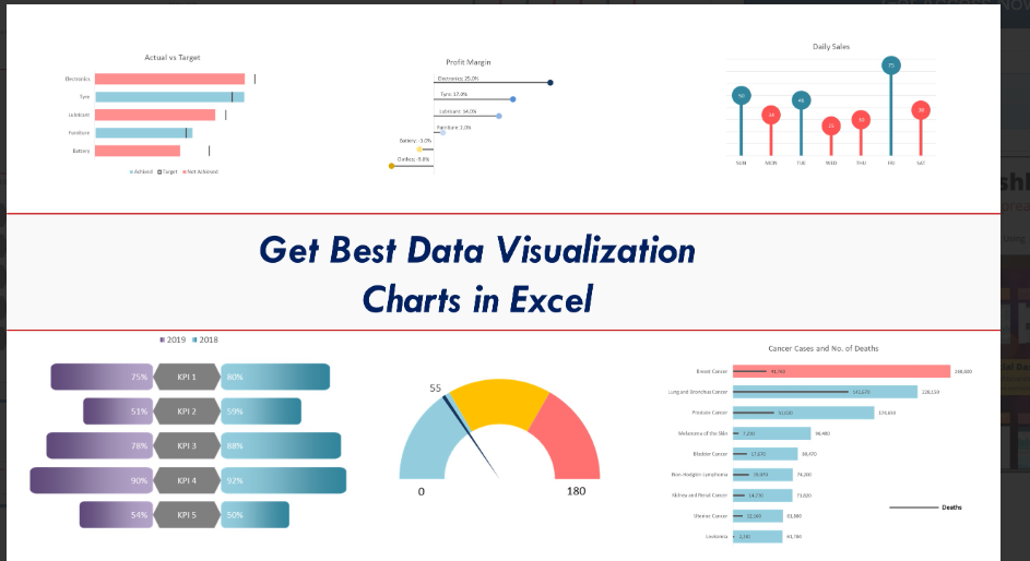
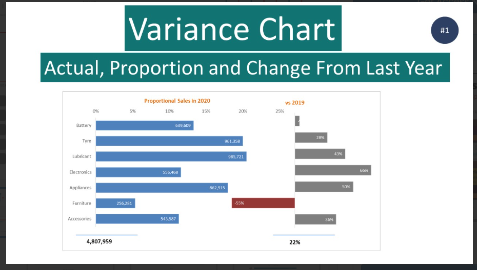
a) Charts and Graphs: Choose appropriate chart types, such as bar charts, line graphs, pie charts, or scatter plots, based on the nature of your data and the story you want to convey. Ensure the visuals are properly labeled, use contrasting colors, and include clear legends to enhance readability.
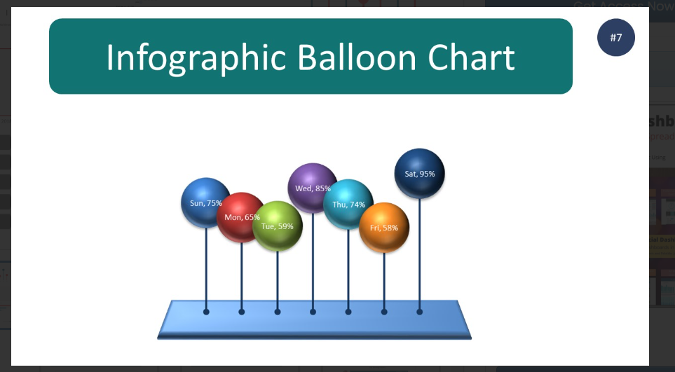
b) Infographics: Infographics combine text and visuals to present complex information visually appealing and concisely. Create custom infographics using PowerPoint’s built-in shapes, icons, and smart art, or leverage pre-designed infographic templates to save time and effort.
c) Tables and Grids: Tables and grids can effectively present numerical data or comparisons. Use alternating colors or shading to differentiate rows and columns and highlight critical figures or trends for emphasis.
d) Data Maps: Consider incorporating data maps if your data involves geographical information. PowerPoint and Google Slides provide map templates and tools to plot data points, color regions, and visualize trends across different locations.
Choose the Right PowerPoint Templates and Google Slides Themes
PowerPoint templates and Google Slides themes are pre-designed layouts that can provide a cohesive and visually appealing framework for your presentation. These templates offer a variety of styles, color schemes, and typography options, making it easier to maintain consistency and professionalism throughout your slides. When selecting templates, look for ones designed explicitly for data-heavy presentations or data visualization in PowerPoint. These templates often include placeholders and designs optimized for charts, graphs, and infographics, saving you time and effort in creating visually engaging slides.
Keep It Simple and Minimize Clutter
While it’s important to present data comprehensively, it’s equally important to avoid overwhelming your audience with too much information. Keep your slides uncluttered and focus on the essential elements. Use concise and clear labels, titles, and captions to guide the audience’s understanding. Minimize the use of lengthy text paragraphs and opt for bullet points or short phrases to convey key messages. Remember, the visual aspect of data presentation should be the primary focus, with text serving as a supplementary aid.
Use Animations and Transitions Wisely
Animations and transitions can enhance the flow and engagement of your presentation. However, use them judiciously and purposefully. Employ animations to gradually reveal data points or elements, emphasizing one piece of information at a time. Transitions between slides should be smooth and seamless, maintaining the audience’s attention and avoiding distractions. Avoid excessive animations or transitions that can appear gimmicky and detract from the content.
Practice and Rehearse
Finally, practice and rehearse your presentation to ensure smooth delivery and confidence in presenting complex data. Familiarize yourself with the content, timing, and transitions. Pay attention to your tone of voice, body language, and pacing to maintain a connection with your audience. Use your rehearsal time to identify any areas that need further clarification or simplification and make necessary adjustments.
Highlight Key Insights and Takeaways
While presenting complicated and extensive data, it’s essential to distill the most important insights and takeaways for your audience. Emphasize the key findings, trends, or patterns that support your presentation objectives. Callout boxes, arrows, or visual cues draw attention to these critical points. By highlighting the key insights, you ensure your audience grasps the most relevant information and can retain it even after the presentation.
Provide Context and Interpretation
Data can be open to interpretation, so it’s crucial to provide context and interpretation to avoid misinterpretation or confusion. Explain the methodology behind the data collection and analysis, including any limitations or biases. Offer insights and explanations that help the audience understand why certain trends or patterns have emerged. This contextual information adds depth and credibility to your presentation and enables the audience to make more informed conclusions.
Use Data Annotations and Labels
When presenting complex data, it’s important to provide clear annotations and labels to guide the audience’s understanding. Data annotations help explain specific data points, outliers, or significant observations. Labels on charts and graphs should be concise and descriptive, allowing the audience to interpret the data accurately. Consider adding additional information in tooltips or notes to provide further context or definitions for complex terms or abbreviations.
Interact with the Data
Engage your audience by allowing them to interact with the data during your presentation. Powerpoint templates and Google Slides themes offer interactive features such as hyperlinks, buttons, and slide navigation. You can link certain data points or elements to additional slides or external resources, allowing the audience to explore the data in more detail. Interactive elements create a dynamic and participatory experience, keeping the audience actively involved and enhancing their understanding of the data.
Practice Data-driven Storytelling
Data-driven storytelling is a powerful technique to make your data presentation more impactful. Instead of bombarding the audience with numbers and statistics, tell a compelling story that is supported by the data. Start with a narrative arc that introduces a problem or challenge, presents the data as evidence or supporting facts, and concludes with a resolution or actionable insights. By framing your data within a story, you engage the audience emotionally and intellectually, making the information more memorable and actionable.
Seek Feedback and Iterate
After delivering your presentation, seek feedback from your audience or colleagues. Ask for their impressions, understanding of the data, and any areas that need further clarification. Use this feedback to iterate and improve your presentation for future occasions. By continually refining your data presentation skills, you can become more proficient in delivering complex information effectively and making a lasting impact on your audience.
The Bottom Line
Presenting complicated and extensive data through PowerPoint and Google Slides can be daunting. Remember, data visualization in PowerPoint is not just about making the data visually appealing—it’s about enabling your audience to grasp the insights and make informed decisions based on the presented information.
Biz Infograph is an excellent and user-friendly platform for any business, whether big or small, for professional presentations and data management.
Connect with Biz Infograph and check out our Best PowerPoint Templates and dashboard templates for effective and impactful Free PowerPoint Infographic Templates