

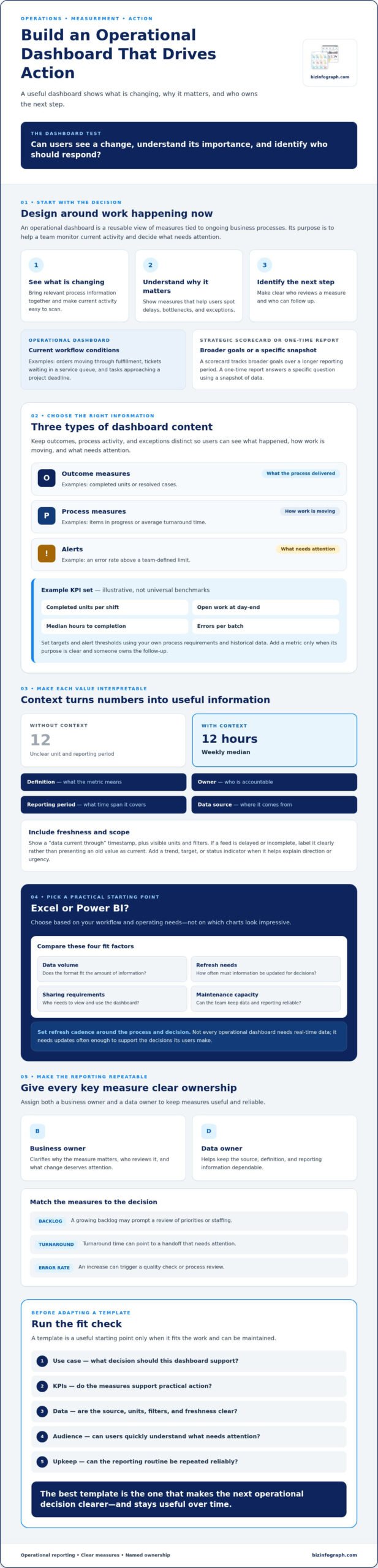
The best-looking operational dashboard template may still leave your team asking, “What should we do next?” A useful dashboard helps people see what is changing, understand why it matters, and identify who owns the next step.
When operational information is scattered across files and systems, teams can spend valuable time assembling updates. A report can also look clear but fall short if its metrics do not support day-to-day decisions. The right setup brings relevant information together without adding clutter or creating unnecessary manual work.
This guide will help you identify operational metrics, assign ownership, and choose an Excel or Power BI starting point that fits your team. You’ll learn how to match a template to your workflow, select measures that support practical action, and make reporting easier to repeat. We’ll also cover how to check data readiness, sharing needs, and ongoing maintenance before you commit to a format.
Key Takeaways
- Choose an operational dashboard template based on the decisions your team needs to make, not on which charts look impressive.
- Separate outcome measures, process measures, and alerts so users can see what needs attention and why.
- Compare Excel and Power BI based on data volume, refresh needs, sharing requirements, and maintenance capacity.
- Assign a business owner and data owner to each key measure to keep reporting useful and reliable.
- Before adapting a template, check that it fits your use case, KPIs, data, audience, and upkeep routine.
What an operational dashboard template should help you see
An operational dashboard template is a reusable view of measures tied to ongoing business processes. It helps a team monitor current activity and decide what needs attention.
It focuses on work happening now or within a short operating cycle: orders moving through fulfillment, tickets waiting in a service queue, or tasks approaching a project deadline. A shared view can help users spot delays, see where a process is slowing, and coordinate a response. For a general introduction to the concept, see Dashboard.
This differs from a strategic scorecard, which typically tracks broader goals over a longer reporting period, and from a one-time report, which answers a specific question using a snapshot of data. An operational dashboard is useful when its measures are refreshed often enough to support the decisions users need to make. Set the refresh cadence around the process and decision, rather than assuming every dashboard needs real-time data.
Operational dashboard vs. KPI dashboard: what is the difference?
An operational dashboard emphasizes process activity and timely monitoring. It might show open orders, items awaiting approval, or unresolved service requests, helping a lead decide where to redirect work. A KPI dashboard may focus on broader goals and reporting periods, such as monthly service levels or progress toward an annual target.
The labels can overlap, so define the dashboard’s purpose before choosing a template. Ask whether users need to respond to current workflow conditions or review performance against wider goals. That answer will help you decide which measures belong in the view and how often they need to be updated.
Who benefits from an operational dashboard?
Operations managers can use order-flow measures to spot a backlog and investigate where fulfillment is slowing. Team leads can monitor service queues and decide how to distribute incoming requests. Business owners or project leads can review delivery milestones, identify work at risk, and agree on a follow-up.
In each case, the dashboard should make a decision clearer, not simply place more numbers on screen. Decide who will review each measure, what change deserves attention, and who can respond. For example, if a lead is expected to act on a growing queue, make the queue size and its data timestamp easy to find. That turns the dashboard from a passive display into a practical coordination tool.
What to include in an operational dashboard template
Build the view around questions your team needs answered, not charts that merely fill space. What result are you aiming for? Where in the process is work slowing down? Is anything outside its expected range, and who should follow up? An operational dashboard template earns its place when each measure helps answer one of those questions.
Keep three kinds of information distinct:
- Outcome measures: Show what the process delivered, such as completed units or resolved cases.
- Process measures: Reveal how work is moving, such as items in progress or average turnaround time.
- Alerts: Highlight an exception that needs attention, such as an error rate above a team-defined limit.
For every metric, record its definition, owner, reporting period, and data source. Include a “data current through” timestamp so users can judge whether the information is fresh enough for the decision at hand. If a feed is delayed or incomplete, label it clearly instead of presenting an old value as current. Also make units and filters visible, so users know what the figure includes.
Choose operational KPIs that lead to decisions
Use KPIs to guide a response, not just describe activity. Throughput can help a team investigate whether capacity matches incoming work. A growing backlog may prompt a review of priorities or staffing. Turnaround time can point to a handoff that needs attention, while an increase in error rate can trigger a quality check or process review.
Illustrative KPI set, not universal benchmarks: A team might track completed units per shift, open work at day-end, median hours to completion, and errors per batch. Set targets and alert thresholds using your own process requirements and historical data. Before adding a metric, make sure someone can explain its purpose and owns the follow-up.
Make dashboard data easier to interpret
A single number rarely tells the whole story. Add a trend, target, or status indicator when it helps users understand direction or urgency. Label units, date ranges, filters, and sources. “12” is ambiguous, while “12 hours, weekly median” gives useful context. Choose visuals that make the comparisons users need easy to read, and use dashboard design best practices as a guide to keeping the view focused on its audience and data.
A ready-made template can save setup time, but its measures and layout still need to fit your workflow. Explore Excel dashboard templates as a potential starting point, then check the selected template’s format, data requirements, and metrics against your reporting needs.
Excel or Power BI: which operational dashboard template fits?
The best format is one your team can keep accurate, current, and useful. Excel often fits familiar spreadsheet workflows and manageable reporting needs. Power BI is worth considering when users need to explore connected data or interact with reports. Neither option is automatically right for every team. Compare the practical demands before choosing an operational dashboard template.
| Factor | Excel | Power BI |
|---|---|---|
| Data volume | Can suit a contained dataset maintained in workbooks. | Consider for reporting that brings together multiple data sources; check the template’s model and setup needs. |
| Refresh needs | Confirm who updates the source data and how often. | Confirm how refresh is configured, monitored, and maintained. |
| Sharing | Check how users will access the workbook and manage versions. | Check workspace permissions, viewer access, and licensing requirements. |
| Maintenance | Plan for formula, chart, and workbook upkeep. | Plan for data connections, model updates, and report maintenance. |
When an Excel operational dashboard template makes sense
Excel may be a practical starting point if the source data already lives in spreadsheets, a small group maintains the report, and the reporting process is straightforward. Before selecting a template, confirm who updates the workbook and how often. Review its formulas, charts, required inputs, and software requirements against your own setup. A polished preview alone does not confirm compatibility or suitability.
When to consider a Power BI dashboard template
Consider Power BI if users need to filter and explore reports or bring information from multiple sources into a shared view. The specific template and your data setup determine whether those needs can be met. Verify the data model, required connections, refresh process, permissions, and ongoing maintenance before adopting it. Check the licensing needed for report creators and viewers too, since access arrangements can affect how you share the dashboard.
Make the choice by checking your workflow: Where does the data live? How often must it be refreshed? Who needs access, and who will maintain the report? A downloadable Excel dashboard template or Power BI template can provide a time-saving starting point, but confirm its specifications before adapting it to your reporting process.
How to adapt a dashboard template to your operations
A template gives you a structure to work from, but your team’s process should shape the finished dashboard. Adapt it step by step, keeping each measure connected to a decision, a responsible person, and a trusted source.
Map the workflow, users, and data sources
Start by naming the process and the decisions the dashboard should support. Then list the people who will use it, where each measure comes from, and how often the data needs updating. Check for unclear metric definitions or missing access permissions before building the report. Resolve those dependencies early, so users can tell whether a blank value means “no activity” or “data not available.”
Follow a practical setup workflow
- Define the decisions. Write down what users should do when a measure changes, such as investigate a delay or reassign work.
- Select the measures. Keep metrics that inform those decisions, and clarify each calculation, unit, and reporting period.
- Assign ownership. Name a business owner who is accountable for the measure’s relevance and follow-up, and a data owner who understands the source and its accuracy. One person may fill both roles, but make both responsibilities explicit.
- Map data and access. Record the source for each measure, update frequency, and who needs permission to view or maintain it.
- Configure the template. Adapt labels, filters, and visuals to match the team’s language and daily workflow. Remove sections that do not support a decision.
- Validate and review. Compare sample dashboard figures with trusted source records, then ask intended users whether the view helps them complete their tasks.
Test, refine, and maintain the dashboard
Before sharing results, trace sample figures from the dashboard back to their original records. Check that date ranges, filters, and calculations are consistent, and flag discrepancies for the relevant data owner. Ask users whether labels are clear, filters help them find what they need, and the most important information stands out.
Set a review cadence that fits the process. At each review, look for outdated metrics or definitions, changed workflows, and broken or delayed data connections. This keeps the dashboard useful as operations evolve, rather than letting it become a static report users no longer trust.
Once you’ve mapped the workflow and know what the template needs to support, explore dashboard templates as a starting point. Check each option’s format and requirements, then adapt it to your team’s actual processes.
Choose an operational dashboard template you can put to work
The right template should match the way your team makes decisions and manages work. Before you choose, check that its measures, data requirements, and format suit your operations. Treat it as a starting point, not a finished reporting system. You may need to adjust the layout, definitions, or data setup to fit real workflows.
A quick checklist before selecting a template
- Use case: What operational process will it monitor, and which decisions should the dashboard support?
- KPIs: Are the measures clearly defined, useful to the intended audience, and linked to someone responsible for follow-up?
- Data readiness: Can you access the required sources, and do the data definitions and update routines support reliable reporting?
- Users: Who will view, update, and maintain the dashboard? Check that the format works for them.
- Upkeep: Is someone responsible for keeping data connections, metric definitions, and reporting routines current?
Before committing, review the template’s format, software requirements, included components, and data setup instructions. These details can vary, so verify them for the specific template instead of assuming it will work with your existing files or systems.
Find a template format that fits your workflow
If your team already works with spreadsheets and has manageable reporting needs, Excel dashboard templates can offer a familiar place to begin. Browse the Excel dashboard templates available from Biz Infographs, and check each option’s specifications before choosing. Power BI templates are another format to evaluate if your reporting needs call for interactive exploration. Confirm the specific template’s data model and setup requirements before deciding it fits.
In either format, the operational dashboard template should support your process rather than dictate it. Remove measures that do not help users act, clarify labels that do not match team language, and make sure the people responsible can maintain the underlying data. A good fit is one your team can understand, trust, and use consistently.
Ready to compare formats? Explore Biz Infographs templates and find a starting point to adapt to your team’s workflow.
Build a dashboard your team can act on
The right operational dashboard template starts with the decisions your team needs to make. Choose measures that clarify performance, assign owners, and check that the data is accurate and current. Then select Excel or Power BI based on your team’s data, reporting needs, and ability to maintain the setup.
A template is a practical starting point, not a substitute for adapting the view to your workflows. Biz Infographs offers Excel dashboard templates and Power BI templates, along with free lifetime updates. Review each template’s details, including its software requirements and data setup, to find an option that fits your needs.
Explore Biz Infographs dashboard templates to compare formats and choose a starting point for your team’s reporting workflow.
Frequently Asked Questions
What is an operational dashboard template?
An operational dashboard template is a reusable layout for tracking measures tied to ongoing business processes. It gives a team a consistent way to view current activity, spot exceptions, and decide what needs attention. For example, a service team might adapt one to monitor open requests and resolution times. The template is a starting point: adjust its metrics, definitions, and data inputs to match the actual workflow.
What should an operational dashboard include?
An operational dashboard should include a focused set of KPIs and enough context for users to interpret them. Show metric definitions, units, date ranges, and relevant targets or trends. Identify a business owner for follow-up and a data owner responsible for the source or calculation. Include a clear data freshness indicator, such as the latest update time, and flag missing or delayed information so users do not mistake it for current data.
What is the difference between an operational dashboard and a KPI dashboard?
An operational dashboard focuses on timely monitoring of active processes, such as work in progress, service queues, or order flow. A KPI dashboard may cover broader performance goals over a longer reporting period, such as monthly results or progress toward an annual target. The terms can overlap, and a dashboard may serve both purposes. Decide whether users need to respond to current process conditions or review wider performance before choosing a format.
Is Excel or Power BI better for an operational dashboard?
Neither is universally better. Choose based on your workflow and reporting needs. Excel may suit a team that already manages data in workbooks and has a manageable reporting process. Power BI may be worth evaluating if users need interactive exploration or reporting across multiple data sources. For either format, check how updates, sharing, permissions, and maintenance will work, then confirm the specific template’s software and data requirements.
Can I use an Excel template with my own operational data?
Often, but first confirm that your data matches the template’s structure and requirements. Review the expected columns, formats, formulas, charts, and instructions for adding or updating records. Check that your Excel version and file type are compatible, and test sample data before relying on the results. Compare calculated figures with trusted source records. If the template’s structure differs from your data, you may need to adapt the workbook carefully.
How do I choose KPIs for an operational dashboard?
Start with the decisions users need to make, then select measures that help guide those actions. If a team needs to manage delayed work, for example, backlog and turnaround time may help identify where to investigate. Define each KPI’s calculation, units, and reporting period so users interpret it consistently. Assign a business owner to explain the measure and coordinate follow-up. Leave out metrics that have no clear purpose or owner.
How often should an operational dashboard be updated?
Set the update cadence according to how quickly the process changes and when users need to make decisions. A frequently changing service queue may need fresher data than a process reviewed in a regular team meeting. The dashboard can only be as current as its source data, so show the latest update time and flag delays. Choose a cadence the team can maintain reliably, and review it if workflows or decision needs change.