

How many hours did you lose last week wrestling with manual slide alignment and broken Excel links? You likely agree that staring at a mountain of raw data is exhausting; especially when you know there is a powerful story hidden inside that you just can’t seem to visualize. It’s frustrating to spend more time formatting a single chart than you spent actually analyzing the results.
This guide shows you how to reclaim your schedule and elevate your influence by using professional data driven presentation templates that bridge the gap between complex numbers and executive-ready insights. You’ll learn to transform static spreadsheets into persuasive business narratives that drive decisions rather than causing confusion. We will explore how to leverage high-performance PowerPoint Infographic Templates and Excel Dashboard Templates to automate your reporting and deliver a “best-in-class” professional appearance. From mastering scalable reporting tools to improving stakeholder engagement, you’re about to discover how to shine as a data-led leader without needing a degree in graphic design.
Key Takeaways
- Learn how data driven presentation templates function as dynamic frameworks to transform raw metrics into persuasive business narratives with minimal manual effort.
- Discover the technical advantages of linking Excel data for real-time updates; ensuring your charts are always accurate and ready for executive review.
- Evaluate which platform, such as PowerPoint, Excel, or Power BI, best suits your reporting depth to ensure maximum stakeholder engagement and clarity.
- Master the art of selecting the right infographic layout by identifying your core KPI and matching it to your data’s complexity.
- Reclaim your productivity by leveraging high-performance, best-in-class templates that deliver a professional appearance without requiring advanced design skills.
The Critical Role of Data Driven Presentation Templates in 2026
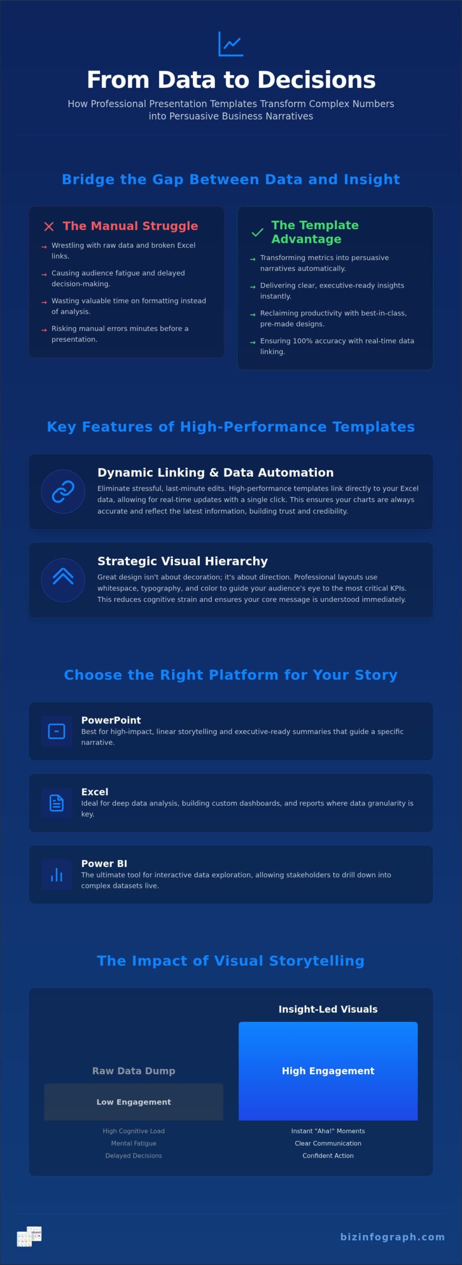
Imagine walking into a high-stakes boardroom with a 50-page spreadsheet. Your audience’s eyes would glaze over instantly. In 2026, the standard for professional communication has shifted. Stakeholders no longer accept static, flat reports that require a decoder ring to understand. Instead, they demand data driven presentation templates that act as dynamic frameworks for high-impact business storytelling. These tools don’t just hold information; they translate raw metrics into strategic meaning. By moving away from “data dumping” and toward insight-led visuals, you save your team’s time and increase your own professional ROI. You become the Expert Facilitator, a productivity partner who uses high-performance tools to make the complex look effortless and refined.
Why Visual Storytelling Trumps Raw Data
Why do executives remember a single chart more than a ten-minute speech? It’s because the human brain is naturally wired for pattern recognition rather than processing long strings of text. When you present raw data, you force your audience to do the heavy lifting of analysis. This creates unnecessary cognitive load, which often leads to mental fatigue and delayed decision-making. By using professional PowerPoint Infographic Templates, you clear the mental clutter. You provide a shortcut to the “aha!” moment that every presenter dreams of achieving. Data visualization is the bridge between analysis and action. It ensures your message isn’t just heard, but understood and acted upon with confidence.
Meeting the 2026 Standard for Corporate Presentations
The bar for professional excellence has never been higher. In a global marketplace, your slides are often your first and most lasting impression. Using disjointed, manual designs suggests a lack of precision and can undermine your authority. Best-in-class data driven presentation templates ensure that your visuals remain polished and consistent across every department. Modern templates must also be structured for the future of work. As AI tools like Microsoft Copilot become standard, having a clean, logical slide structure is essential for software to interpret and summarize your data correctly. Our Excel Dashboard Templates and Power BI Templates provide this robust foundation. They allow you to focus on high-level strategy while the design takes care of itself, ensuring you always shine in front of your audience.
Core Features of High-Performance Data Driven Templates
What separates a standard slide deck from a high-performance asset? Many professionals focus solely on aesthetics, but the true value of data driven presentation templates lies in their functional architecture. A premium template isn’t just a background; it’s a productivity engine designed to handle complex datasets while maintaining a polished, executive-ready look. Whether you’re building a five-slide summary or a fifty-slide annual report, these tools ensure your visuals remain crisp, your data stays accurate, and your branding is unmistakable. It’s about empowering you to control the narrative without getting bogged down in the pixel-perfect details.
Dynamic Linking and Data Automation
Have you ever had to update twenty different charts five minutes before a meeting? It’s a recipe for stress and manual errors. High-performance templates solve this by utilizing dynamic chart integration. By linking your Excel data directly to your visuals, you can achieve real-time updates with a single click. This automation is a cornerstone of our PowerPoint infographic templates, ensuring that the numbers on your screen always match your source files. This level of data integrity is vital during high-stakes presentations where one wrong decimal point can derail an entire strategy. It transforms your workflow from manual data entry to strategic oversight.
Visual Hierarchy and Infographic Design
Effective visualization isn’t about filling every inch of the slide. It’s about using visual hierarchy to lead your audience’s eye to the most critical KPI. Professional layouts use whitespace and sophisticated font choices to improve readability and reduce cognitive strain. When you use business presentation templates designed by experts, you aren’t just making things look “pretty.” You’re adopting a structured communication style that reinforces your professional brand voice. These layouts allow you to simplify multi-stage process flows into digestible visuals that any stakeholder can grasp instantly.
Consistency is the final piece of the puzzle. A scalable template allows you to adapt colors, fonts, and logos across diverse reporting tools without losing quality. This ensures that a global team can produce unified, high-quality reports that look like they came from the same desk. If you’re ready to stop wrestling with formatting and start focusing on results, exploring our collection of Excel Dashboard Templates is the perfect next step to streamline your reporting process.
Choosing Your Platform: PowerPoint, Excel, or Power BI?
Selecting the right platform is the first step toward presentation mastery. While many assume PowerPoint is the only option, the modern professional knows that the best data driven presentation templates are those that match the audience’s needs and the data’s complexity. PowerPoint is your best friend for high-level storytelling and executive summaries where the narrative is king. It’s designed to persuade and inspire. However, if you need to dive into the “how” and “why” behind the numbers, Excel or Power BI might be more appropriate. As your productivity partner, we want you to choose the tool that lets your insights shine most brightly.
When to Use Excel Dashboard Templates
Excel remains the backbone of corporate data for a reason. It’s accessible, familiar, and incredibly powerful for operational tracking. If you need to monitor daily workflows or use sales dashboard templates, Excel provides the flexibility to explore data interactively. It allows departmental managers to track KPIs without requiring specialized software or complex licenses. By leveraging interactive excel dashboard templates, you can create a centralized hub for your team to analyze performance trends in real-time. It’s a pragmatic choice for those who value rapid iteration and deep-dive analysis. You don’t need to be a data scientist to build something impressive; you just need the right framework.
The Power of Power BI for Executive Reporting
For organizations managing massive datasets, Power BI is the gold standard for real-time visualization. It moves beyond static slides to provide live, drill-down experiences that stakeholders can access even on mobile devices. Using professional Power BI dashboard templates allows you to handle thousands of rows of data without sacrificing performance or visual clarity. The real-time data refreshes mean your executive team is always looking at the most current information, which is critical for agile decision-making. Transitioning from traditional slides to these interactive environments positions you as a forward-thinking leader who values transparency and data-led precision.
Ultimately, your choice depends on the depth of the conversation. Are you presenting a summary to the board or a working session to your peers? By matching your data driven presentation templates to the specific reporting environment, you ensure your message hits the mark every time. This strategic alignment is what transforms a simple update into a catalyst for business growth.
How to Select the Best Template for Your Business Story
Which specific metric determines the success of your meeting? Before you browse through thousands of designs, you must identify the core KPI that your audience needs to remember. A common mistake is choosing a layout based on visual appeal rather than data functionality. If your goal is to show a simple year over year growth trend, a complex multi-stage infographic will only distract from your message. Conversely, a high-level executive summary requires data driven presentation templates that can distill massive datasets into a single, persuasive visual. You’re not just buying a slide; you’re selecting a communication strategy that defines how your stakeholders perceive your expertise.
Technical compatibility is another critical factor that many professionals overlook until the last minute. Does the template support your specific version of Microsoft 365? Does it handle the update frequency you require? If you’re producing a recurring monthly report, you need a robust framework that allows for seamless data refreshes without breaking the layout. Our templates are built to ensure that your software remains stable, preventing the frustrating crashes that often plague lower-quality alternatives found online. It’s about having the confidence that your tools will work perfectly when the pressure is on.
Mapping Visuals to Presentation Goals
Your choice of template should change based on the story you’re telling. Project managers often prioritize milestone tracking and clear timelines to keep teams aligned. In contrast, financial reporting layouts for quarterly business reviews must emphasize accuracy and comparative analysis. If you’re in a growth-focused role, look for sales and marketing templates that highlight conversion funnels and customer acquisition costs. Matching the visual structure to your specific business goal ensures that your audience stays engaged and focused on the right priorities. It turns a standard update into a strategic conversation.
Ensuring Long-Term Usability and ROI
A professional template is an investment in your personal brand. When your slides are clean, logical, and aesthetically superior, you command more authority in the room. This is why we prioritize clean code in our Excel and PowerPoint frameworks; it ensures your files remain lightweight and responsive. To stay ahead of the curve, always look for products that offer free lifetime updates. As Microsoft introduces new features, your tools should evolve alongside the software. This long-term usability guarantees that your data driven presentation templates remain best-in-class for years to come, providing a massive return on your initial investment.
Ready to elevate your next executive summary? Explore our professional PowerPoint Infographic Templates to find the perfect match for your business narrative.
The Biz Infographs Advantage: Efficiency Meets Excellence
Choosing the right partner makes all the difference in your professional journey. At Biz Infographs, we don’t just see ourselves as a template provider; we are your dedicated Productivity Partner. We understand that your time is your most valuable asset. That’s why our curated data driven presentation templates are engineered to remove the friction from your daily workflow. Whether you’re utilizing our PowerPoint Infographic Templates, Excel Dashboard Templates, or Power BI Templates, you’re accessing tools designed by specialists who value both aesthetics and technical precision. We help you bridge the gap between raw numbers and executive insight with ease.
One of the most significant advantages we offer is our commitment to longevity through our free lifetime updates policy. In a software environment that changes every few months, static files quickly become obsolete. Our updates ensure that your investment stays current with the latest Microsoft 365 features and global design trends. This creates a foundation of trust; you can focus on your data, knowing your visual tools will always perform at a high level. It’s a unique commitment to your long-term success that sets our offerings apart in the digital marketplace.
Professional Quality Without the Custom Design Price Tag
Hiring a custom design agency for every quarterly report or board meeting is simply not sustainable for most professionals. Agencies often charge premium rates for work that can take weeks to deliver. In contrast, our high-performance designs allow for instant deployment in fast-paced environments. You can download a best-in-class layout and have your data visualized in minutes rather than days. This shift allows you to adopt the Expert Facilitator mindset. You focus on the high-level strategy and persuasive narrative while we handle the complex design architecture. It’s a sophisticated solution that delivers professional results without the custom agency overhead.
Your Path to Impactful Presentations
Getting started is simpler than you might think. We recommend beginning with a clear assessment of your current reporting needs. If you’re focused on operational tracking or departmental KPIs, our Excel dashboard templates provide a perfect entry point for mastering data efficiency. From there, you can expand into our broader collection to find the specific assets that match your unique business story. Our marketplace is designed to be your one-stop shop for professional visualization tools.
The transition from manual struggle to professional pride happens the moment you see your first automated chart come to life. You deserve to walk into every meeting with the confidence that your visuals are as sharp as your analysis. We invite you to browse our full collection today and start your journey toward becoming a more impactful, data-led leader. It’s time to stop wrestling with slides and start letting your work shine in front of your audience.
Master the Future of Professional Visualization
Reclaiming your valuable time starts with moving away from manual slide design and embracing the power of modern automation. You’ve discovered how data driven presentation templates act as a catalyst for strategic storytelling, allowing you to bridge the gap between complex raw metrics and executive-level action. Whether you’re leveraging Excel for deep operational tracking or Power BI for real-time stakeholder reporting, the key is choosing a functional framework that supports your professional growth. By focusing on visual hierarchy and dynamic data linking, you ensure your message is never lost in the noise.
It’s time to transform your reporting struggle into a lasting source of professional pride. With our best-in-class Excel Dashboard Templates, PowerPoint Infographic Templates, and Power BI tools, you can deliver high-impact results every single time. Our commitment to free lifetime updates means your assets remain high-performance as software standards evolve. Empower your next presentation with Biz Infographs templates and show your stakeholders what true data-led leadership looks like. You already have the insights; now it’s time to make them shine with total confidence.
Frequently Asked Questions
What are data driven presentation templates?
Data driven presentation templates are dynamic frameworks designed to connect your visual charts directly to live source data. They go beyond static images by allowing you to update your metrics instantly from Excel or Power BI. Using these templates helps you bridge the gap between complex raw numbers and persuasive business narratives. It’s a high-performance solution that ensures your data remains accurate while you focus on delivering executive-level insights with total confidence.
How do I link Excel data to my PowerPoint presentation template?
Linking your data is a straightforward process that eliminates manual entry errors. Simply copy your chart or data range in Excel and use the ‘Paste Special’ feature in PowerPoint to select ‘Paste Link.’ This creates a dynamic connection where changes in your spreadsheet reflect instantly on your slides. It’s a vital feature for high-stakes meetings where you need the most current figures available without wrestling with broken formatting or alignment issues.
Can I customize the colors and fonts in these templates to match my brand?
Yes, you have complete control over the aesthetic of your slides. Our data driven presentation templates allow you to adjust theme colors, fonts, and logos directly within the master slide settings. This flexibility ensures that every report you produce aligns perfectly with your corporate branding guidelines. It’s a professional way to maintain a consistent ‘best-in-class’ appearance across global teams while saving hours of manual design work.
What is the difference between a dashboard and a presentation slide?
A dashboard is primarily used for operational tracking and interactive data exploration, often updated daily or weekly. In contrast, a presentation slide is a curated snapshot designed for high-level storytelling and executive summaries. While dashboards allow for deep-dive analysis, slides focus on persuasion and driving specific business decisions. Using both tools together ensures you have the right reporting depth for every audience, from departmental managers to the board.
Do your templates work with the latest versions of Microsoft Office and Power BI?
Our products are fully optimized for the latest versions of Microsoft 365, including Excel, PowerPoint, and Power BI. We build our frameworks using clean code to ensure stability and prevent crashes during high-pressure presentations. Whether you’re working on a desktop or a mobile device, these templates maintain their professional polish and functional integrity. You don’t have to worry about technical compatibility issues when you’re using our high-performance assets.
Are there free updates available if the software version changes?
Yes, we provide free lifetime updates for all our digital products. We understand that software standards and design trends evolve quickly, so we ensure your investment remains current. If Microsoft releases a significant update that affects how data driven presentation templates function, you’ll receive the latest version at no extra cost. This policy builds long-term trust and ensures you always have access to the best-in-class visualization tools.
Is it easy for a non-designer to use these templates?
Absolutely. These tools are designed specifically as a ‘Productivity Partner’ for professionals who aren’t graphic designers. We handle the complex design architecture and visual hierarchy so you don’t have to. You simply input your data, and the template transforms it into a polished, professional-grade infographic. It’s an empowering way to look like a design expert while spending your time on high-level strategy and data analysis instead.
Which is better for a board meeting: PowerPoint or Power BI?
PowerPoint is generally better for formal board meetings because it allows you to control the narrative flow and keep the focus on strategic takeaways. Power BI is superior for working sessions or technical reviews where stakeholders need to drill down into live, massive datasets. For the best impact, many leaders use a PowerPoint executive summary that links to a Power BI dashboard for deeper, interactive Q&A sessions.