
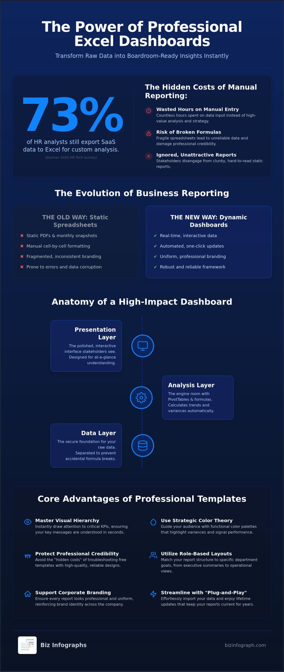
Did you know that 73% of HR analysts still export their SaaS data back to Excel for custom analysis, according to Gartner’s 2025 HR Tech survey? Despite the rapid growth of specialized software, the world’s most critical business decisions are still powered by the flexibility of a spreadsheet. You’ve likely felt the pressure of this reality, spending hours on manual data entry only to end up with clunky, unattractive reports that your stakeholders simply ignore.
It’s exhausting to deal with broken formulas when you just want to shine in front of your team. This guide is your path to relief. You’ll discover how to transform complex data into boardroom-ready insights with professional excel dashboard templates that save hours of manual work. We will show you how to leverage the latest 2026 innovations, including AI-driven Copilot analysis and automated workflows that update with a single click. From plug-and-play solutions to high-impact visuals, you’re about to learn how to master the art of data storytelling and reclaim your status as a productivity partner.
Key Takeaways
- Stop wasting time on static spreadsheets and embrace dynamic reporting frameworks. Learn how professional excel dashboard templates turn raw data into interactive tools that engage your stakeholders.
- Master the art of visual hierarchy to ensure your most critical KPIs stand out instantly. Use strategic color theory to highlight variances and guide your audience toward the right decisions.
- Understand the real ROI of your tools by evaluating the “hidden cost” of troubleshooting free templates. High-quality designs protect your professional credibility and save hours of manual formatting.
- Match your reporting structure to specific departmental goals using role-based layouts. Whether you are presenting to executives or operational teams, the right framework ensures your message hits the mark.
- Streamline your workflow with “plug-and-play” solutions that support your corporate branding. Discover how to import data effortlessly and enjoy lifetime updates that keep your reports current for years to come.
What are Excel Dashboard Templates and Why Do They Matter?
Ever felt the frustration of staring at a blank spreadsheet while a critical deadline looms? An Excel dashboard template is your secret weapon. It’s a pre-configured reporting framework that eliminates the need to build complex systems from scratch. Instead of wrestling with cell borders and manual formatting, you step into a sophisticated structure designed for maximum impact. Understanding What is a dashboard? clarifies its role as a real-time progress tracker. By using high-quality excel dashboard templates, you shift your focus from the tedious chore of data collection to the high-value work of data analysis in seconds.
The Evolution of Modern Business Reporting
Static PDFs are quickly becoming relics of the past. By 2026, reporting standards have shifted to demand real-time interactivity over monthly snapshots. We’ve moved away from manual cell-formatting toward automated data visualization that responds instantly to user inputs. This transition has made visual literacy a mandatory skill for modern managers. If you can’t translate rows of numbers into a clear, visual narrative, you’ll struggle to stay competitive. Professionals are now expected to provide insights that are not just accurate, but also engaging and easy to digest at a glance.
Key Components of an Interactive Template
A professional-grade template isn’t just a collection of charts. It’s a robust system built on a logical three-tier architecture that ensures both stability and speed. This structure protects your work and makes updates seamless.
- The Data Layer: This is the foundation where your raw information lives securely. It’s kept separate from the visuals to prevent accidental deletions or formula breaks.
- The Analysis Layer: Think of this as the engine room. It utilizes PivotTables and advanced formulas to do the heavy lifting, calculating variances and trends without you lifting a finger.
- The Presentation Layer: This is the “face” of your dashboard. It’s the polished, interactive interface that your stakeholders see, designed to highlight the most important KPIs first.
Consistency is also a major factor in corporate success. When every department uses different colors, fonts, and layouts, your brand identity feels fragmented. Premium excel dashboard templates ensure that every report looks like it was produced by a global leader. This uniformity reinforces your professional credibility and ensures that stakeholders focus on the data rather than the design inconsistencies. It’s about moving from a “DIY” feel to a “best-in-class” standard that commands attention in the boardroom. You’re not just presenting numbers; you’re providing a standardized framework for high-stakes business decision-making.
The Anatomy of a High-Impact Dashboard Template
Why do some reports command immediate attention while others are relegated to the “unread” folder? The difference lies in the anatomy of the design. A high-impact dashboard isn’t just a collection of numbers; it’s a carefully structured visual story. To achieve this, you must master the visual hierarchy. This principle dictates that the most critical information, usually your primary KPIs, should occupy the top-left corner where the human eye naturally begins its scan. By following fundamental principles for effective data visualization, you ensure that your audience grasps the “so what” of your data within seconds of opening the file.
Color theory plays a vital role in this narrative. In professional excel dashboard templates, color is never used for mere decoration. Instead, it acts as a functional signal. Use high-contrast palettes to highlight critical KPI variances. For instance, a subtle shift from green to amber or red immediately alerts a stakeholder to a potential issue without them needing to read a single digit. This “glanceable” design is what separates a professional tool from a cluttered DIY project. If you’re ready to move beyond basic spreadsheets, you can find premium visualization tools that handle these design complexities for you.
Dynamic Interactivity with Slicers and Filters
Static reports are a thing of the past. Modern stakeholders want to explore data on their own terms. By incorporating Slicers and Timelines into your excel dashboard templates, you give your audience the power to drill down into specific regions, departments, or timeframes. There’s a significant psychological benefit to this approach. When users can interact with the data themselves, they feel a greater sense of ownership and confidence in the insights presented. Place your navigation elements consistently on the left or top of the screen to create an intuitive user experience that feels like a modern web application rather than a spreadsheet.
Data Visualization Best Practices
Default Excel settings are often the enemy of clarity. They suffer from “chart junk”, which includes unnecessary gridlines, borders, and labels that distract from the core message. Professional templates strip away this noise in favor of minimalist design that leads to faster decision-making. Choosing the right chart type is equally essential. Use a waterfall chart to show the cumulative effect of positive and negative values, or a gauge chart for a quick pulse check on a single metric. Integrating specialized Excel Charts into your workflow ensures maximum clarity. Remember, the goal isn’t to show every piece of data you have. It’s to show exactly what matters for confident, high-stakes action.
Professional vs. Free Templates: Evaluating the Real ROI
Is a “free” template actually free? It’s a question many professionals overlook until they’re deep into a spreadsheet at 10 PM on a Sunday. While the initial price tag of zero is tempting, the “Hidden Cost of Free” often manifests as hours spent fixing broken formulas or untangling messy data structures. Many users encounter significant challenges of Excel for complex data visualization when trying to force a basic sheet to perform like a high-end tool. You’re a leader, not a troubleshooter. Choosing premium excel dashboard templates ensures you spend your time interpreting insights rather than fighting with cell references.
The difference in design quality is immediately apparent. Free templates often suffer from “DIY clutter,” featuring clashing colors and confusing layouts that fail to inspire confidence. In contrast, Biz Infographs focuses on premium aesthetics that mirror the high-end nature of professional digital products. Beyond looks, there’s a critical security element to consider. Downloading unverified, macro-enabled files from the internet carries significant risks. Professional templates provide a clean, secure environment that protects your corporate data while delivering a polished, global-leader feel to your reporting.
The “Build vs. Buy” Decision for Professionals
Think about your hourly rate. If it takes you five hours to build a functional dashboard from scratch, you’ve already spent hundreds of dollars in lost productivity. A premium template is a fraction of that cost and offers a “plug-and-play” experience. These tools reduce the risk of embarrassing reporting errors in the boardroom by providing a tested, robust framework. There’s also a undeniable psychological boost when you present a report that rivals a Power BI dashboard template in terms of visual impact and clarity. It changes how your peers perceive your technical authority.
Long-Term Value and Updates
Static free templates quickly become obsolete as new versions of software emerge. In 2026, features like AI-powered Copilot integration and new dynamic array functions can break older, unsupported sheets. This is where “Free Lifetime Updates” become a unique value proposition. When you invest in a professional library, your tools evolve alongside the software. This allows you to standardize reporting across entire teams, ensuring everyone uses a unified, best-in-class standard for their recurring annual reports. It’s about building a sustainable workflow that supports your growth as a productivity partner for years to come.
Choosing the Right Template for Your Business Function
How do you ensure your data actually drives action? Success in data visualization isn’t about finding the most complex chart. It’s about matching your reporting framework to your specific departmental goals. A finance director looking for cash flow variances requires a completely different layout than a marketing manager tracking campaign ROI. To shine as a productivity partner, you must adopt role-based reporting. This means providing high-level, “at-a-glance” insights for executives while offering granular, drill-down capabilities for operational teams. For leaders who need to present with absolute clarity in the boardroom, exploring strategic executive dashboard template examples can help you identify the right layout to empower your entire leadership team. When you use the right excel dashboard templates, you ensure every stakeholder gets exactly the information they need to make confident decisions.
Sales and Marketing Dashboards
In the fast-paced world of sales, timing is everything. You need to track conversion rates, pipeline velocity, and ROI per channel in real-time to pivot your strategy effectively. Professional templates allow you to visualize geographic performance using interactive map charts, giving you a global perspective on your market share. By comparing actual performance against monthly and quarterly targets, you can identify which regions are over-performing and which need more support. For a deeper look at how to structure these insights effectively, explore our sales dashboard template excel strategies and 2026 data visualization guide to transform your raw numbers into automated, actionable reporting. This level of clarity transforms a standard sales meeting into a strategic powerhouse session where the next steps are obvious to everyone involved.
Operations and Project Management
Operational excellence relies on transparency and the ability to spot bottlenecks before they derail a project. Using Gantt charts and milestone trackers within your dashboard provides a clear roadmap for every team member. You can monitor resource allocation with precision, ensuring no single person is overwhelmed while others are underutilized. Integrating a specialized operations dashboard template into your daily workflow helps maintain this balance. It’s about moving away from reactive firefighting and toward proactive management that stakeholders respect.
Sometimes, the insights you’ve gathered in Excel need to be shared in a high-stakes presentation. This is where you can bridge the gap between deep-dive analysis and executive storytelling. You can easily transition your findings into PowerPoint infographic templates to create a cohesive brand experience. This ensures that whether your audience is looking at a live spreadsheet or a slide deck, they see a consistent, best-in-class standard. Ready to transform your departmental reporting? Elevate your professional credibility today by selecting from our premium collection of excel dashboard templates.
Maximizing Your Dashboard Efficiency with Biz Infographs
How do you turn a high-quality tool into a recurring time-saver? Owning premium excel dashboard templates is the first step, but true efficiency comes from mastering the workflow. By adopting a systematic approach to data management, you move beyond simple reporting and become a strategic asset to your organization. This is where you transition from a data processor to a productivity partner who provides clarity in high-pressure environments. It’s about working smarter, not harder, to ensure your insights are always ready when the boardroom calls.
Seamless Data Integration
Before you import your information, prioritize data hygiene. Use the “Find Duplicates” tool to remove errors and “Lock Rows” to prevent accidental shifts in your source files. Once your data is clean, map your raw columns directly to the template’s input sheet. This one-time setup ensures that every future update is a simple “copy and paste” operation. Always verify your formula integrity after the first data refresh to ensure your charts reflect the new reality accurately. These small steps allow the automation features within Biz Infographs tools to do the heavy lifting, reducing your recurring monthly workload significantly.
You can also customize every aspect of the visual experience to match your corporate identity. Updating the color palette and inserting your firm’s logo takes only seconds but adds a layer of professional polish that stakeholders notice. This level of personalization ensures that your reports aren’t just accurate; they’re fully aligned with your brand’s sophisticated standards. It transforms a standard workbook into a source of personal pride.
From Spreadsheet to Boardroom Presentation
Impactful data visualization doesn’t end in the spreadsheet. When it’s time to present, you can easily export dashboard snapshots into high-impact presentation decks. This allows you to maintain a consistent visual language across all platforms. During live meetings, use Excel’s native features to maintain interactivity. Slicers and filters allow you to answer stakeholder questions on the fly, proving your authority as an expert facilitator who truly understands the nuances of the data.
You have the power to transform how your organization views data. By using these professional frameworks, you aren’t just saving hours of manual formatting; you’re building a reputation for excellence. Explore the full collection of professional Excel dashboard templates at Biz Infographs and start your journey toward effortless, high-performance reporting today. Your path to becoming the go-to data expert in your office starts with the right tools.
Step into Your Role as a Strategic Leader
You’ve discovered how the right framework transforms a chaotic spreadsheet into a high-performance decision engine. By mastering visual hierarchy and selecting role-based layouts, you move beyond basic data entry into the role of a strategic facilitator. Professional excel dashboard templates aren’t just about aesthetics; they’re about reclaiming your valuable time and ensuring your message resonates with stakeholders. You now have the roadmap to eliminate manual formatting and focus on the high-level analysis that drives business growth.
Don’t let clunky designs or broken formulas hold you back from shining in front of your audience. Join over 10,000 business professionals worldwide who trust Biz Infographs to deliver best-in-class visualization tools. Every purchase comes with 100% secure instant downloads and free lifetime updates, ensuring your reports remain cutting-edge as software continues to evolve. It’s time to trade frustration for professional pride.
Upgrade Your Reporting with Professional Excel Dashboard Templates and experience the confidence of presenting boardroom-ready insights every single time. You’ve always had the expertise to lead. Now you finally have the professional tools to match your ambition.
Frequently Asked Questions
How do I create a professional dashboard in Excel without design skills?
You can create a professional report by using a pre-configured template that handles the layout, color scheme, and visual hierarchy for you. These tools are designed for minimal effort, allowing you to focus on your data while the template manages the aesthetics. By simply inputting your raw figures, you generate boardroom-ready reports that look like they were crafted by a specialist. It’s the fastest way to shine without needing a background in graphic design.
Will these Excel dashboard templates work on both Mac and Windows?
Yes, our templates are fully compatible with both Mac and Windows operating systems. As long as you have a supported version of Microsoft Excel installed, you can enjoy seamless performance across all your devices. This cross-platform flexibility ensures that teams can collaborate effectively regardless of their hardware preferences. You won’t have to worry about layout shifts or broken features when sharing files with colleagues, maintaining a consistent, best-in-class standard.
Do I need to be an Excel expert to use these templates?
No, you only need basic knowledge of how to enter data into a spreadsheet to use these tools effectively. We’ve designed our excel dashboard templates to be “plug-and-play,” meaning the complex formulas and PivotTables are already set up behind the scenes. You simply follow a straightforward input process, and the dashboard updates automatically. This approach empowers professionals at all skill levels to produce high-impact visualizations that would normally require advanced technical training.
Can I customize the colors and fonts to match my company branding?
Absolutely, every template is fully customizable to align with your specific corporate identity. You can easily change the color palette, font styles, and insert your company logo using Excel’s standard formatting tools. This flexibility ensures your reporting remains consistent with your brand’s global standards. It allows you to transform a standard reporting framework into a personalized piece of professional work that reinforces your credibility as an expert facilitator within your organization.
What is the difference between an Excel dashboard and a Power BI report?
Excel dashboards are ideal for flexible, localized data analysis and quick reporting within a familiar spreadsheet environment. Power BI reports are better suited for massive datasets and advanced cloud-based collaboration across large enterprises. While Power BI offers deeper “drill-through” capabilities, excel dashboard templates provide a more accessible and immediate solution for most daily business functions. They don’t require additional software subscriptions or specialized IT setup, making them a highly efficient choice for many professionals.
Are these templates one-time purchases or do they require a subscription?
All our templates are available as one-time purchases with no recurring subscription fees. This model provides exceptional long-term value, especially since we include free lifetime updates on all dashboard products. You pay once and gain a permanent asset that you can use for your recurring annual or monthly reports. This transparent approach eliminates the hidden costs associated with many SaaS tools, allowing you to build a comprehensive template library without ongoing financial commitments.
How do I update the data in a pre-made dashboard template?
Updating your data is as simple as copying your new figures into the designated input sheet and clicking “Refresh.” The template’s internal logic will automatically recalculate all formulas and update every chart and KPI indicator instantly. This automated workflow eliminates the need for manual cell formatting or chart adjustments every month. It’s a high-performance system that significantly reduces the time you spend on routine reporting tasks, letting you focus on high-level strategy instead.
What versions of Microsoft Excel are compatible with these templates?
Our templates are compatible with Microsoft Excel 2016 and all later versions, including the current Microsoft 365 subscription. They are optimized to leverage modern features like dynamic arrays and the latest visualization engines. Whether you’re using a desktop version or the cloud-based Office 365 environment, you’ll experience robust performance. Keeping your software updated ensures you can take full advantage of the AI-powered Copilot features and other innovations that continue to enhance the spreadsheet experience in 2026.
2 replies on “Excel Dashboard Templates: The Professional Guide to Data Visualization in 2026”
[…] report looks exactly as intended. If you want to jumpstart your reporting, choosing high-quality excel dashboard templates allows you to deliver best-in-class results without the manual […]
[…] pipeline and conversion efficiency to ensure the company hits its targets. Using professional excel dashboard templates remains the gold standard for financial accuracy because they combine the flexibility of a […]