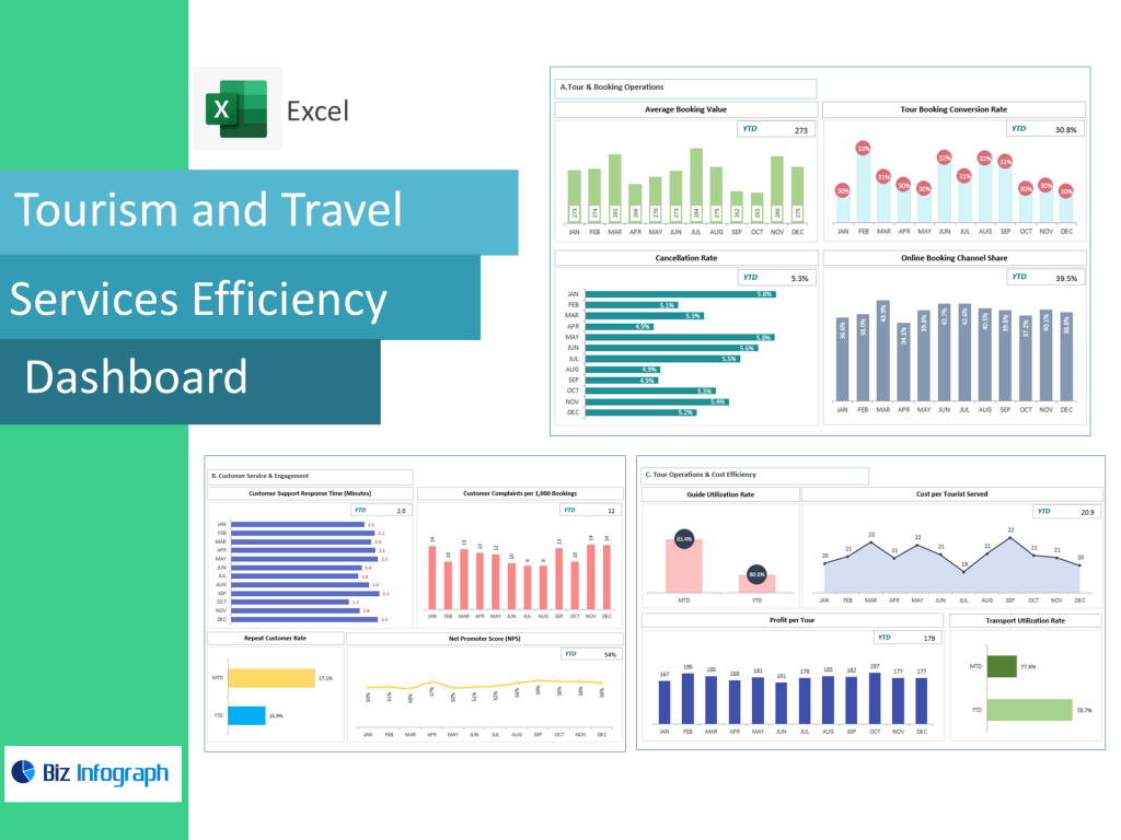
Understanding the Tourism and Travel Services Efficiency Dashboard
How a Tourism Dashboard Helps Travel Businesses Improve Operations
A Tourism and Travel Services Efficiency Dashboard acts as a centralized command center where travel businesses can consolidate travel data from multiple sources—booking systems, CRM platforms, hotels, destination partners, and marketing channels. Travel operators and tourism companies rely on dashboards to visualize performance, monitor booking trends, identify cancellation spikes, and track guest satisfaction scores. Because the tourism industry is dynamic and affected by seasonality, global events, and shifting customer preferences, a dashboard helps travel businesses stay agile by offering real-time insights into operational changes. The dashboard simplifies analytics by automating calculations that would otherwise require manual spreadsheets or complicated BI reports.
With the dashboard’s ability to compile travel data into actionable insights, managers gain clarity on occupancy levels, tour type performance, top destinations, conversion rates, and customer satisfaction levels. Through a tourism dashboard, travel companies can optimize operations, improve profitability, and allocate resources effectively to meet fluctuating demand. The system helps travel businesses make informed decisions faster—adjusting hotel capacity, improving service quality, refining tour schedules, and forecasting demand for future seasons. Essentially, the dashboard helps transform raw data into an operational advantage, ensuring consistent performance in the highly competitive tourism sector.
Key Metrics and Data-Driven Insights Used in Tourism Dashboards
A tourism dashboard relies heavily on key travel metrics and KPIs that reflect service quality, guest experience, and operational efficiency. Metrics like booking lead time, tour type profitability, cancellation rate, occupancy rate, top destinations booked, average spend per traveler, and satisfaction scores give tourism operators a full operational overview. Travel operations also track conversion rates from marketing efforts to measure how well destination promotions perform for specific travel seasons. These KPIs are essential because they highlight whether marketing campaigns succeed, whether travelers prefer certain dates or destinations, and whether pricing strategies align with demand.
Data-driven insights allow travel businesses to understand guest behavior, segment customers by preferences, and tailor travel packages accordingly. Combining KPIs with business intelligence tools creates predictive insight—forecasting demand, anticipating peak seasons, and identifying emerging travel patterns. With BI dashboards pulling data from multiple sources, managers can spot trends earlier and avoid disruptions. Because KPIs update automatically, businesses no longer rely on delayed reporting cycles. Instead, real-time data empowers travel operators to optimize operations, improve service offerings, and continuously enhance customer satisfaction. For destination marketing organizations and hospitality business teams, these metrics guide strategic planning with precision.
Enhancing Guest Experience Through Tourism and Hospitality Dashboards
In tourism and hospitality, guest experience defines reputation, loyalty, and repeat bookings. A dashboard helps hospitality business teams improve guest experience by tracking satisfaction data, service quality ratings, and customer satisfaction insights alongside operational indicators. With metrics like satisfaction scores, check-in efficiency, cancellation rate reasons, review sentiment, and customer complaint patterns, hotel managers and travel operators can quickly detect service gaps. These data-driven insights allow travel companies to resolve issues before they escalate, personalize guest interactions, and improve the end-to-end travel experience.
Visualizing guest experience data reveals patterns such as dissatisfaction with specific hotels, issues with tour guides, transportation delays, or high dissatisfaction during certain travel periods. Dashboards also support proactive engagement by issuing alerts when satisfaction scores drop or when cancellations rise. This early warning system helps travel businesses adjust resources, improve communication, or refine service workflows. By aligning operational efficiency with personalized service design, tourism dashboards directly contribute to enhancing guest satisfaction and achieving higher customer retention. In an industry where experience drives profitability, dashboards offer a continuous improvement mechanism.
Core Features and Structure of a Tourism Dashboard
Essential Components of an Efficient Travel Operations Dashboard
An efficient tourism dashboard includes several core components that help operators manage travel operations seamlessly. The dashboard tracks booking activity, cancellation alerts, guest satisfaction scores, occupancy levels, travel package performance, and daily revenue metrics. Consolidating all this in one dashboard provides travel operators and hospitality managers with a comprehensive view of operations and profitability—making it easier to respond quickly to dynamic market conditions.
A command center-style dashboard might show key performance indicators, top destinations, live booking numbers, conversion rates, and alerts for declining satisfaction scores. It also visualizes performance by tour type, marketing channel, and travel season, helping teams forecast demand accurately. Additional features include automated calculations for revenue performance, comparison of popular destinations, and daily updates without manual effort. This creates a dashboard built for tourism optimization—combining BI, automation, and easy visualization to support fast operational decisions. Ultimately, an efficient travel operations dashboard increases transparency, performance consistency, and overall service quality.
Tourism Dashboard Template and Tourism Dashboard in Excel Options
Travel operators can choose between dashboard templates, tourism dashboard in Excel, or Power BI dashboards depending on budget and data complexity. A tourism dashboard in Excel allows small travel companies to use an Excel file and data sheet to manage bookings, KPIs, and satisfaction scores without investing in complex BI solutions. Excel templates include pre-built formulas, charts, conditional formatting, and automated calculations that update as new data is added. This makes Excel templates ideal for beginners who need ready-to-use dashboards without advanced technical skills.
For more advanced needs, tourism operators benefit from dashboard templates that plug into Power BI or cloud-based analytics platforms. These systems integrate multiple data sources—CRM, booking engines, payment tools, hotel management systems—and convert them into real-time insights. Power BI dashboards update automatically and support complex BI layers, allowing travel companies to scale their analytics capabilities. Whether in Excel or BI, a dashboard template streamlines implementation, reduces configuration time, and helps travel teams visualize performance immediately. Templates also ensure KPI consistency across departments, improving collaboration across travel operations, marketing, and guest services.
How a Dashboard Helps Travel Operations Make Data-Driven Decisions
A tourism dashboard enables travel operations to make data-driven decisions by organizing key metrics and delivering insights instantly. With booking trends, traveler demographics, and cancellation rates visible in one place, operators can adjust pricing, update itineraries, or optimize operations in real time. Travel businesses use dashboards to monitor demand for different tour types, identify popular destinations, and assess marketing performance. This helps travel companies make informed decisions to boost revenue and reduce operational inefficiencies.
Dashboards also include alerts notifying managers when KPIs exceed or fall below threshold levels—for example, when cancellation rates spike or booking demand drops unexpectedly. This allows travel operations to act immediately, adjusting marketing efforts, improving guest communication, or revising tour offerings. Data-driven decision-making is crucial in tourism, where demand shifts quickly and competitive advantage depends on operational agility. The dashboard consolidates all relevant data into one dashboard, removing guesswork and creating a uniform analytics view for the entire travel operations team.
Driving Operational Efficiency in Travel and Hospitality
Using Metrics and Dashboards to Improve Hospitality and Guest Experience
Metrics and dashboards help hospitality businesses improve guest experience by tracking performance indicators that influence traveler satisfaction. KPIs such as booking response time, complaint resolution time, service quality scores, and satisfaction scores help identify operational bottlenecks that impact guest perceptions. Travel companies use dashboards to identify underperforming hotels, tours with low ratings, or destinations receiving repeated complaints.
Hospitality dashboards also track F&B productivity, table turnover, staff workload distribution, and communication efficiency across touchpoints. Data-driven visibility helps hospitality teams optimize resources, reallocate staff, and improve operational workflows. When operations run smoothly, guest perception improves. By integrating data from PMS, booking apps, surveys, and CRM, the dashboard provides a full picture of the guest journey. This insight helps travel operators and hospitality teams tailor services, personalize guest interactions, and increase overall satisfaction scores.
How Travel Businesses Benefit From Key Metrics Tracking
Tracking key travel metrics gives travel companies clarity on what drives profitability, guest satisfaction, and operational efficiency. Metrics like booking volume, cancellation trends, booking lead time, tour type profitability, and destination performance provide a deep understanding of revenue drivers. Travel operators can determine which packages are most profitable, which marketing channels generate the best conversion rates, and which destinations are trending in different seasons.
Tracking metrics through dashboards also helps identify operational inefficiencies. For example, if a tour repeatedly sees high cancellation rates, the dashboard highlights this issue and helps operators investigate possible causes—pricing, scheduling, poor itinerary fit, or supplier issues. Performance visibility helps travel operations optimize resources, adjust strategies, and refine services to improve guest satisfaction and profitability. Dashboards also eliminate the need for manual reporting by automating KPI updates, saving valuable time for travel businesses.
Why Data-Driven Decision-Making Strengthens Tourism Service Efficiency
Data-driven decision-making strengthens tourism service efficiency by aligning operational actions with real-time performance insights. With dashboards powered by business intelligence tools, travel companies gain insights into traveler behavior, destination demand patterns, and service quality gaps. This clarity helps operators forecast demand, plan staffing, negotiate supplier contracts, and adjust pricing strategies based on real market conditions.
BI dashboards pull data from multiple sources—PMS, booking apps, CRM tools, marketing systems—and transform it into actionable insights. This allows travel businesses to respond quickly to fluctuations rather than relying on outdated reports. The dashboard helps streamline operations, optimize resources, and boost revenue through better forecasting. Efficient service delivery results in improved guest experience, higher satisfaction scores, and stronger customer loyalty.
For ready-to-use Dashboard Templates: