Introduction to Sales Dashboard in Excel Template
What Is a Sales Dashboard in Excel and Why Use It?
A sales dashboard in Microsoft Excel is a visual reporting tool that consolidates key sales metrics, helping sales teams analyze performance quickly and effectively. This type of dashboard is built using Excel tables, formulas, and dynamic charts to transform raw sales data into actionable insights. The dashboard displays essential sales KPIs such as sales volume, revenue trends, and sales cycle length. Designed to help sales managers make informed decisions, the dashboard is typically created as an Excel workbook with dedicated dashboard sheets. Businesses use Excel because it is a powerful yet accessible tool for small and large organizations alike. Excel tools like pivot tables and slicers support interactive sales dashboards, enabling users to drill down into specific data points. Whether it’s a simple Excel spreadsheet or a premium dashboard template, this setup is ideal for boosting sales visibility.
Benefits of Using an Excel Dashboard Template for Sales Analysis
Using a pre-designed Excel dashboard template for sales analysis saves time and ensures consistency in reporting. These templates, often free or part of premium packages, come with built-in dynamic charts, calculated fields, and ready-made layouts to help you optimize your sales tracking. A dashboard Excel template can be customized to track various metrics, including sales growth, customer acquisition, and regional sales performance. With Excel formulas and charts, users can transform raw data into a visual dashboard that highlights trends and outliers. Additionally, sales teams benefit from automated data updates and drop-down filters, making the dashboard interactive and user-friendly. Templates support a wide range of applications, from basic tracking to complex project management dashboards. By using Excel, organizations can analyze sales activities, monitor sales figures, and maintain consistency across departments.
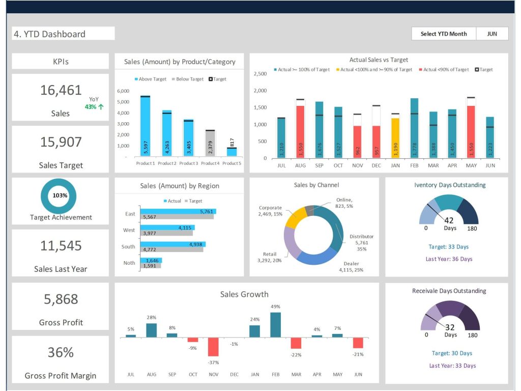
Key Elements of a Sales Dashboard
Essential Sales Metrics and KPIs to Track
An effective sales dashboard in Excel presents a comprehensive view of key sales metrics and KPIs. These can include monthly revenue, sales pipeline, conversion rates, lead sources, and the average sales cycle length. Creating Excel dashboards to track these metrics allows teams to identify bottlenecks and successes throughout the sales funnel. Sales insights are visualized using line charts, bar graphs, and dynamic tables within the Excel dashboard template. By focusing on metrics like sales volume and revenue per representative, businesses can better understand overall sales performance. These dashboards use Excel tools such as conditional formatting and pivot tables to highlight trends. Including clear and actionable KPIs in your dashboard helps sales managers assess performance in real time.
Designing a KPI Dashboard That Supports Sales Teams
Designing dashboards that support sales teams requires a thoughtful layout and data visualization strategy. A well-organized KPI dashboard in Excel includes visually appealing elements like dynamic charts, conditional formatting, and color-coded indicators. The goal is to create a dashboard to show performance gaps, forecast trends, and boost sales strategy alignment. Sales dashboard templates in Excel often separate KPIs by product, region, or sales representative, enabling deeper analysis. Creating an Excel dashboard from scratch or modifying a dashboard Excel template allows sales managers to tailor reports to their specific needs. Dashboard creation also involves using Excel formulas to calculate variances, growth percentages, and other important figures. This approach ensures your dashboard is more than just a static report—it’s a fully interactive decision-making tool.
How an Interactive Sales Dashboard Enhances Sales Performance
Interactive sales dashboards using Microsoft Excel enhance performance by providing real-time feedback on sales activities and results. Features such as drop-down filters, slicers, and interactive graphs allow users to drill into specific data points, improving the dashboard’s usability. An interactive sales dashboard in Microsoft Excel helps sales teams explore trends, track goal achievement, and compare actual performance against targets. Creating a dashboard in Excel using raw sales data allows for flexibility and customization. These dashboards enable sales teams to visualize your sales data and adjust strategies as needed. As a project management dashboard template, it can also track milestones, marketing and sales alignment, and campaign ROI. Using sales dashboards effectively means your sales team can respond quickly to changes in customer behavior or market conditions.
Creating a Sales Dashboard in Excel
Step-by-Step Guide to Create a Sales Dashboard in Excel
To create a sales dashboard in Excel, start with an Excel workbook and import your raw sales data into an Excel table. Use Excel formulas to calculate sales metrics such as revenue, unit sales, and conversion rates. Next, insert dynamic charts and graphs to visualize sales trends over time. Use pivot tables and slicers to allow for interactive filtering by region, time period, or product category. Place all key visual elements on a dedicated dashboard sheet for clarity. Creating an Excel dashboard from scratch may take time, but it offers flexibility and precise control over layout and features. For beginners, using a sales dashboard Excel template can simplify the process. This dashboard is an Excel solution that makes tracking and analysis streamlined and professional.
Tips for Using Excel Templates and Dashboard Layouts
When using an Excel dashboard template, focus on clarity, consistency, and user interactivity. A clean layout improves readability and makes the dashboard more useful for day-to-day operations. Ensure key sales KPIs are positioned at the top for quick reference. Use Excel tools like data validation, named ranges, and conditional formatting to enhance the user experience. Dashboard templates should be dynamic and flexible, allowing for updates without extensive rework. Excel spreadsheet designs should include sections for sales activities, forecasts, and actual results. Regularly updating your dashboard with new data ensures you maintain real-time accuracy. Creating Excel dashboards becomes easier with pre-built elements, especially if you need to visualize sales metrics across multiple teams or campaigns.
Common Mistakes to Avoid When Creating Excel Dashboards
Common mistakes in creating Excel dashboards include overloading the layout with too many charts, neglecting to label axes, and using inconsistent color schemes. Another error is failing to define the purpose of the dashboard—without a clear focus, dashboards can become cluttered and less effective. Always ensure your dashboard sheet contains only the most relevant KPIs and avoids duplicating information. Avoid using too many formulas on the same worksheet as it can slow performance. When building an interactive sales dashboard, test each feature thoroughly to ensure accurate outputs. Use Excel’s built-in protection features to prevent accidental changes to key cells or ranges. Finally, avoid hardcoding values into dashboards; always link them to dynamic tables or inputs to make your dashboard more resilient and scalable.
Optimizing and Maintaining Your Sales Dashboard
Best Practices for Updating Your Dashboard with Real-Time Sales Data
To maintain real-time accuracy, link your Excel dashboard to a reliable data source. This could be a connected Excel table, an external database, or Power Query for automated refreshes. Real-time sales insights help sales managers act quickly and make informed decisions. When updating your dashboard, always use consistent formats for dates, currency, and product codes to avoid confusion. Schedule regular updates to your data set—whether daily, weekly, or monthly—and test all dynamic elements after each update. Dashboard creation processes should include version control and change logs to track updates over time. For large datasets, consider separating data and visualization sheets to optimize performance. These best practices ensure your sales dashboard is a reliable resource for your sales team.
Using Sales Dashboards to Show Trends and Performance Over Time
Sales dashboards are powerful tools for visualizing trends and performance over time. Line charts and bar graphs can illustrate changes in sales volume, customer acquisition, and product revenue across multiple periods. By using Excel templates, businesses can compare sales performance by month, quarter, or year. A dashboard report can also highlight variances between budgeted and actual sales. Sales dashboard in Excel templates offer built-in trend indicators and historical comparisons, helping you track performance across the entire sales cycle. Dashboards show not only the final numbers but also the progression toward goals. This insight allows sales teams to adjust their tactics proactively, based on real-time data and long-term patterns.
Comparing Excel Dashboards vs Power BI Dashboards
While both Excel and Power BI dashboards offer data visualization and interactivity, they serve slightly different use cases. Excel dashboards are excellent for small to medium-sized datasets, quick ad-hoc reporting, and users familiar with spreadsheet environments. Power BI dashboards, on the other hand, provide advanced analytics, automated data refresh, and multi-source data integration. Sales teams using Excel benefit from its simplicity, ease of use, and integration with Microsoft Office. However, Power BI offers more robust dashboard creation capabilities, including AI-powered insights and scalable sharing across organizations. Choosing between the two depends on the complexity of your data and the scope of your reporting needs. For many organizations, using Excel dashboards is the first step before scaling to Power BI.
For ready-to-use Dashboard Templates: