Understanding a Customer Service and Transaction Efficiency Dashboard
How a Customer Service Dashboard Enhances Support and Service Operations
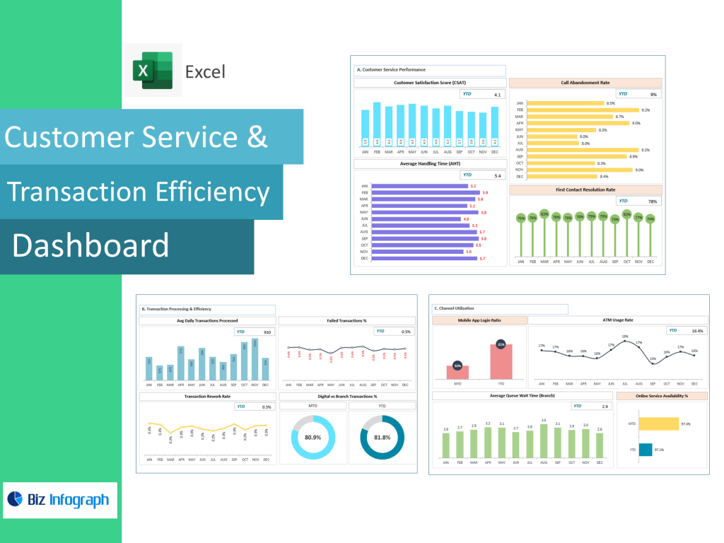
A customer service dashboard is a visual representation of service performance, real-time operations, and customer interaction trends. It allows customer support teams to track service metrics, resolution speed, sentiment shifts, and communication volume across multiple channels. The dashboard offers valuable insights into your customer support performance, helping managers identify bottlenecks and efficiency gaps. A well-structured customer service dashboard gives a comprehensive view of your customer operations, allowing leaders to measure customer satisfaction metrics such as Net Promoter Score (NPS), response time, and first-contact resolution.
The dashboard is designed to improve customer service and streamline support workflows by centralizing KPIs and trends into one real-time interface. Customer service representatives benefit from immediate visibility into customer issues, ensuring they can deliver outstanding customer service without delays. A dashboard gives leaders the ability to track customer effort score, percentage of customer issues resolved within SLA, and repeated contact frequency. By understanding customer sentiment, preferences, and common customer concerns, businesses can take actions that boost customer satisfaction and reduce churn. This makes a customer service dashboard essential for organizations that want to improve the customer experience and maintain superior service standards.
What a Customer Experience Dashboard Includes for Performance Visibility
A customer experience dashboard includes key metrics that provide a complete view of the customer journey—from initial contact to resolution and long-term loyalty. This dashboard visualizes sentiment trends, customer satisfaction ratings, transaction response speed, escalation patterns, and customer retention rate. It gives leadership a full understanding of customer experience management by capturing how effectively support teams resolve issues and how satisfied customers feel after every interaction. Customer experience dashboard examples show that companies track customer engagement, emotional tone from feedback, and overall customer happiness using metrics like CSAT, CES, and Customer Lifetime Value.
The dashboard includes customer acquisition cost, churn warning signals, and customer sentiment categories such as positive, neutral, and frustrated. When the dashboard provides real-time visibility into customer behavior and service delivery, management can make decisions to optimize your customer service process. A customizable dashboard layout ensures metrics align with business needs, product or service type, and communication volume. By offering a complete view of the customer experience, dashboards to monitor support operations become powerful tools for improving service consistency, reducing friction, and increasing customer loyalty. Understanding customer expectations enables organizations to take meaningful action that improves customer satisfaction and accelerates support efficiency.
Customer Support Dashboard Capabilities for Faster Resolution and Tracking
A customer support dashboard is designed to support agents, supervisors, and service analysts in monitoring performance and accelerating issue resolution. It consolidates customer service KPIs, support ticket progress, response timing, and SLA compliance into one centralized view. Dashboards allow support teams to monitor queue length, escalation percentage, and the status of open cases. A customer support dashboard offers real-time insights into your customer operations and helps you understand customer frustrations before they escalate. With the dashboard tracking percentage of customer issues solved within the first reply, managers can pinpoint improvement opportunities instantly.
Customer support dashboard examples often include modules for measuring customer churn likelihood, agent workload balance, and support channel comparison (chat, phone, email, in-app). A support dashboard also measures the percentage of customer issues resolved under SLA, ensuring commitments are consistently met. Insight into ticket backlog levels enables teams to optimize your customer service processes and maintain fast transaction handling. When customer support dashboards highlight recurring complaint categories, businesses can enhance knowledge bases or streamline workflows. Ultimately, these dashboards help improve customer satisfaction and build strong customer relationships through responsive, data-driven support strategies.
KPI Tracking Through a Customer Service KPI Dashboard
Center KPI Dashboard Metrics to Improve Customer Satisfaction
A customer service KPI dashboard focuses on metrics that directly influence support quality and customer sentiment. Common KPIs include customer satisfaction scores, customer retention rate, customer effort score, and average handling time. A center KPI dashboard measures the percentage of customer issues solved on first contact, escalation rates, and negative feedback patterns. When businesses measure customer satisfaction using KPIs, they gain deeper insight into what enhances or harms the customer experience. Customer service performance improves when KPIs expose inefficiencies in communication flow, resolution accuracy, or skill gaps among agents.
KPI dashboards help organizations build strong customer loyalty strategies by identifying drivers of positive sentiment. The dashboard is a visual tool that highlights volume trends, response delays, missed SLA deadlines, and unresolved tickets. With real-time KPI alerts, companies can act quickly to improve the customer service experience. A well-crafted KPI system improves overall customer satisfaction by helping teams understand customer needs, buying triggers, and frustration points. By using metrics like customer lifetime value and churn risk signals, the dashboard boosts customer engagement and long-term relationship value.
SLA Dashboard Indicators for Service Quality and Response Times
A dedicated SLA dashboard measures whether service response obligations and delivery expectations are being met. It tracks service level agreement compliance, first response time, final resolution time, and escalated case duration. SLA dashboards improve customer satisfaction by ensuring support teams maintain fast, reliable service delivery. These dashboards help organizations monitor service performance in real-time, identifying when support queues expand or when customers wait too long. SLA dashboards are especially valuable for call centers, transaction processing departments, and high-volume support environments.
With service metrics clearly presented, managers can optimize staff assignments and reduce customer waiting time. The dashboard includes alerts when SLA thresholds are breached, helping teams maintain contract commitments. High SLA compliance contributes to a top customer experience, increasing customer loyalty and reducing customer churn. SLA dashboards give organizations the control needed to deliver consistent, responsive service. By providing a clear view of your customer operations, SLA dashboards make it possible to improve service speed and quality at scale.
Customer Service KPI Dashboard Reporting for Efficiency Evaluation
A customer service KPI dashboard provides efficiency reporting that evaluates performance at every support touchpoint. Dashboards and HR reports—used as a comparison—highlight similar functions: measuring productivity, identifying gaps, and enhancing service workflow. A KPI dashboard allows managers to assess handling time trends, measure customer satisfaction post-interaction, and analyze customer feedback themes. It helps teams understand customer pain points, enabling rapid improvement actions.
When KPI reporting identifies agents with high efficiency and positive customer sentiment, best-practice training can be replicated across teams. Customer service dashboard examples show dashboards transform service quality by bringing visibility to friction points. Robust reporting insights into customer sentiment guide automation strategy, staff training focus, and backlog prioritization. The dashboard enables decisions to optimize your customer service operations and improve retention outcomes. With KPI reporting, organizations gain a continuous improvement loop that strengthens the customer experience over time.
Customer Experience Dashboard Examples & Use Cases
Customer Experience Dashboard Examples for Real-Time Interaction Monitoring
Customer experience dashboard examples demonstrate how businesses can monitor transactional support, customer tone, buying behavior, and post-resolution satisfaction in real time. A customer satisfaction dashboard visualizes NPS trends, positive vs negative feedback, and customer churn risk indicators. These examples help organizations understand customer journey touchpoints, enabling deeper engagement and better customer experiences. Dashboards track customer lifetime value, effort score, and purchase frequency, offering insights into long-term retention and loyalty.
Real-time customer experience dashboards give rapid feedback loops so customer support teams can resolve dissatisfaction before it affects reputation. Dashboards also track customer engagement, such as time spent on help pages or chat interactions. With strong customer experience insights, organizations can improve the customer experience proactively. These dashboards help businesses refine messaging, support tone, and service delivery consistency. Customer experience dashboard examples clearly show how metrics help customer experience managers create long-lasting customer relationships.
Best Customer Service Dashboard Examples for Support Teams
The best customer service dashboard examples combine operational speed, customer sentiment analysis, and performance tracking in one interface. They focus on both customer satisfaction and agent efficiency, giving a balanced view of support performance. These dashboards measure average call handling time, percentage of customer issues resolved, agent productivity, and customer churn probability. A dashboard visualizes communication bottlenecks, enabling leaders to improve your customer service flow.
The best examples include interactive filtering by product or service type, customer region, or issue category. Best dashboards also track customer acquisition cost vs retention value. These dashboards help boost customer loyalty by refining support resolutions and enhancing customer education. Businesses using top customer experience dashboards report improved customer retention, better customer experiences, and fewer escalations. Support teams using these dashboards deliver outstanding customer outcomes at scale, making dashboards a core engine for customer experience improvement.
How HubSpot Service Hub Dashboards Improve Customer Service
HubSpot Service Hub dashboards provide customizable and automated reporting features that help customer service representatives manage cases more efficiently. They integrate communication history, SLA timelines, customer sentiment notes, and feedback into a single workspace. HubSpot dashboards help teams track pipeline status, overdue cases, churn trends, and satisfaction metrics like customer sentiment score or effort score. These dashboards improve customer service because they centralize all support interactions into one seamless CRM environment.
HubSpot dashboards allow filtering by agent, team, customer lifetime value, and service level priority. They support automation workflows, ticket escalation routing, and personalized customer support messaging. With real-time insights into your customer activity, support managers can train agents more effectively and reduce resolution cycles. HubSpot dashboards increase customer loyalty by making every support experience more responsive, more accurate, and more personal.
Building a Customer Support Dashboard
Steps for Building a Customer Service Dashboard with the Right Metrics
Building a customer service dashboard requires selecting the right customer service KPIs, organizing them visually, and connecting data sources for real-time reporting. The dashboard includes volume charts, SLA countdowns, sentiment scoring, escalation tracking, and resolution history. Step-one is understanding the customer journey—mapping decision points, common issues, and transaction breakpoints. Step-two is identifying which metrics like customer effort score and resolution time affect customer loyalty most. Step-three is selecting a customizable dashboard platform capable of trend filtering, drill-downs, and automation. Step-four is validating data accuracy using historical tickets and churn events.
Good dashboards help you understand customer sentiment and retention drivers, improving the customer experience significantly. A dashboard offers clarity on where customers struggle or repeat contact, helping you improve service quality. By building a customer dashboard intentionally, organizations reduce guesswork and improve data-based customer decision making.
Dashboard Examples Showing How to Improve Customer Service Performance
Customer service dashboard examples show teams how to identify resolution gaps, reduce escalations, and communicate smarter. Dashboards visualize the support funnel: new inquiries → assigned cases → ongoing → resolved → escalated. Viewing this flow helps you optimize your customer service system. The dashboard can transform weak operations by highlighting top delay sources. It also monitors how long it takes customer service representatives to close issues, making training more directed.
Dashboards also make customer sentiment more visible, helping teams learn from both compliments and complaints. By mapping service trends to churn events, dashboards reveal where to improve customer satisfaction most effectively. Supported by visual tracking, customer service teams can deliver exceptional customer service consistently.
For ready-to-use Dashboard Templates: