

The best value proposition canvas template isn’t necessarily the one with the most polished boxes. It’s the one that helps you test what customers actually need. It’s easy to fill in jobs, pains, and gains from your team’s perspective, then mistake a tidy canvas for evidence of customer fit. Start with customer insight and make assumptions visible.
A useful format should be clear enough for solo planning and structured enough for a productive team discussion. This guide explains how to choose a practical template, map customer needs to specific products, services, and benefits, and decide what to validate next. You’ll see how the Customer Profile (jobs, pains, and gains) connects to the Value Map (products and services, pain relievers, and gain creators), without trying to solve every customer problem at once.
Use the canvas as a fit hypothesis, not a box-filling exercise. Keep the work focused on one customer segment, distinguish research from assumptions, and turn the finished map into clear questions for customer validation. These steps help you communicate recommendations with confidence without treating the canvas as proof.
Key Takeaways
- Choose a value proposition canvas template based on how you’ll use it, whether for solo planning, team collaboration, or presenting findings.
- Write each entry for a specific customer, situation, and desired outcome to make the connections more useful.
- Prioritize customer needs by their importance and the strength of the evidence behind them.
- Turn the strongest customer-offer matches into assumptions to validate, rather than treating a completed canvas as proof of fit.
- Summarize the target customer, priority need, proposed offer, and open assumption so others can quickly understand your findings.
What a Value Proposition Canvas Template Helps You Clarify
Choose a template for the work you need it to do: support your own thinking, guide a team discussion, or communicate conclusions to stakeholders. A useful value proposition canvas template makes the relationship between a particular customer and your offer visible. It helps you see what you know, what you’re assuming, and where the fit may be weak.
The canvas is a structured view, not a verdict on demand. It organizes hypotheses about customer needs and the value your offer may provide, but filling every area doesn’t prove customers want the solution. Treat each connection as something to investigate. For a broader foundation, Value Proposition on Wikipedia explains how a value proposition describes the value an organization aims to deliver.
What goes into a Value Proposition Canvas?
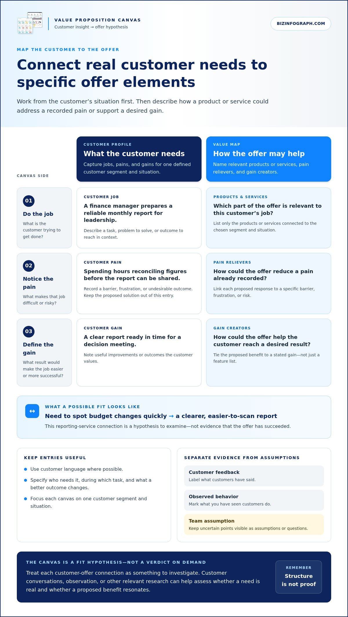
The canvas has two connected sides: a Customer Profile and a Value Map. The profile captures customer jobs, pains, and gains. Jobs are tasks or outcomes customers are trying to achieve; pains are frustrations, barriers, or risks; gains are results they want or value.
The Value Map describes your products and services, the pain relievers that address customer frustrations, and the gain creators that support desired outcomes. Fit is a reasoned link between a priority on the customer side and a specific benefit on the offer side. For example, a reporting service might connect a team’s need to spot budget changes quickly with a clearer, easier-to-scan report. That connection is a hypothesis to examine, not evidence that the offer has succeeded.
When is a canvas template useful?
Use a canvas when shaping a new offer, reviewing an existing one, or aligning a team around who it serves and why. Focus each canvas on one defined customer segment and situation. If a buyer and an end user have different goals or pain points, combining them can blur priorities. Separate profiles make those differences easier to discuss.
Start with exploratory planning: capture what the team believes customers need, and mark uncertain points as assumptions. Then use customer research to learn how people describe their jobs, obstacles, and desired outcomes. Research may change what belongs on the canvas, so leave room to revise rather than treating the first draft as final.
Next, identify which assumptions matter most to the offer and decide how to test them. Customer conversations, observation, or other relevant research can help you assess whether a need is real and whether the proposed benefit resonates. The template gives the work structure; evidence comes from learning about customers. That distinction keeps a polished canvas useful without mistaking a completed worksheet for customer validation.
How to Complete Each Value Proposition Canvas Template Section
Work from the customer side toward your offer. In a value proposition canvas template, record what the customer is trying to do before deciding how your product or service should respond. Tie each note to one customer segment and a real situation. Where possible, label whether an entry comes from customer feedback, observed behavior, or a team assumption. This helps prevent an appealing solution from being mistaken for a proven need.
Map the customer profile: jobs, pains, and gains
Use customer language where possible. Make each entry concrete enough that a teammate can picture the situation, rather than just recognize a broad market category.
- Jobs: Ask, “What is this customer trying to get done?” Describe a task, problem to solve, or outcome to reach in context, such as a finance manager preparing a reliable monthly report for leadership.
- Pains: Ask, “What makes that job difficult or risky?” Capture barriers, frustrations, or undesirable outcomes, such as spending hours reconciling figures before the report can be shared. Don’t write the solution here.
- Gains: Ask, “What result would make this job easier or more successful?” Note useful improvements or outcomes the customer values, such as producing a clear report in time for a decision meeting.
Avoid entries like “businesses need efficiency.” Specify who needs it, during which task, and what “more efficient” would change. If you don’t yet know the answer, record it as a question or assumption instead of presenting it as a customer fact.
Map the value proposition: products, relievers, and creators
Now describe your offer from the customer’s perspective. Don’t fill these areas with a feature list alone. Explain how each element could address a recorded pain or support a stated gain.
- Products and services: Ask, “What part of our offer is relevant to this customer’s job?” List only the products or services connected to the chosen segment and situation.
- Pain relievers: Ask, “How could this offer reduce a pain already recorded?” Link each proposed response to a specific barrier, frustration, or risk. If there’s no matching pain in the profile, revisit the connection.
- Gain creators: Ask, “How could this offer help the customer reach a desired result?” Tie the benefit to a gain, rather than describing a feature without explaining why it matters.
Follow one example thread: the finance manager needs a monthly report ready for a leadership meeting (job); manual reconciliation delays it (pain); a clear, timely summary is the desired gain. A reporting service might propose organized reporting as a pain reliever and a decision-ready summary as a gain creator. Keep the links visible and mark them as hypotheses until customer evidence supports them.
Once your connections are clear, share the findings in a polished format. PowerPoint infographic templates can help present workshop insights and recommendations visually, without replacing the working canvas itself.
Choose a Value Proposition Canvas Template for Your Workflow
The right format is the one that helps people think clearly and use the canvas after the first draft. Before choosing a value proposition canvas template, decide whether the main task is a hands-on workshop, ongoing digital editing, structured analysis, or presenting conclusions. A polished format that leaves too little room for useful notes can slow the work down.
Printable canvas or editable digital template?
A printable layout can work well for a group discussion where participants want to see the whole canvas, add notes by hand, and compare ideas in the room. An editable slide is useful when the canvas will be revised, reused, or shared digitally. Spreadsheet-style layouts can suit structured reviews, especially when a team wants to keep entries organized in rows. None is automatically best. Check that labels and writing areas remain readable at the size and on the screen where people will use them.
Think about the canvas’s journey, not just how it will be filled in. A large printed page can make it easier for a group to scan all six areas together, while a slide can support a digital workshop and later presentation. A spreadsheet can keep notes orderly, but a grid may make the relationship between customer needs and offer elements less visually immediate. If space is tight, shorten entries without losing the customer, situation, or intended outcome.
A practical checklist for selecting your template
Make the choice based on the work itself. Consider who will complete the canvas, how they’ll edit it, where it will be shared, and what the final output needs to communicate. Use this checklist before choosing a format:
- Audience: Choose a file type that fits the tools and working habits of the people contributing, including anyone who needs to review the result.
- Editing: Decide whether contributors need to add notes together, revise entries over time, or complete the canvas independently before discussion.
- Writing space: Check that jobs, pains, gains, products and services, pain relievers, and gain creators each have room for concise, specific entries.
- Readability: Preview the layout at its intended print size or screen view. Make sure headings, notes, and the two sides are easy to scan.
- Sharing and final output: Decide whether the working file itself is the deliverable or whether you’ll summarize the important findings in a presentation.
Adapt the layout to fit your workflow without changing what each area is for. Enlarge a section that needs more note space, add a marker for assumptions, or use consistent colors to distinguish customer observations from proposed responses. Keep both sides visible and make the links between them easy to follow. Don’t let decoration, extra categories, or a compressed page obscure the canvas’s purpose: showing how a specific offer may address a customer’s priorities.
After preparing the working canvas, create a clear visual summary to help colleagues understand the key findings and recommendations. PowerPoint infographic templates can support that presentation step without replacing the canvas used to develop the thinking.
Turn Canvas Entries Into Prioritized, Testable Customer-Offer Matches
A polished value proposition canvas template can organize your thinking, but it can’t establish product-market fit on its own. A line connecting a customer pain to a proposed benefit is a hypothesis until customer evidence supports it. Identify which matches matter most and which need investigation.
Prioritize each potential match using two questions: How important is this need to the customer? and How strong is the evidence behind our understanding? A need customers repeatedly describe and tie to a meaningful outcome deserves more attention than a benefit the team thinks customers might appreciate. Keep both dimensions visible. An important need with weak evidence may be a valuable research question; a well-supported need with a vague offer connection may call for a sharper response.
How to check whether a canvas match is meaningful
Label entries as direct observations, team interpretations, or untested assumptions. Then trace each pain reliever or gain creator back to a specific customer priority. Ask: “What did the customer say or do that supports this need?” and “How does this proposed benefit help in that situation?” If the link relies only on a feature description, rewrite it in terms of the customer’s desired outcome.
For example, “automated reminders” describes a feature. “Helps project coordinators notice approaching deadlines before handoffs are delayed” connects a possible benefit to a customer situation. If you can’t explain why that result matters to the chosen segment, revisit the match or mark it as an assumption. Remove connections that look appealing on the canvas but lack clear customer context.
Common template mistakes that weaken the result
Keep the profile focused. Combining customer groups with different responsibilities or priorities can produce contradictory entries and make it hard to tell whose needs the offer addresses. Create separate profiles when the situations meaningfully differ. Replace broad phrases like “better quality” with an outcome a customer could recognize, such as fewer errors during a specific task or more confidence in a particular decision.
Resist filling every space just to make the canvas look complete. A short, evidence-aware map is more useful than a crowded one filled with generic claims. Prioritize customer needs that are important and supported, while keeping uncertain but consequential ideas visible for follow-up.
Turn the most important unknowns into questions you can investigate through customer interviews, observation, or other suitable feedback:
- Do customers in this segment experience this problem in the situation described?
- How do they currently handle it, and what makes that approach difficult?
- Would the proposed benefit meaningfully improve the outcome they care about?
- What evidence would change or strengthen the team’s current assumption?
Once you’ve prioritized the matches, present the key insights clearly. PowerPoint infographic templates can help stakeholders review the needs, proposed benefits, and open questions.
Present Your Value Proposition Canvas Findings With Clarity
A completed canvas contains the detail behind your thinking, but stakeholders usually need a shorter view of what it means. Keep the working canvas as your reference, then create a concise summary that makes the customer, proposed value, and next decision easy to grasp. Show both the strongest match and what still needs to be learned.
Turn the completed canvas into a decision-ready summary
Build the summary around four points: who the target customer is, which need matters most, what offer response you propose, and which assumption remains open. Keep the language specific. “Small retailers need simpler inventory” is broad; a clearer summary might describe independent shop owners trying to avoid running out of a popular item during a busy sales period. The goal is to explain the context behind the proposed value, not just its headline.
Show the connection between the priority need and the offer response. Make clear what customer evidence supports the need and what remains the team’s interpretation. For example, you might state that customer feedback identifies difficulty tracking stock as a recurring concern, while the proposed reporting feature’s usefulness still needs testing. This distinction keeps a recommendation credible and gives the team a practical next step.
Keep supporting detail available without crowding the main visual. Put research notes, secondary customer needs, and lower-priority matches in the working canvas or an appendix. The summary should guide a decision, not reproduce every entry. Readers should be able to identify the customer, key need, proposed response, and next question at a glance.
Communicate the result in a polished business presentation
Use a clear visual hierarchy to separate three things: customer evidence, proposed value, and next steps. Consistent labels, restrained color, and readable text help people distinguish what customers have said from what the team plans to offer. If the findings are still early, make that status visible. A polished slide should clarify the strength of the evidence, not make an untested match look settled.
A value proposition canvas template can hold the detailed analysis, while a focused presentation communicates the conclusions that matter for the discussion. Use a separate slide for the customer and priority need, another to show the proposed offer response, and a final one to outline the assumption or feedback needed next. Keep the full canvas accessible for anyone who wants to examine the supporting detail.
Once your conclusions are clear, choose a visual format that supports the audience and decision. Biz Infographs’ PowerPoint infographic templates and business presentation templates can help you present findings with a consistent visual structure. Explore professional presentation and data visualization templates to communicate your next customer insight clearly.
Put Your Next Customer Insight to Work
Your next step doesn’t have to be a major launch. Use the strongest insight from your canvas to guide one focused customer conversation, a small offer adjustment, or a clearer decision about what to explore next. Keep the value proposition canvas template as a living reference and update it as you learn. This way, your next move is shaped by evidence rather than the desire to make the worksheet look finished.
When you’re ready to share those insights, choose visuals that help your audience focus on the decision. Biz Infographs offers downloadable PowerPoint infographic, Excel dashboard, and Power BI templates, with professional visual assets designed to reduce manual creation effort and free lifetime updates.
Explore professional presentation and data visualization templates to give your next customer insight a clear, confident visual story.
Frequently Asked Questions
Is a Value Proposition Canvas the same as a Business Model Canvas?
No. A Value Proposition Canvas examines how an offer responds to customer needs, while the Business Model Canvas maps the wider system that delivers and sustains the business. For example, use the first to refine why a customer might choose a service, then use the broader canvas to consider channels, revenue streams, partners, and key activities. The frameworks can complement each other, but they answer different planning questions.
Can I use a Value Proposition Canvas for an existing product?
Yes. Use a value proposition canvas template to review which customer situations an existing offer serves and where friction may remain. Choose a real use case, such as a customer getting started with a software tool, and look for patterns in support requests, usage feedback, or sales conversations. Compare those signals with the benefits you communicate. The review can surface a practical improvement question, even if the product already has loyal users.
How many customer segments should go in one Value Proposition Canvas?
Use one canvas for one customer segment with a sufficiently similar context and set of priorities. If a product serves both independent consultants and large procurement teams, their buying processes and desired outcomes may differ enough to warrant separate canvases. You can then compare the profiles to spot shared needs and meaningful differences. This makes it easier to tailor messaging or decide whether the offer needs distinct versions for different groups.
Can a Value Proposition Canvas be used for a service or nonprofit?
Yes. The framework can help clarify value for a service, nonprofit program, or mission-led offer. First decide whose perspective you’re mapping. A nonprofit’s funder, program participant, and community beneficiary may have different needs, even when they’re connected to the same initiative. You can create a distinct profile for each relevant group and define value in terms of the outcomes that matter to them, not only financial returns.
Who should complete a Value Proposition Canvas: one person or a team?
Either approach can work. A solo draft is useful for preparing a first version before a planning session. A cross-functional team can add perspectives from customer support, sales, product, or service delivery. To keep discussion productive, ask contributors to bring a concrete example or customer interaction to support important claims. If team members disagree, capture the difference as a question to investigate instead of forcing a quick consensus.
Can teams complete a Value Proposition Canvas remotely?
Yes. For a remote session, share an editable canvas in advance and ask participants to review the same customer scenario before adding their input. Use brief entries that fit on screen, and agree on a simple way to flag questions or competing interpretations. Reserve time at the end to assign an owner to each important follow-up, so the discussion produces clear next actions rather than a document that no one revisits.