

Most business presentations don’t fail because the numbers are wrong; they fail because they dump raw metrics instead of guiding a clear decision. You’ve likely experienced the frustration firsthand: you spend hours manually aligning tables and formatting slides, only to watch stakeholders tune out the moment a wall of numbers appears. Knowing how to present data effectively isn’t just a technical skill; it’s the vital bridge between complex analysis and decisive executive action.
You shouldn’t have to second-guess which chart format fits your metrics or waste valuable hours building slide decks from scratch. In this guide, you’ll learn how to transform complex numbers into compelling visual narratives that capture attention and earn immediate leadership buy-in. We’ll explore battle-tested chart selection rules, clarity-first design principles for 2026, and efficient visual workflows that help you deliver executive-ready presentations with total confidence.
Key Takeaways
- Mastering how to present data effectively requires shifting from raw metric dumps to narrative-driven decisions that align with leadership priorities.
- A structured four-step preparation framework ensures you isolate a single lead insight before spending any time building presentation slides.
- Selecting the ideal chart format based on precise data relationships eliminates visual ambiguity and prevents misleading interpretations.
- Clarity-first dashboard techniques and action-driven headlines allow executive stakeholders to grasp critical takeaways in five seconds or less.
- Leveraging pre-formatted business templates removes tedious manual formatting so you can deliver board-ready reporting assets in minutes.
What Makes Data Presentations Effective in Business Settings?
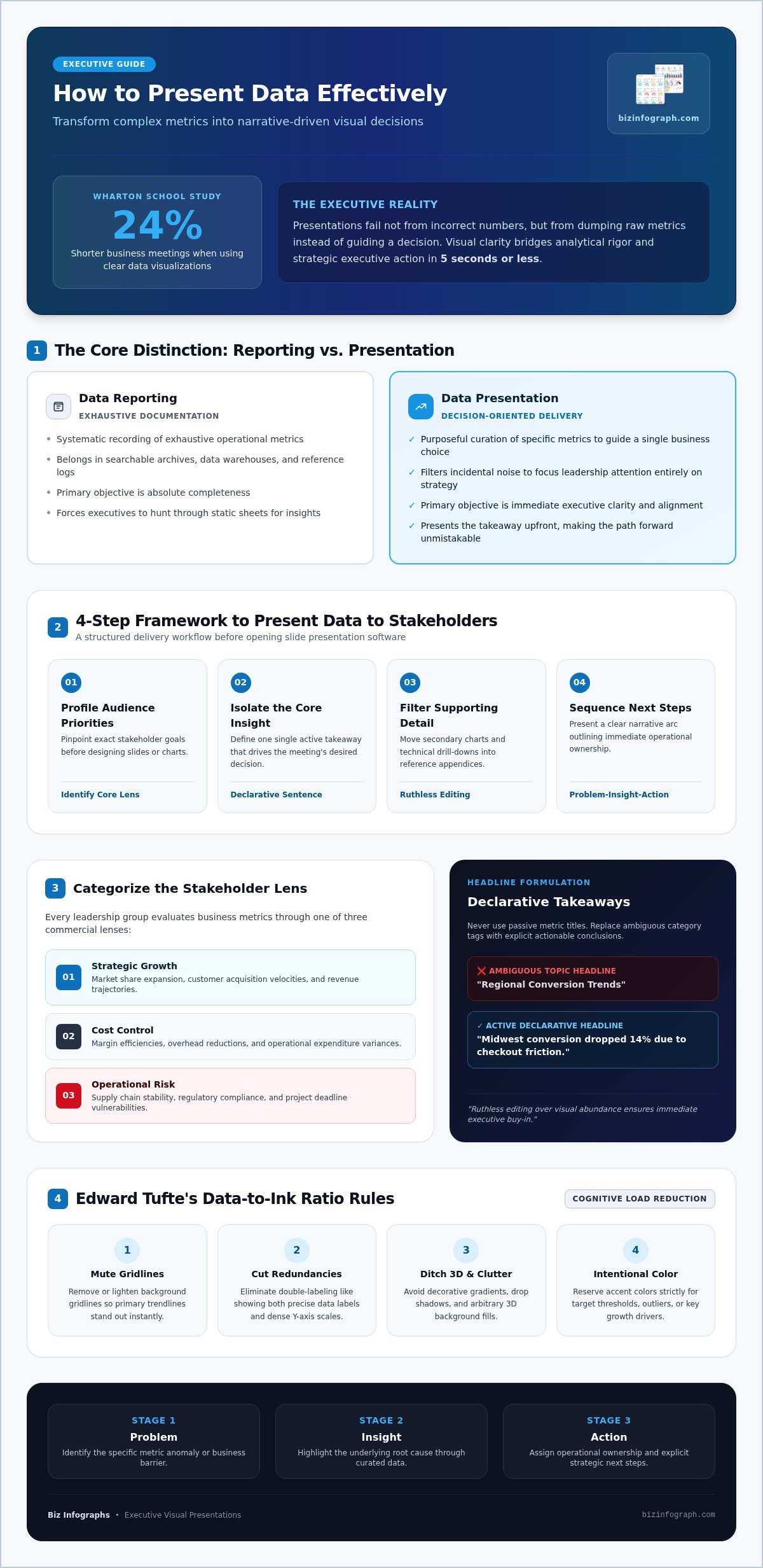
Effective data presentation is the deliberate practice of translating raw figures into clear visual decisions. Too many business reviews unravel because a presenter pastes a massive spreadsheet onto a slide, triggering immediate cognitive overload. A Wharton School of Business study revealed that data visualizations can shorten business meetings by 24%, showing that visual clarity directly accelerates operational velocity. Decision-makers don’t need comprehensive metric repositories during an executive session; they need contextual meaning that answers one fundamental question: what action should we take next? Visual storytelling bridges analytical rigor and strategic executive action, turning cold numbers into shared organizational momentum.
The Core Difference Between Data Reporting and Data Presentation
Understanding this distinction is the cornerstone of how to present data effectively across any enterprise environment:
- Data Reporting: The systematic recording of exhaustive operational metrics. It belongs in searchable archives, data warehouses, and reference documentation where completeness is the primary objective.
- Data Presentation: The purposeful curation of specific metrics designed to guide a single business choice. It filters out incidental noise to focus leadership attention entirely on strategic implications.
Static spreadsheet printouts force executives to hunt for insights. Decision-oriented executive briefings present the takeaway upfront, making the path forward unmistakable.
Understanding Cognitive Load and the Data-to-Ink Ratio
Cognitive load theory explains how working memory processes incoming information. When a slide forces viewers to parse tiny gridlines, excessive labels, and 3D effects, their mental capacity to evaluate strategic risk vanishes. As defined in modern data and information visualization principles, the data-to-ink ratio established by pioneer Edward Tufte argues that every visual element must serve the data. If an ink stroke does not convey actionable meaning, remove it.
To master how to present data effectively, strip decorative clutter by applying these immediate steps:
- Mute or remove background gridlines so primary trendlines stand out clearly.
- Eliminate visual redundancies, such as having both a data label and a dense Y-axis scale on the same chart.
- Ditch decorative gradients, drop shadows, and arbitrary background fills that distract the eye.
- Reserve accent colors strictly for target thresholds, underperforming metrics, or standout growth drivers.
4-Step Framework to Present Data to Any Stakeholder
Presenting data shouldn’t feel like navigating a minefield. While raw metrics provide evidence, a structured delivery guarantees executive alignment. Follow this battle-tested four-step framework to translate intricate datasets into seamless, boardroom-ready briefings.
- Profile Audience Priorities: Pinpoint exact stakeholder goals before opening slide software.
- Isolate the Core Insight: Define one single takeaway that drives the meeting’s desired decision.
- Filter Supporting Detail: Move secondary charts and technical drill-downs into reference appendices.
- Sequence Actionable Next Steps: Present a clear Problem-Insight-Action narrative arc that outlines immediate operational ownership.
Step 1 & 2: Audience Profiling and Isolating the Core Insight
Every leadership group approaches metrics through a distinct commercial lens. Before designing a single chart, categorize your audience’s dominant focus into one of three core pillars:
- Strategic Growth: Focus on market share expansion, customer acquisition velocities, and revenue trajectories.
- Cost Control: Highlight margin efficiencies, overhead reductions, and operational expenditure variances.
- Operational Risk: Emphasize supply chain stability, regulatory compliance, and project deadline vulnerabilities.
Once you know their lens, distill your core insight into a single, active declarative sentence. Instead of writing “Regional Conversion Trends,” state “Midwest conversion dropped 14% due to checkout friction.” Remove any metric that fails to support that specific conclusion directly. True proficiency in how to present data effectively comes from ruthless editing, not visual abundance.
Step 3 & 4: Narrative Sequencing and Actionable Recommendations
Arrange your presentation so every visual naturally prompts the question answered by the next slide. Start with the operational bottleneck, reveal the diagnostic metric, and immediately propose the operational resolution. As highlighted in established public sector guidance on making data understandable, avoiding internal jargon and pairing plain language with clear visual logic prevents audience detachment.
Always conclude data blocks with clear, time-bound operational recommendations. Instead of ending on an open-ended chart, specify who owns the intervention and when teams expect measurable returns. You can streamline this storytelling process by mastering business presentation templates, which help maintain rigorous visual hierarchy and logical narrative pacing across departments.
If you want to spend less time building slides from scratch while keeping your reporting visually unified, exploring curated presentation frameworks on bizinfograph.com is a practical way to fast-track your executive slide preparation.
How to Choose the Right Chart Type for Your Data
Picking the wrong chart type can wreck an otherwise brilliant analysis. When a visualization mismatches the underlying mathematical relationship, stakeholders reach faulty conclusions or spend the entire meeting trying to decode the axes. Matching your data structure to the appropriate graphic form is the foundation of how to present data effectively without creating confusion.
Every commercial metric fits into one of four primary analytical relationships:
- Comparison: Highlighting performance variances across discrete categories, regions, or teams.
- Composition: Showing how individual component segments contribute to an aggregate whole.
- Trend: Revealing performance trajectories, seasonality patterns, or operational shifts over time.
- Relationship: Exploring correlations between two or more independent business variables.
Visualizing Trends Over Time and Categorical Comparisons
Horizontal bar charts work best when category labels are lengthy or when comparing more than seven discrete business units. Reading labels horizontally prevents the neck-straining awkwardness of diagonal text. For continuous tracking across quarters or years, clean line charts remain the gold standard because they highlight momentum and rate of change instantly.
Never rely on 3D bar graphs or pseudo-depth styling. Adding an artificial third dimension distorts visual perspective, making bar heights impossible to evaluate accurately against the baseline axis. Keep bar geometry flat and direct.
Handling Proportions, Distributions, and Multi-Variable Metrics
While pie charts are common, they fail as soon as you exceed three categories. The human brain struggles to compare relative slice angles accurately. Replace cluttered pie charts with stacked bar or waterfall charts, which make step-by-step net impacts easy to trace.
Deploy scatter plots when your objective is to pinpoint correlations between inputs and outcomes, such as marketing ad spend versus customer lifetime value. To eliminate the guesswork of configuring complex reporting models, review the ultimate 2026 guide to Excel dashboard templates to see how pre-built layouts automate precise chart selection and ensure clean visual balance across your corporate reports.
Choosing charts with strategic intent reinforces how to present data effectively across all executive interactions, turning complex multidimensional numbers into clear visual conclusions.
Designing Visual Slides and Dashboards That Executives Understand Fast
Executives spend an average of three to five seconds scanning a slide before deciding where to focus their attention. If your visual layout forces leadership to hunt for the central takeaway, the room quickly disengages. Mastering how to present data effectively at the executive level requires intentional architecture: placing your core metric where eyes land first, applying color with strict discipline, and delivering immediate comparative context.
Establishing an Uncompromising Visual Hierarchy
Start by swapping passive titles like “Quarterly Performance Overview” for active conclusions such as “Operating Margins Grew 4.2% Following Logistics Consolidation.” This single adjustment communicates your finding before you say a word. Position this primary takeaway and its supporting chart in the top-left quadrant of the layout, following standard Western reading patterns. Mute background gridlines and drop secondary axis labels to let the essential metric claim high-contrast focus.
Using Color and Benchmarks to Direct Attention Deliberately
Color should communicate function, not personality. Saturated colors must serve as deliberate directional signals rather than decoration:
- Accent Tones: Reserve bold hues like crimson or emerald exclusively for critical variances, missed targets, or rapid growth drivers.
- Neutral Grays: Render baseline performance, prior year periods, and standard run rates in subtle grays to keep them legible without competing for attention.
- Comparative Context: Never display a standalone figure; always anchor performance against budget targets, prior-year actuals, or industry benchmarks.
Common Data Visualization Mistakes to Eliminate
Even seasoned managers often fall into visual traps that compromise credibility during high-stakes presentations:
- Dual Y-Axes: Plotting two different scales across opposing axes confuses magnitude and creates accidental, misleading correlations between unrelated metrics.
- Inconsistent Slide Palettes: Changing color meanings from one visual to the next forces stakeholders to constantly re-learn your visual code.
- Truncated Bar Baselines: Starting a bar chart’s value axis above zero exaggerates minor differences and misrepresents actual proportions.
Consistently executing these visual standards across every deck takes time, but starting from a structured foundation removes the friction. To elevate your reporting quickly, browse professional dashboard and infographic templates at bizinfograph.com to give your teams boardroom-ready clarity on demand.
Streamlining Presentation Workflows with Professional Business Templates
Building executive decks and analytical charts from scratch is one of the biggest drains on professional productivity. Talented analysts frequently spend forty percent of their prep time nudging text boxes, aligning chart borders, and reformatting colors instead of interrogating the numbers. Standardized digital presentation templates resolve this friction instantly. By establishing rigorous formatting and pre-built visual hierarchies, teams transform raw operational rows into polished executive summaries in minutes rather than hours.
Pairing structured slide frameworks with intentional storytelling elevates organizational credibility across every presentation. When leadership encounters a clean, unified aesthetic week after week, cognitive friction disappears. The audience stops analyzing slide mechanics and focuses entirely on approving strategic initiatives.
Why Structured Frameworks Outperform Blank Presentation Software
Starting with a blank canvas forces you to make dozens of non-analytical micro-decisions regarding typography, column spacing, and padding. Professional frameworks eliminate these repetitive hurdles by providing pre-engineered visual hierarchies that guide the viewer’s eye naturally.
They also ensure seamless visual cohesion between backend analytical models and boardroom slide presentations. Pairing Excel dashboard templates with matching PowerPoint slide assets prevents jarring visual handoffs during cross-functional reviews. When communicating intricate processes or multi-phase roadmaps, explore the high-impact PowerPoint infographic templates guide to learn how structured graphic layouts translate complex concepts into instant clarity.
Creating a Repeatable System for Weekly and Monthly Reporting
Establishing an agile reporting workflow relies on building a repeatable system rather than redesigning slides for every recurring meeting. Implementing standardized digital assets delivers three immediate enterprise advantages:
- Dynamic Data Refreshing: Modular dashboard templates link directly to updated spreadsheets, letting monthly figures repopulate charts automatically without breaking layout formatting.
- Centralized Asset Libraries: Maintaining a shared departmental repository of pre-approved templates ensures seamless collaboration and prevents rogue, off-brand slide designs.
- Analyst Empowerment: Team members without formal design training can produce executive-ready visuals independently, boosting confidence and driving faster decisions.
Ultimately, knowing how to present data effectively requires respecting your own working hours as much as leadership’s attention span. Adopting ready-to-use business templates eliminates manual formatting, sharpens visual storytelling, and guarantees your insights command the authority they deserve.
Transform Your Data into Confident Leadership Decisions
Executive buy-in doesn’t come from overwhelming the boardroom with every operational metric you tracked. It comes from purposeful curation, matching the exact chart format to your analytical narrative, and stripping away visual clutter so your lead insight lands within seconds. When you treat slide architecture as a tool for decisive action rather than static decoration, mastering how to present data effectively transforms from a time-consuming chore into your greatest career asset.
You don’t need to waste late nights manually aligning shapes or second-guessing layout choices. With access to dozens of pre-built business infographics and dynamic spreadsheet dashboards, you can translate complex analyses into boardroom-ready visual assets in minutes. Plus, with free lifetime updates included on all professional digital templates, your reporting workflows will stay aligned with modern visual standards year after year. Explore professional presentation and dashboard templates at Biz Infographs, and step into your next executive briefing with complete confidence.
Frequently Asked Questions
What is the most effective way to present complex data to non-technical stakeholders?
The most effective way is anchoring metrics directly to strategic outcomes rather than statistical mechanics. Replace technical methodology with plain-language business impacts, focusing on revenue, timeline, or customer experience. Knowing how to present data effectively to non-technical leaders means curating visual takeaways that answer what happened and why it matters. Keep deep technical distributions in appendix slides for reference, reserving the main view for high-level directional guidance.
How do I choose between a bar chart, a line chart, and a pie chart?
Choose your chart based strictly on the mathematical relationship you need to communicate. Use bar charts to compare discrete categories or rankings where label space is required. Line charts are the clear choice for displaying continuous trends, velocity, and seasonality over fiscal quarters or months. Limit pie charts to simple compositions with three or fewer slices, or replace them with stacked bars to preserve proportion accuracy.
How many data points or charts should I put on a single presentation slide?
Limit each presentation slide to one primary chart that supports a single takeaway headline. If you must present a multi-metric dashboard, cap the visual components at three to four complementary cards, or five to seven high-level KPIs. Overcrowding a slide forces your audience to scan rather than listen. If a data point doesn’t directly reinforce the main conclusion on that specific slide, move it to the appendix.
What is the data-to-ink ratio and why is it important in business presentations?
The data-to-ink ratio measures the proportion of visual ink dedicated to displaying actual data versus decorative design elements. In business presentations, maintaining a high ratio reduces visual noise and cognitive strain. By stripping away heavy borders, dark gridlines, redundant axis labels, and drop shadows, you direct executive attention strictly to meaningful trends. Every mark on your slide should deliver analytical value, making data comprehension instant and effortless.
Should I use Excel dashboards or PowerPoint slides for executive reporting?
Both formats serve distinct stages of corporate reporting, and pairing them delivers the best results. Dynamic Excel dashboard templates work best for operational reviews, scenario modeling, and routine updates where stakeholders need interactive filtering. PowerPoint infographic templates excel during executive briefings where you need structured visual narratives to guide a strategic decision. Combining both creates a seamless workflow from raw analytical models to boardroom-ready presentations.
How can I present negative financial data or missed KPIs effectively?
Present negative data with complete transparency by pairing the missed benchmark directly with its root cause and a clear recovery roadmap. A core principle of how to present data effectively is avoiding visual tricks like truncated axes to disguise losses. Highlight the negative variance using an alert color, state the operational breakdown in your action title, and conclude immediately with time-bound corrective steps to inspire confidence and regain control of the room.