

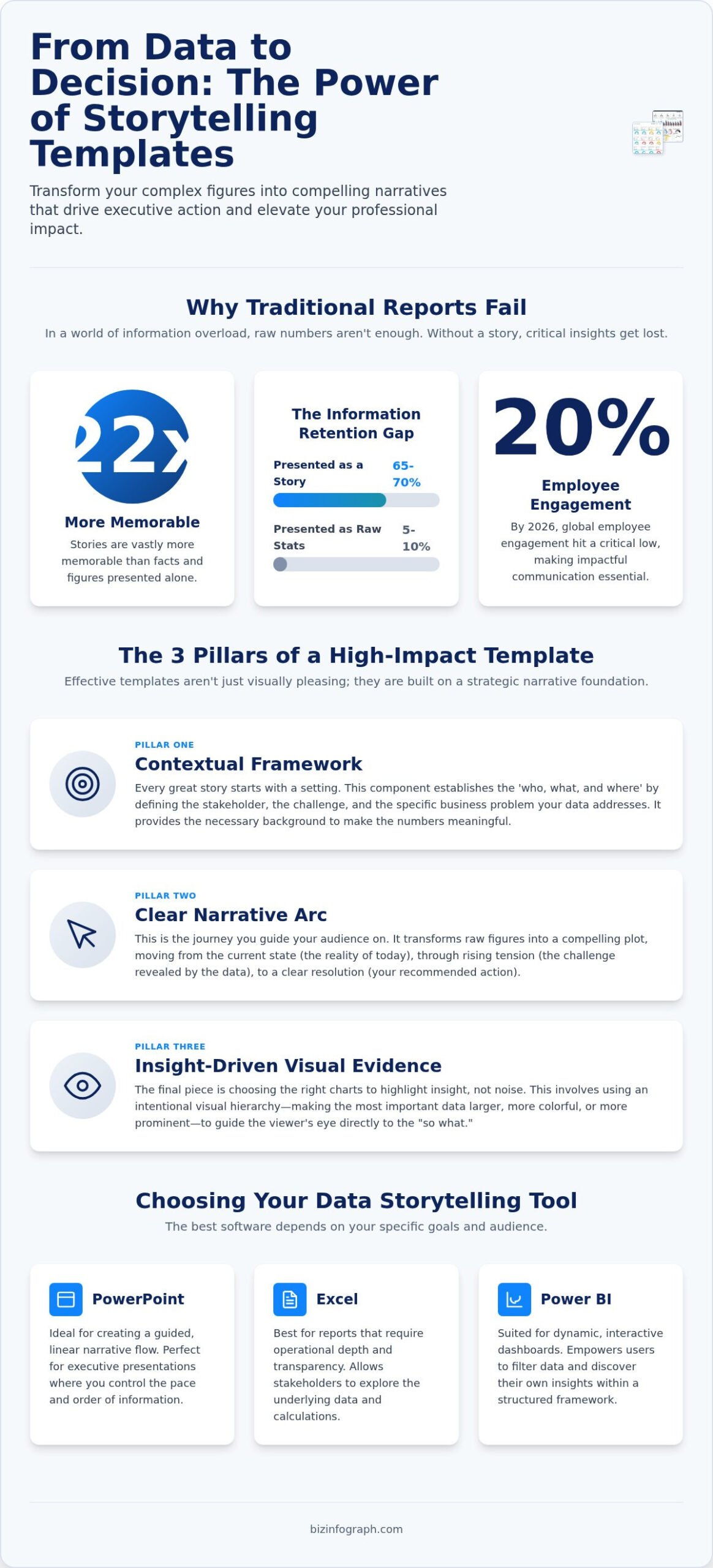
Did you know that stories are 22 times more memorable than facts alone? In a 2026 business climate where global employee engagement has hit a low of 20 percent, simply presenting numbers isn’t enough to drive change. You’ve likely spent hours perfecting a spreadsheet only to face “death by PowerPoint” when stakeholders fail to see the “so what” in your report. It’s exhausting to feel like your data is being ignored. By utilizing professional data storytelling templates, you can finally stop the manual design grind and start delivering the clarity your leadership team craves.
We’ll show you exactly how to bridge the gap between raw data and executive action using frameworks that prioritize impact. You’re going to learn how to achieve polished, best-in-class visual aesthetics without needing any specialized design training. This guide previews the most effective ways to speed up your reporting cycles while securing higher buy-in for your projects. We’ll explore how to transform your complex figures into compelling narratives that make you the most effective communicator in the room. It’s time to turn your technical expertise into a source of professional pride and influence.
Key Takeaways
- Learn how to move beyond static reporting by using frameworks that blend narrative structure with visual evidence to influence executive decisions.
- Discover the three essential pillars of professional data storytelling templates. These frameworks guide stakeholders from a current state to recommended actions with ease.
- Identify the best software for your specific goals. Choose between the linear flow of PowerPoint, the operational depth of Excel, or the dynamic insights of Power BI.
- Master the step-by-step process of identifying your “One Big Thing” to ensure your core message is never lost in the data.
- Achieve best-in-class visual aesthetics and faster reporting cycles using expert-designed tools that require minimal design effort.
What Are Data Storytelling Templates and Why Do They Matter?
What exactly makes a report move from a dull file to a decision-driving asset? In its simplest form, a data storytelling template is a narrative blueprint for business intelligence. While traditional data and information visualization focuses on the “what,” these templates provide the “why.” They are structured frameworks that combine narrative flow with visual data evidence to ensure your message sticks. By 2026, the global data analytics market has grown to over $83 billion, yet most of that data is wasted because it’s never communicated effectively. We’re seeing a massive shift from simple data visualization to true data communication. It’s no longer about making things look “pretty”; it’s about making them clear.
The psychological impact of this approach is undeniable. Research shows that people retain 65 to 70 percent of information when it’s presented as a story. Compare that to the mere 5 to 10 percent retention rate for raw statistics. Static charts often fail because they lack context, leaving the audience to do the heavy lifting of interpretation. Professional data storytelling templates solve this by providing a guided experience. They turn a series of isolated metrics into a logical journey that leads directly to a conclusion.
The Difference Between a Chart and a Story
Standard charts show what happened last quarter. Stories explain why those numbers matter for next year’s budget. Templates provide the essential connective tissue between isolated data points, turning a series of peaks and valleys into a logical argument. By using an intentional visual hierarchy, these tools guide the viewer’s eye toward the most critical insight first. This prevents stakeholders from getting lost in the weeds of a complex dashboard. You aren’t just showing numbers; you are facilitating a conversation.
Efficiency Gains for Modern Professionals
Efficiency is the hallmark of a high-performance career. Professional data storytelling templates reduce design time from hours of manual chart-tweaking to just minutes of data entry. This allows you to focus on the strategy rather than the pixels. Beyond individual speed, these frameworks ensure consistency across departmental reporting. When every team uses a unified storytelling structure, the executive board can digest information faster and with more confidence. You’ll move from being a “data dumper” to a productivity partner who delivers best-in-class results every single time.
The 3 Core Components of a High-Impact Storytelling Template
What makes a template truly effective? It isn’t just about the colors or the grid layout. High-impact data storytelling templates rely on three structural pillars: a contextual framework, a clear narrative arc, and visual evidence that prioritizes insight over noise. Executives in 2026 don’t have time to hunt for the point. They need reports that are scannable and immediately clear. If your template doesn’t guide them from the current problem to a recommended action within seconds, it’s just a collection of charts.
Understanding how to effectively tell a story with data is the difference between a forgotten PDF and a boardroom victory. By using a narrative arc, you transform raw figures into a journey. You start with the reality of today, introduce the tension revealed by the metrics, and conclude with a specific resolution. This structure provides the professional relief stakeholders need to make confident choices. It turns a standard update into a strategic asset that commands attention.
Visual evidence is the final piece of the puzzle. It’s about choosing the right chart type to highlight the “insight” rather than the “noise.” In 2026, the best data storytelling templates prioritize scannability above all else. Business leaders are often reviewing these reports on mobile devices or during short gaps between meetings. If they can’t find the “so what” immediately, they move on. High-quality templates ensure that the most important data is physically larger or more vibrantly colored, creating a natural path for the eye to follow.
Establishing the Narrative Context
Every story needs a protagonist and a challenge. In business reporting, your protagonist is the stakeholder, and the challenge is the specific problem statement identified in your data. Before you even open a spreadsheet, your template should define whose data needs are being met. Using PowerPoint infographic templates helps set a professional visual tone from the very first slide. This immediate aesthetic quality signals that the information is high-value and authoritative. It builds trust before a single word is read.
Designing for Cognitive Load
Your audience’s brain has a limited capacity for processing new information. To keep them engaged, you must eliminate non-essential elements. We suggest the “3-second rule”: if a viewer can’t grasp the main insight of a slide in three seconds, the design is too cluttered. Use color and typography strategically to signal urgency and importance. A bright accent color should only highlight the most critical data point. If everything is bold, nothing is bold. For those looking to streamline this process, adopting high-quality Excel Dashboard Templates can be a game-changer for maintaining this balance between detail and clarity.
PowerPoint vs. Excel vs. Power BI: Choosing Your Template
Selecting the right platform is the first critical step in mastering data storytelling templates. While some suggest moving all reporting to the web, the reality of corporate decision-making in 2026 still lives within the Microsoft ecosystem. Each tool offers distinct advantages depending on your audience and the depth of the data you need to convey. Choosing the wrong medium can lead to confusion, while the right choice creates instant alignment. Your goal is to match the tool’s strengths to your narrative’s specific needs.
A holistic communication strategy often involves using these tools in tandem. You might use one for daily operational tracking and another for high-level quarterly reviews. This multi-tool approach ensures that your data storytelling templates reach every stakeholder in the format they find most useful. It’s about delivering the right insight, at the right time, through the most effective channel possible.
When to Use PowerPoint Templates
PowerPoint is the undisputed king of high-stakes presentations where you control the pace of the narrative. It’s the ideal choice for board meetings, pitch decks, and internal training sessions where a linear flow is essential. By utilizing professional business presentation templates, you maintain brand consistency while focusing on the impact of a “single-slide” infographic story. This format allows you to distill a complex quarterly performance into one punchy, memorable visual that drives immediate discussion.
The Analytical Strength of Excel Dashboards
Excel remains the global industry standard for operational tracking and deep-dive analysis. High-quality Excel dashboard templates allow for interactive “what-if” scenarios that static slides simply can’t match. This makes Excel perfect for team meetings where you need to explore data live. You can automate recurring reports to save hours of manual effort, transforming your spreadsheet from a simple grid into a sophisticated narrative tool. It’s the ultimate “Productivity Partner” for those who need to balance granular detail with clear summaries.
Scaling with Power BI Templates
When you need to synthesize massive datasets or provide real-time enterprise visibility, Power BI is the solution. It moves your reporting from static snapshots to dynamic, live data journeys that update automatically. Using Power BI dashboard templates allows you to integrate multiple data sources into a single narrative hub. This is particularly valuable in 2026’s fast-paced market, where real-time responsiveness often defines a company’s success. It provides the high-level oversight necessary for global leadership teams to act with confidence.
How to Transform Raw Data into a Narrative Using Templates
Turning a spreadsheet into a compelling story is a systematic process. It requires moving beyond the “what” of the numbers to the “why” of the business impact. By following a structured five-step approach, you can ensure your data storytelling templates deliver maximum clarity and influence. This isn’t about adding decorative elements; it’s about building a logical bridge that leads your audience to a specific conclusion.
- Step 1: Identify the ‘One Big Thing’. Before touching any design tool, define the core message. What is the single most important insight the audience needs to remember?
- Step 2: Select a matching template. Choose a structure that mirrors your message. Use a comparison layout for market analysis or a flow-based design for process improvements.
- Step 3: Clean and input data. Focus strictly on the most relevant KPIs. Too many data points create noise that distracts from your primary narrative.
- Step 4: Annotate the visuals. Use callouts and brief text descriptions to provide explicit insights. Don’t assume the data speaks for itself; tell the reader what they are seeing.
- Step 5: Review for flow. Read through your presentation to ensure the conclusion matches the data evidence provided. The transition from one slide to the next should feel like a natural progression.
Finding the ‘So What’ in Your Data
The biggest challenge in reporting is filtering out the noise to find the narrative signal. You must be ruthless with what you include. Every chart should serve the “One Big Thing” you identified in step one. Matching your data types to the correct infographic style is vital for this. For example, you can use a Timeline template to visually map project milestones and demonstrate consistent growth over several quarters. This specific visual choice makes the progress feel tangible and inevitable rather than just a list of dates.
Customization Without Complexity
Professional results don’t require advanced design skills. You can easily adapt corporate colors and fonts to pre-made templates to maintain brand consistency. This allows you to focus on maintaining data integrity while enhancing the overall visual appeal. Remember that the final slide of your story should always be a “Call-to-Action.” Tell your stakeholders exactly what they need to do next based on the evidence you’ve presented. If you’re ready to start your transformation, browse our collection of professional dashboard and infographic templates to find your perfect match. These tools are designed to help you shine in front of any audience with minimal manual effort.
Elevate Your Professional Impact with Biz Infographs
Why do thousands of high-level executives and analysts turn to Biz Infographs for their reporting needs? It’s because they understand that data is only as valuable as the story it tells. Our data storytelling templates are designed to be your ultimate productivity partner. We provide the tools you need to bridge the gap between technical complexity and executive clarity. Whether you are operating within the PowerPoint, Excel, or Power BI ecosystem, our templates ensure your message is delivered with precision, style, and authority. You don’t just present numbers; you lead conversations.
One of the most significant advantages we offer is free lifetime updates for all our products. In the rapidly evolving design landscape of 2026, staying current is essential for maintaining your professional edge. You don’t have to worry about your reports looking dated or your charts becoming obsolete as new software versions emerge. As aesthetic trends shift and Microsoft updates its platforms, your templates will evolve with them. This commitment to long-term excellence allows you to focus on your core strategy while we handle the high-end visual standards.
The Biz Infographs Quality Standard
How much time have you wasted trying to align icons or fix inconsistent chart colors? Our expertly crafted designs meet the sophisticated 2026 aesthetic trends without requiring you to have advanced technical or design skills. We’ve built a comprehensive library tailored for every specific business department. Sales teams can track pipelines, HR can visualize engagement, Finance can report on fiscal health, and Ops can monitor efficiency with ease. These are not generic layouts. They are specialized frameworks designed for the unique data needs of your specific role. We believe that professional aesthetics should be accessible to everyone, regardless of their background.
Getting Started Today
Are you ready to stop struggling with manual design and start leading with confidence? Browsing our site to select the perfect template for your next project is simple and intuitive. For growing businesses or ambitious professionals who want total flexibility, the All-in-One bundle provides the most comprehensive value. It gives you immediate access to our full range of PowerPoint, Excel, and Power BI tools. This ensures you have the right narrative blueprint for any situation, from a quick team update to a high-stakes board presentation. It’s time to stop dumping data and start driving action. Transform your data into a powerful story with Biz Infographs today!
Master the Art of Strategic Data Communication
You’ve seen how the right structural blueprint turns a confusing spreadsheet into a decisive executive action. By mastering the narrative arc and identifying your “One Big Thing,” you move from being a reporter of facts to a driver of strategy. Whether you choose the linear flow of PowerPoint or the real-time depth of Power BI, your ability to communicate clearly is your greatest professional asset. Utilizing professional data storytelling templates ensures that your insights are never lost in the noise of a crowded meeting.
Biz Infographs is here to be your productivity partner on this journey. Our tools are trusted by global business professionals who demand excellence without the design headache. Every template is 100% customizable and easy to use, ensuring you produce best-in-class results in minutes. Plus, with free lifetime updates, your reporting always stays ahead of the curve. Explore Best-in-Class Data Storytelling Templates and start your transformation today. You have the data; now it’s time to tell the story that matters.
Frequently Asked Questions
What makes a good data storytelling template?
A high-quality template provides a clear narrative arc that guides the viewer from a problem to a solution. It isn’t just a collection of charts; it’s a structural blueprint that prioritizes cognitive clarity. Best-in-class data storytelling templates use visual hierarchy to highlight the most important KPIs first. This ensures stakeholders grasp the “so what” in seconds. It balances aesthetics with data integrity to make your message both beautiful and authoritative.
Can I use these templates if I’m not a designer?
Absolutely. These tools are specifically designed as productivity partners for busy professionals who lack formal design training. You can achieve expert-level results with minimal manual effort. The layouts are pre-configured with professional color palettes and font hierarchies. This allows you to focus on your strategic message while the template handles the visual heavy lifting. It’s the fastest way to transform a standard report into a source of personal pride.
Are the Excel dashboard templates compatible with older versions of Office?
Our templates are built to perform optimally on Microsoft 365 and recent versions of Office. While they maintain broad compatibility, using the most current software ensures that all interactive charts and automation features work seamlessly. This allows you to take advantage of the latest visualization tools available in 2026. If you’re using an older version, we recommend updating to ensure your reports maintain their professional edge and sophisticated aesthetic.
How do I choose between a PowerPoint and an Excel storytelling template?
Choose PowerPoint when you need to deliver a high-stakes, linear narrative during a meeting or pitch. It’s best for controlling the pace of the story. Select an Excel template when your audience needs to explore data interactively or track operational metrics over time. Excel is the industry standard for deep-dive analysis and “what-if” scenarios. Combining both tools creates a holistic communication strategy that reaches every stakeholder in their preferred format.
Do the Power BI templates require advanced DAX knowledge?
You don’t need advanced DAX knowledge to get professional results with our templates. We’ve designed them to be expert facilitators that handle the technical complexity for you. This allows you to transition from static stories to dynamic, live data journeys with minimal effort. These data storytelling templates are built to be accessible for general business users. It’s an innovative way to work that makes high-quality design accessible to everyone.
Can I customize the colors and fonts to match my corporate brand?
Yes, every template is 100 percent customizable to ensure it aligns perfectly with your corporate identity. You can easily adjust colors, fonts, and logos within the standard Microsoft interface. This flexibility allows you to maintain brand consistency across all departmental reporting. It ensures that your high-impact visualizations feel like an integrated part of your company’s professional ecosystem. You’ll deliver a polished, sophisticated result that mirrors the high-end nature of your work.
What is the best way to present complex financial data to non-experts?
The most effective method is to filter out the noise and focus on the narrative signal. Start by identifying the “One Big Thing” your audience needs to understand. Use an infographic style that matches the data type, such as a timeline for growth or a comparison for market share. Annotate your visuals with brief, explicit insights that explain the significance of the figures. This approach ensures non-experts feel capable and supported throughout your presentation.
How often are the templates updated for new design trends?
We provide free lifetime updates for all our templates to ensure they always reflect the latest design trends. As aesthetic standards evolve in 2026 and beyond, your tools will evolve with them. This commitment to excellence means your reports will never look dated or unprofessional. You can download the latest versions at any time to keep your visual communication sharp and modern. It’s part of our role as your long-term productivity partner.