

How much time did your team lose this week simply trying to decode whether your operations are actually meeting their targets? If you’re still stuck in the cycle of manual data entry and reports that are hard to read, you’re not alone. Most professionals struggle with inconsistent tracking across departments; this leaves leadership blind to the hidden bottlenecks that eat away at the bottom line. It’s time to stop fighting with your data and start making it work for you. By implementing a professional operations dashboard template, you can finally bridge the gap between raw numbers and the strategic clarity you need to lead effectively in 2026.
We agree that your time is far too valuable to be spent formatting cells or chasing down missing metrics. You deserve to walk into every meeting with the confidence that your data is accurate, visual, and ready to inspire your stakeholders. This guide promises to transform your reporting workflow from a weekly burden into a high-performance competitive advantage. We’ll explore how to choose the right digital tools to save hours of manual effort, identify operational issues before they escalate into crises, and present your results with the polished look of an expert facilitator.
Key Takeaways
- Shift from static, retrospective reporting to real-time operational awareness to stay competitive in the 2026 business landscape.
- Eliminate manual data entry and “ugly” reports by adopting a high-performance operations dashboard template with built-in automation.
- Pinpoint exactly which efficiency and quality KPIs, like cycle time and error rates, are essential for identifying hidden bottlenecks.
- Follow a proven, step-by-step implementation strategy to clean your data and structure it for maximum stakeholder impact.
- Save hours of work every week while looking like a data expert with professional-grade visualization tools designed for immediate results.
What is an Operations Dashboard Template and Why is it Essential?
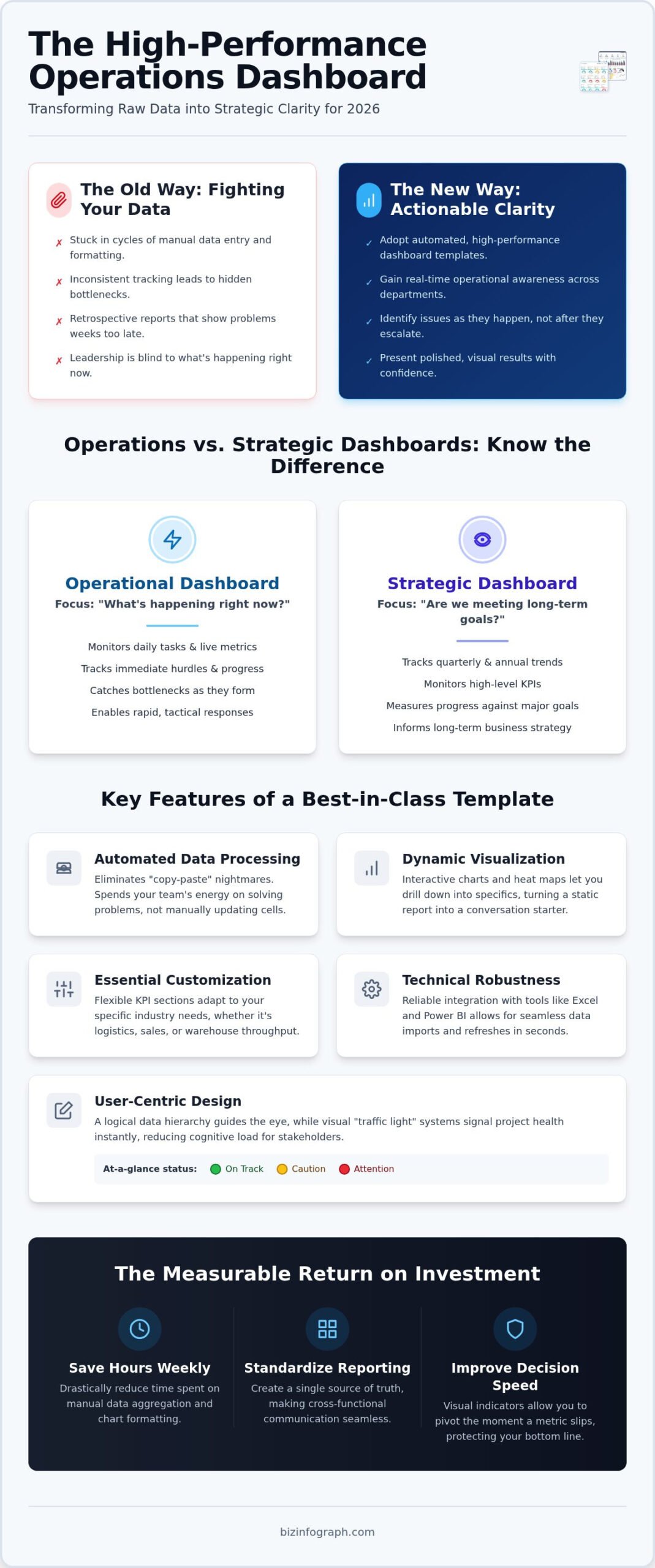
What exactly is an operations dashboard template? Think of it as the high-definition cockpit of your business. It is a centralized visual tool designed to monitor daily performance and complex workflows in real time. In the past, many companies relied on retrospective reporting; they looked at what happened last month to make decisions for next month. By 2026, that lag is a liability. Success now requires immediate operational awareness. You need to see a bottleneck as it forms, not weeks after it has already stalled your progress.
A professional template bridges the gap between messy, raw data rows and the refined insights your executives demand. It translates technical noise into a visual story that anyone can understand. While analytical dashboards dig into the “why” and strategic dashboards track the “where to,” your operational dashboard tells you exactly “what’s happening right now.” It’s the difference between reading a history book and watching a live map.
The ROI of Using a Professional Template
Why build from scratch when you can lead with excellence? Using a pre-designed operations dashboard template provides immediate relief from the frustration of “blank spreadsheet” syndrome. The return on investment is clear and measurable. First, you’ll experience a massive reduction in the hours typically spent on manual data aggregation and chart formatting. Instead of fighting with cell borders, you’re analyzing trends. Second, it creates a standard for reporting across different departments. When every team uses the same high-quality framework, cross-functional communication becomes seamless. Finally, it improves your decision-making speed. Visual “at-a-glance” status indicators allow you to pivot the moment a metric slips, protecting your bottom line.
Operations vs. Strategic Dashboards: Knowing the Difference
It’s easy to confuse these two tools, but their purposes are distinct. An operational focus is all about the “now.” It tracks daily tasks, live metrics, and immediate hurdles. If a production line slows down or a support queue spikes, the operational dashboard flashes the alarm so you can act. Strategic dashboards, on the other hand, focus on long-term goals, quarterly trends, and high-level KPIs. Because operations move at the speed of business, your template must be dynamic and easily updated. It isn’t a static document to be filed away; it’s a living engine that keeps your team agile, focused, and ready to shine in front of any audience. For professionals who want to extend this level of clarity and brand presence to physical workspaces or corporate events, Banner 4 Sale offers high-quality custom signage that makes a lasting impression.
Key Features of a Best-in-Class Operations Dashboard Template
What separates a mediocre tracker from a high-performance engine? In 2026, it’s all about moving away from the “copy-paste” nightmare that plagues so many offices. A premium operations dashboard template must feature automated data processing. This ensures your team spends their energy on solving problems rather than manually updating cells. For businesses seeking to integrate these workflows into a broader automated environment, Apollonix Tecnologia provides expert consultancy to ensure your data sources are optimized and connected. Dynamic visualization tools, such as interactive charts and heat maps, allow you to drill down into specific regions or timeframes with a single click. This level of interactivity turns a static report into a conversation starter that drives real change.
Customization is equally vital for your success. Your industry has unique needs, so your KPI sections should be flexible enough to adapt to those specific requirements. Whether you’re tracking logistics, sales volume, or warehouse throughput, the layout should remain clean and professional. Aesthetics aren’t just for show; they ensure clarity during high-pressure meetings where every second counts. If you’re looking to elevate your reporting today, choosing a professional Excel dashboard can save you hours of setup time.
User-Centric Design for Non-Designers
You don’t need a degree in graphic design to create something stunning. The best templates utilize a logical data hierarchy that guides the eye toward the most critical information first. By using color-coded “traffic light” systems, you can signal the health of a project instantly. Green means go, yellow suggests caution, and red demands immediate attention. This visual shorthand reduces the cognitive load on your stakeholders, making it much easier for them to digest complex information and say “yes” to your recommendations. Minimal design effort on your part leads to higher engagement from everyone in the room.
Technical Robustness: Excel and Power BI Integration
Reliability is the backbone of any operational tool. Leveraging Power Query for seamless data imports allows you to refresh your entire report in seconds, keeping your data fresh and accurate. While Power BI offers advanced cloud features, many professionals still prefer Excel dashboard templates for their offline accessibility and universal familiarity. This technical flexibility ensures that your reporting system is scalable, growing alongside your business data without breaking. It’s about having a tool that works as hard as you do, providing the stability you need to lead with confidence.
Critical KPIs for Your Operational Performance Tracking
Data is the lifeblood of your organization, but without the right focus, it’s just noise. To truly excel, you must populate your operations dashboard template with metrics that actually move the needle. Think of your KPIs as the vital signs of your business health. If you aren’t tracking the right ones, you’re flying blind. In 2026, high-performance teams categorize their tracking into four distinct pillars: efficiency, quality, finance, and people. This holistic view ensures you aren’t just busy, but productive.
- Efficiency Metrics: Focus on cycle time, throughput, and resource utilization. These tell you how fast you’re moving and if your assets are being used effectively.
- Quality Metrics: Monitor error rates and compliance scores alongside Customer Satisfaction (CSAT). To streamline the collection of user issues for your dashboard, learn more about FeedbackGraph. Speed means nothing if the output is flawed.
- Financial Metrics: Keep a sharp eye on operational costs and budget variance. Tracking daily revenue ensures you’re profitable in real time. Pairing your operations data with a dedicated business expense tracker excel template gives you a complete picture of where every dollar is going across your organization.
- Team Metrics: Don’t overlook the human element. Monitoring overtime hours and task completion rates helps you spot employee burnout indicators before they lead to turnover.
Selecting KPIs That Drive Action
How do you choose what stays and what goes? Every metric in your operations dashboard template should pass the SMART test: Specific, Measurable, Achievable, Relevant, and Time-bound. Avoid “vanity metrics” at all costs. These are numbers that look impressive on a slide deck but don’t actually inform your strategy or highlight a problem. For example, total page views might look great, but they don’t tell you anything about your internal processing efficiency. Instead, link your operational KPIs directly to broader organizational objectives. When your daily tasks align with the company’s North Star, your team feels empowered and focused.
Industry-Specific Metric Variations
Your dashboard needs to speak your industry’s language. If you’re in manufacturing, your focus will likely be on Overall Equipment Effectiveness (OEE) and minimizing downtime to keep the floor running smoothly. For those in the service sector, first-response times and ticket resolution speeds are the gold standard for success. Meanwhile, logistics professionals prioritize order accuracy and warehouse turnover rates to ensure the supply chain remains unbroken. Even in specialized fields like structural engineering, using tools such as GMatrix-7 for MBS or LGS design provides the precise data required for high-level operational tracking. By tailoring your template to these specific needs, you transform a general tool into a precision instrument that helps you shine in your specific field. This targeted approach is what allows you to identify issues before they become crises.
Ready to move from raw data to a finished product? Implementing a professional operations dashboard template is a straightforward journey when you follow a structured plan. It’s about building a reliable engine that powers your daily decisions. You don’t need to be a coding expert to get this right; you just need a logical approach that prioritizes clarity and accuracy. By following these five steps, you’ll transform your reporting workflow into a high-performance asset.
- Step 1: Define your core audience. What primary questions do they need to answer every morning?
- Step 2: Clean and structure your raw data sources. Consistency is the secret to a dashboard that never breaks.
- Step 3: Map your data to the pre-built charts in your template to see your metrics come to life.
- Step 4: Set up automated refresh intervals. In 2026, manual updates are a relic of the past that wastes precious time.
- Step 5: Test and refine. Gather feedback from your team and adjust the layout to better serve their needs.
Data Preparation Best Practices
Standardized naming conventions for your data columns are non-negotiable. If your sources use different labels for the same metric, your automation will fail. Learn how to create a dashboard in Excel using robust data tables to ensure your links remain secure. This foundation prevents the common errors in formula references that often derail DIY projects. When your data is structured correctly, the template does the heavy lifting for you.
Visual Storytelling and Final Polishing
Once the technical side is solid, focus on the user experience. Remove “chart junk” like unnecessary gridlines or distracting background colors that pull focus away from the most important data points. Add contextual notes or callouts to explain significant variances; this helps stakeholders understand the “why” behind the numbers instantly. Finally, ensure your dashboard is mobile-friendly. Managers in 2026 are often on the move and need to check performance from their tablets or phones. If you’re ready to look like a pro, download a ready-to-use operations dashboard template and start your transformation now.
Why Biz Infographs Offers the Ultimate Operations Solution
Why settle for a subscription model where you never truly own your reporting logic? At Biz Infographs, we believe in empowering you with tools that provide lasting value. Our operations dashboard template is designed to be a one-time investment that serves your career for years to come. Unlike competitors who tie you to monthly fees, we offer a professional-grade solution that you can download and fully control. This is about professional excellence; our templates are crafted by specialists who understand that your data needs to do more than just exist. It needs to impress.
Time is your most precious resource. Our focus on automation means you can stop the repetitive cycle of manual chart creation and start focusing on high-level analysis. Whether you prefer the flexibility of Excel, the advanced connectivity of Power BI, or the presentation power of PowerPoint, we have you covered. Our versatility ensures that you have the right tool for every audience and every platform. Plus, with free lifetime updates for 2026 and beyond, your reporting will always stay at the cutting edge of design and functionality.
Empowering Your Professional Journey
We’ve all felt the frustration of spending hours on a report only to have it ignored because it was too complex or visually unappealing. Our mission is to transform those moments into sources of personal pride. By using a polished operations dashboard template, you gain the confidence to lead data-driven meetings with absolute clarity. You aren’t just presenting numbers; you’re facilitating a strategic conversation. Accessing our global library of high-impact business visualization tools gives you the support you need to shine in front of your peers and leadership. It’s about moving from a “data person” to a “productivity partner” in the eyes of your organization.
Explore Real-World Success Stories
The impact of professional design goes far beyond aesthetics. When your data is structured logically and presented beautifully, stakeholder buy-in happens naturally. Managers across various industries use these excel dashboard examples to drive growth and secure project approvals. They’ve discovered that when reports are easy to read, decisions are made faster. This professional edge can be the difference between a project that stalls and one that receives immediate funding. Don’t let poor visualization hold your insights back. Browse our full collection of professional dashboard templates today! and start building your legacy of operational excellence.
Take Command of Your Operational Future
The transition from manual data entry to strategic leadership starts with the right tools. By adopting a professional operations dashboard template, you’ve learned how to replace “ugly” reports with high-impact visuals that identify bottlenecks before they become crises. You now have a roadmap to automate your workflow, select the KPIs that truly matter, and present your findings with the confidence of an expert facilitator. This isn’t just about better charts; it’s about reclaiming your time and ensuring your hard work gets the recognition it deserves.
At Biz Infographs, we’re proud to be your productivity partner. Our high-quality Excel and Power BI designs are used by professionals worldwide to drive real business growth. When you choose our solutions, you benefit from free lifetime updates, ensuring your reporting remains best-in-class as business needs evolve. It’s time to stop struggling with spreadsheet formatting and start shining in every meeting. Upgrade your reporting with professional Operations Dashboard Templates and lead your team toward a more efficient, data-driven tomorrow. You’ve got the insights; now give them the platform they deserve.
Frequently Asked Questions
What is the difference between an operations dashboard and a KPI report?
An operations dashboard focuses on live monitoring of daily workflows and immediate bottlenecks. In contrast, a KPI report is typically a static snapshot of performance against specific targets over a set period, such as a month or quarter. While the KPI report tells you if you met your goals, the dashboard helps you manage the tasks required to reach them. Using a professional operations dashboard template ensures you have both real-time visibility and historical context.
Can I customize the Excel operations dashboard template for my specific industry?
Absolutely, our templates are designed with maximum flexibility in mind. You can easily adjust the labels, color schemes, and specific metrics to align with your unique industry requirements, whether you’re in manufacturing, logistics, or professional services. This customization allows you to maintain a professional aesthetic while tracking the exact data points that drive your specific business. You don’t have to settle for a generic layout when you can tailor the tool to your team’s needs.
Do I need advanced Excel skills to use these operations templates?
You don’t need to be an Excel wizard to look like a pro. These templates are built for ease of use, featuring clean data tables where you simply input your numbers. The complex formulas and chart formatting are already handled for you in the background. If you can copy and paste or type into a cell, you can manage these high-performance tools. This design allows you to focus on strategic analysis rather than fighting with spreadsheet technicalities.
How often should I update the data in my operations dashboard?
The frequency depends on the pace of your specific operations, but most high-performance teams update their data daily or weekly. Because 2026 business environments move so quickly, waiting a month to see results can lead to missed opportunities. If your template is connected via Power Query, refreshing your data takes only a few seconds. Regular updates ensure that your team is always working with the most current information to identify and solve issues immediately.
Is it better to use Excel or Power BI for an operations dashboard?
Both tools have unique strengths depending on your goals. Excel is often the best choice for professionals who need offline accessibility, universal familiarity, and quick customization without a steep learning curve. Power BI excels when you need to integrate massive datasets from multiple cloud sources or require advanced interactive sharing features. Many of our users start with an Excel operations dashboard template for its simplicity and then move to Power BI as their data maturity grows.
What are the most common mistakes when designing an operations dashboard?
One of the biggest errors is overcrowding the screen with too many metrics, often called chart junk. This creates cognitive overload for your stakeholders. Another mistake is focusing on vanity metrics that look good but don’t inform daily decisions. To avoid these traps, prioritize a clear data hierarchy and use color coding to highlight what needs immediate attention. A clean, focused design ensures that your audience can grasp the most important insights within seconds of looking.
How do I share my operations dashboard with my team securely?
Security is a top priority for any business leader. You can share your Excel files securely by using built-in password protection or hosting the document on a secure platform like SharePoint or OneDrive. These methods allow you to control who has viewing or editing permissions. For Power BI users, sharing is managed through the Power BI Service, which offers robust enterprise-level security protocols. This ensures your sensitive operational data remains in the right hands while empowering your team.
Does Biz Infographs provide updates if software versions change in 2026?
Yes, we provide free lifetime updates for all our dashboard templates. If Microsoft releases significant software updates in 2026 or beyond that affect the functionality of your files, we’ll ensure your tools are updated to remain compatible. This commitment provides you with long-term peace of mind and incredible value. You can invest in your professional toolkit today knowing that your templates will continue to perform at a best-in-class standard as technology evolves.
One reply on “High-Performance Operations Dashboard Template: The 2026 Professional Guide”
[…] simple tracking, we offer specialized solutions like our operations dashboard template for those who need to manage broader business metrics alongside their bills. You aren’t just […]