

How much time did you lose last week wrestling with rows of raw data that your leadership team barely glanced at? It’s a common frustration to spend hours on manual reporting only to deliver a static spreadsheet that feels both confusing and uninspired. You deserve to walk into your next meeting with the confidence of a global leader, presenting visuals that don’t just show numbers but tell a compelling story. By exploring professional excel dashboard examples, you can bridge the gap between overwhelming data and the sophisticated, clear insights your department requires.
We’ll show you exactly how to automate those recurring reports and impress your stakeholders with best-in-class designs. In 2026, a professional dashboard is more than a collection of charts; it’s a strategic tool that leverages modern features like AI-driven narratives and dynamic arrays to save you time. This guide previews ten high-impact templates tailored for various business functions, from sales to HR. You’ll discover the design principles needed to transform your reporting from a chore into a high-performance asset that makes you the productivity partner your company needs.
Key Takeaways
- Learn how to transition from basic spreadsheets to a sophisticated BI platform by leveraging 2026 features like AI-driven narratives and dynamic arrays.
- Master the “Three-Second Rule” to ensure stakeholders grasp your most critical KPIs instantly through a clear visual hierarchy.
- Explore industry-specific excel dashboard examples for sales and finance that transform complex pipelines and cash flow data into actionable business stories.
- Discover how to select the perfect chart types for your data while eliminating “chart junk” to maintain a clean, professional, and mobile-friendly aesthetic.
- Evaluate the “build vs. buy” decision to see how professional templates can automate your recurring reports and deliver expert-grade results with minimal manual effort.
Beyond Basic Spreadsheets: Why Excel Dashboard Examples Matter in 2026
Excel has undergone a massive transformation. It’s no longer just a grid for manual data entry; it’s evolved into a sophisticated business intelligence platform. With the August 2026 release of Microsoft 365 Version 2607, users have access to advanced tools like Python integration and AI-powered formula suggestions that were once the domain of data scientists. However, the biggest hurdle remains the “blank canvas syndrome.” Staring at an empty workbook is paralyzing. This is why studying high-quality excel dashboard examples is essential for anyone looking to shine in a corporate environment.
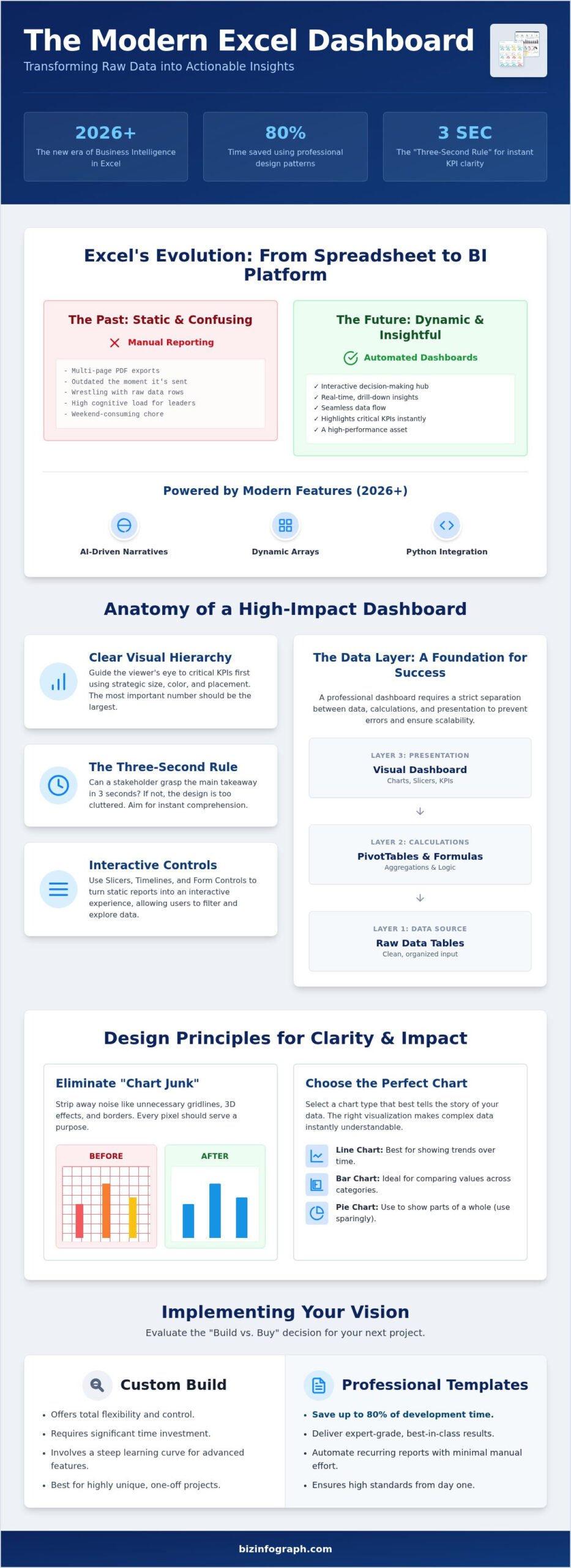
Understanding What is a dashboard is the first step in moving past historical record-keeping. While a traditional report tells you what happened last month, a dashboard tells you what to do right now. It uses linked data and interactive slicers to turn a static document into a living decision-making hub. For a busy executive, professional visualizations reduce cognitive load by highlighting only the most critical KPIs. It’s about clarity, not just volume. You want your leadership team to feel relief when they see your data, not confusion.
The Death of the Static Report
Stakeholders in 2026 don’t have time for multi-page PDFs that are outdated the moment they’re emailed. They demand interactive, real-time insights that allow them to drill down into specific regions or product lines instantly. We’ve shifted from manual data manipulation to automated visualization hubs where data flows seamlessly from your source files to your charts. This transition fosters a data-driven culture because it makes insights accessible to everyone, not just the technical team. It turns your reporting process into a source of personal pride rather than a weekend-consuming chore.
Inspiration vs. Execution: Using Examples to Scale
Why reinvent the wheel? Professional design patterns exist for a reason. Starting with a proven example can save you up to 80% of development time. It allows you to focus on the nuances of your data rather than the mechanics of chart alignment. While custom builds offer total flexibility, our Excel Dashboard Templates bridge the gap between “beginner” and “expert” output. You get the benefit of a best-in-class aesthetic without the steep learning curve. Using excel dashboard examples as a foundation ensures your work meets the high standards of 2026 reporting from day one. You can stop worrying about the “how” and start leading with the “why.” This approach scales your productivity, allowing you to manage multiple departments with the assurance of a global leader.
The Anatomy of a High-Impact Excel Dashboard
A professional Excel dashboard is far more than a collection of charts. It’s a single-page interface designed to communicate your most vital KPIs through linked data, interactive slicers, and a clear visual hierarchy. When you examine top-tier excel dashboard examples, you’ll notice they don’t just dump data; they curate it. The goal is to provide an immediate snapshot of health and performance. By using size, color, and strategic placement, you guide the viewer’s eye to the most critical numbers first. This structured approach ensures your audience feels informed rather than overwhelmed.
The “Three-Second Rule” is your benchmark for success. Can a stakeholder understand the main takeaway of your report in just three seconds? If the answer is no, your design is likely too cluttered. Adhering to data visualization best practices helps you strip away the noise. Modern Excel features like Slicers, Timelines, and Form Controls play a massive role here. They turn a static image into an interactive experience, allowing users to filter data by date or region without ever touching a formula. It’s this level of interactivity that transforms you from a data clerk into a productivity partner.
The Data Layer: Clean Input for Clear Output
Success starts backstage. A professional dashboard requires a strict separation between your raw data, your calculations, and your final presentation. Mixing these layers is a recipe for broken links and confusing errors. While linking cells works for small projects, using PivotTables is often the superior choice for scaling your reporting. You should always aim for a high data-to-ink ratio, which means every pixel on the screen must serve a purpose. If a line or a border doesn’t help explain the data, delete it. This focus on efficiency is what makes our Excel Dashboard Templates so effective for busy managers.
The Design Layer: UI/UX for Spreadsheets
User interface design isn’t just for software developers. In the world of high-end excel dashboard examples, color theory is a powerful tool. Avoid the default, neon Excel colors. Instead, opt for a professional palette of sophisticated blues and greys. Use white space generously to let your charts breathe. Consistent alignment and professional typography signal to your leadership that you’re an expert who values quality. Small details, such as custom iconography for different departments, add a polished air that builds trust. When your design looks this good, your insights carry more weight. Much like how The Better Creative focuses on high-end design to make emails more effective, your dashboard’s visual appeal directly impacts how your data is received by leadership.
Categorized Excel Dashboard Examples for Business Functions
Are you tired of generic reports that fail to address your department’s unique challenges? High-impact excel dashboard examples succeed because they’re built for specific business functions. Whether you’re managing a global sales team or a tight-knit HR department, your visualization needs to speak the language of your KPIs. For retail and service brands, integrating data from a digital rewards platform like BonusQR can provide vital insights into customer retention and loyalty trends. By choosing a template designed for your specific role, you eliminate the guesswork and start delivering insights that matter. It’s about moving from “what happened” to “what we should do next.”
Sales teams thrive on competition and clarity. A “Sales Leaderboard” style dashboard is incredibly effective for motivating reps while tracking pipeline health and conversion rates. You can visualize regional performance and marketing ROI using interactive funnel charts that update as your data changes. If you’re wondering How to create a dashboard in Excel for revenue tracking, focus on connecting your CRM data to dynamic charts that highlight win rates and sales velocity. This approach turns raw sales figures into a roadmap for growth.
Finance and Operations: Precision and Efficiency
For finance professionals, accuracy is everything. An “Executive Summary” dashboard provides the C-suite with a high-level view of cash flow, P&L summaries, and budget vs. actuals. Operational dashboards take this further by tracking supply chain inventory and logistics efficiency. Teams looking to eliminate bottlenecks and gain real-time visibility into their workflows will find that a dedicated operations dashboard template provides the precision and clarity needed for high-stakes decision-making. You’ll find that sparklines are your best friend here; they show 12-month trends in a single cell without cluttering your layout. This clean approach ensures that your financial reporting remains sophisticated and easy to digest during high-stakes board meetings. For professionals who need to go even deeper on cost control, a dedicated business expense tracker excel template can automate the tracking of bills, mileage, and deductions to keep your bottom line protected. It’s the difference between presenting data and providing professional assurance.
Project Planning and HR: Visualizing Timelines and People
Modern development teams often rely on an “Agile Sprint Tracker” to manage milestones and resource allocation. By using conditional formatting, you can automatically highlight at-risk project phases before they become bottlenecks. Similarly, HR departments use people analytics to track employee turnover, headcount, and diversity metrics. These visualizations turn complex spreadsheets into clear stories about your workforce. Check out our comprehensive Excel dashboard templates to find a style that fits your specific project management or HR needs. These excel dashboard examples empower you to lead with data, transforming your daily reporting into a source of professional pride.
Transforming Raw Data into Visual Stories: Which Example Fits Your KPI?
Why settle for a confusing spreadsheet when you can present a persuasive story? The most effective excel dashboard examples succeed because they match the specific visual to the unique nature of the metric. If you’re comparing sales across different regions, a simple bar chart is often your best bet for clarity. However, if you need to show how your net profit was impacted by various expenses throughout the quarter, a waterfall chart provides the necessary bridge that a standard pie chart simply can’t capture. Choosing the wrong visual doesn’t just look unprofessional; it actively misleads your audience and delays critical decisions.
To maintain a best-in-class aesthetic, you must eliminate chart junk. This means stripping away dated 3D effects, heavy borders, and distracting gridlines that clutter the screen. Your goal is to move the conversation from what happened to why it happened. By using conditional formatting as a visual alert system, you can highlight underperforming KPIs in red or targets met in green automatically. This allows your leadership team to spot issues at a glance, transforming your report into a high-performance decision-making tool. You’ll find that when you remove the noise, the signal becomes impossible to ignore.
Choosing the Right Visual for Your Audience
Different stakeholders require different levels of detail. A CEO typically wants to see high-level KPIs that show the overall health of the business. In contrast, a department manager needs granular data to understand daily operations. You can satisfy both audiences within the same file by using Slicers to create customized views. In 2026, visual storytelling is the art of using purposeful design to transform complex metrics into a clear, persuasive narrative that drives executive action. This approach ensures your work carries the authority of a global leader and makes your insights the focal point of every meeting.
The Role of Interactivity in User Engagement
Interactivity is the secret to building stakeholder trust. By incorporating drop-down lists, you allow users to switch between departments or time periods instantly. This drill-down effect provides the necessary detail without sacrificing the clean overview of your main display. When stakeholders can interact with the data themselves, they feel more confident in the underlying numbers and the logic of your reporting. If you want to achieve this level of sophistication without spending days on manual setup, explore our professional Excel Dashboard Templates to jumpstart your next project. These tools help you deliver expert-grade output that makes you the productivity partner your team relies on.
Implementing Your Vision: From Inspiration to a Professional Dashboard
Now that you’ve explored high-impact excel dashboard examples, the question remains: how do you bring this vision to life? You’re at a crossroads between manual creation and professional automation. Building a sophisticated dashboard from scratch often requires dozens of hours spent on formula debugging and pixel-perfect alignment. For the modern professional, this “build vs. buy” decision is a matter of efficiency. Why spend your weekend wrestling with gridlines when you can leverage a proven framework that already meets 2026 standards? It’s about choosing the path that lets you shine in front of your leadership team immediately.
Ensuring your dashboard stays relevant requires a commitment to data maintenance. Always use a structured data entry sheet to feed your visualizations; this prevents the messy corruption that happens when raw data and presentation layers mix. Before you hit “send” on that report, run through this final checklist. Every professional dashboard must have: a clean data source, functional interactivity via slicers, a clear visual hierarchy, zero “chart junk,” and at least one actionable business insight. If your report doesn’t prompt a decision, it’s just a picture. If it does, it’s a strategic asset.
The Professional Shortcut: Biz Infographs Templates
Our pre-made designs are the secret weapon for global professionals who need to save hundreds of hours without sacrificing quality. These templates bridge the gap between “beginner” output and “expert” results instantly. Because we offer free lifetime updates, your reporting will always stay ahead of 2026 design trends and software patches. You can customize any template to match your corporate branding in minutes, ensuring a cohesive look that mirrors the high-end nature of your company. It’s the ultimate relief for anyone tired of starting from a blank canvas.
Next Steps: Level Up Your Reporting Today
Don’t feel like you have to transform everything at once. Start with a single KPI and build your dashboard outward using a proven example as your guide. To truly impress your audience, combine your Excel data with PowerPoint infographic templates for a cohesive, high-performance presentation. This multi-platform approach signals that you’re a seasoned specialist who understands the nuances of data design. Ready to transform your data into a source of personal pride? Explore our premium Excel Dashboard Templates and start leading with confidence today.
Command Your Data with Confidence
You’ve seen how the right excel dashboard examples can bridge the gap between overwhelming spreadsheets and clear, executive-grade insights. By mastering visual hierarchy and choosing the correct chart types, you turn static numbers into a high-performance narrative. You don’t have to spend your weekends wrestling with manual updates or broken formulas anymore. It’s time to reclaim your schedule and present your work with the authority of a global leader. You have the talent and the data; now you simply need the right framework to showcase your results.
Our premium templates are trusted by professionals worldwide to deliver instant results and professional pride. With easy customization and free lifetime updates, you’ll always stay ahead of the latest 2026 design trends. Why start from a blank canvas when you can adopt a best-in-class standard today? Download Professional Excel Dashboard Templates Now and experience the relief of effortless, professional reporting. It’s your turn to shine in front of your audience and lead your department toward a more data-driven future. Let’s make your next presentation your most impressive one yet.
Frequently Asked Questions
Where can I find free Excel dashboard examples?
Microsoft’s official template gallery and community forums offer various free excel dashboard examples for basic inspiration. While these are useful for learning simple layouts, they often lack the sophisticated design and automation features found in premium templates. For high-impact reporting that truly impresses leadership, professional-grade templates provide a more polished aesthetic and save you significant development time compared to basic free versions.
How do I make my Excel dashboard look professional?
Focus on visual hierarchy and a clean UI by removing default gridlines, headers, and sheet tabs. Use a sophisticated color palette of subtle blues and greys rather than standard neon colors. Incorporate white space to let your charts breathe and ensure all elements are perfectly aligned. Professional results usually come from using best-in-class templates that already incorporate these design principles, allowing you to focus on data insights.
Can I use Excel dashboards for real-time data tracking?
Yes, you can achieve near real-time tracking by connecting your file to external data sources via Power Query. This allows your dashboard to refresh automatically when the source data changes in your CRM or database. In 2026, many professionals use this feature to link their excel dashboard examples to cloud-based systems. This automation reduces manual effort and ensures your stakeholders are always looking at the most current performance metrics.
What is the best chart for a business KPI dashboard?
The best chart depends entirely on the data you’re visualizing. For comparing categories, bar or column charts are most effective. If you’re showing trends over time, a line chart or sparkline is the superior choice. Waterfall charts are excellent for explaining the bridge between two financial values. Bullet graphs are perfect for showing performance against a specific target without the clutter of a traditional gauge or pie chart.
Do I need VBA or coding knowledge to use professional Excel templates?
No, you don’t need VBA or coding skills to use modern professional templates. Most best-in-class designs rely on standard features like PivotTables, Slicers, and advanced formulas to create interactivity. This approach makes the dashboards easier to maintain and share across your organization. It’s a significant relief for busy professionals who want expert-grade output without the steep learning curve of programming or complex macro management.
How do I share an Excel dashboard with my team?
The most effective way is to save your file to a shared cloud environment like OneDrive or SharePoint. This allows multiple team members to view the dashboard simultaneously while maintaining a single version of the truth. You can also export specific views as a PDF for static reports. For a truly professional experience, ensure your slicers are set to their default states before sharing the file with your leadership team.
What are the most important KPIs to include in a sales dashboard?
Focus on metrics that drive action, such as total revenue, win rates, and sales velocity. You should also track your pipeline health by visualizing lead-to-opportunity conversion ratios and regional performance. Including a sales leaderboard can motivate your team by highlighting top performers. A well-designed sales dashboard turns these raw numbers into a clear roadmap for achieving your quarterly targets and identifying potential bottlenecks early in the cycle.
How often should I update the data in my Excel dashboard?
Your update frequency should match the decision-making cycle of your audience. For operational teams, daily updates may be necessary to manage inventory or logistics. In contrast, executive leadership often prefers weekly or monthly summaries for strategic planning. By using automated Power Query connections, you can ensure your data is always ready when you need it, transforming a tedious manual task into a seamless, high-performance process.
One reply on “10 Professional Excel Dashboard Examples to Transform Your 2026 Reporting”
[…] or losing at a glance. To see how these chart types come together in practice, browse our curated professional excel dashboard examples that showcase best-in-class designs across multiple business functions. It just […]