Introduction to Sales Dashboards in Power BI
What Is a Power BI Sales Dashboard?
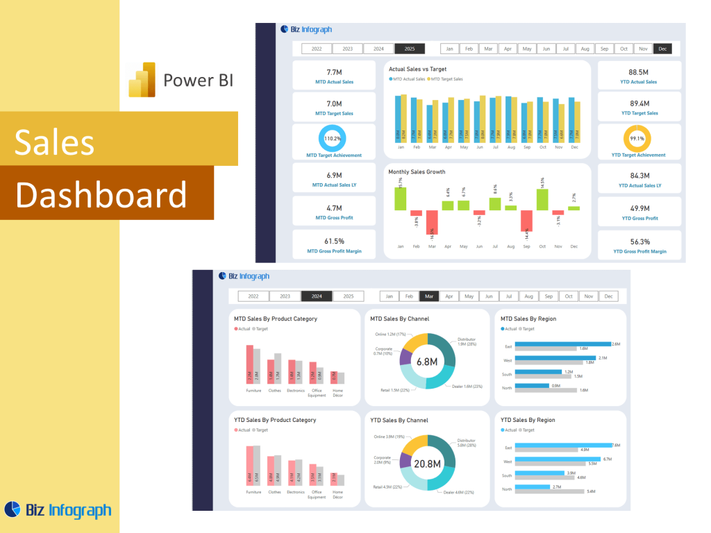
A Power BI Sales Dashboard is an advanced data visualization tool that helps businesses monitor sales metrics, track performance, and identify trends. Built using Microsoft Power BI, this interactive dashboard consolidates data from multiple sources, such as CRMs, spreadsheets, and marketing platforms like the Google Ads Dashboard or Facebook Ads Dashboard. It displays real-time data on sales by region, product sales, and sales funnel progress. The Sales dashboard provides an overview of both strategic and operational insights, helping sales leaders and sales reps make informed decisions and drive revenue growth.
Why Use Power BI for Sales Analysis and Reporting?
Power BI enables organizations to create rich, interactive dashboards without extensive coding. With Power Query, users can clean and transform raw data to create customized views and dashboards. Sales dashboards in Power BI help reduce the need for manual data entry and consolidate key insights for faster decisions. Power BI offers seamless integration with a variety of platforms and services, making it ideal for sales analytics and sales analysis dashboards. As a cloud-based solution, the Power BI Service allows teams to access reports anywhere and collaborate in real time.
Benefits of Interactive Dashboards for Sales Teams
An interactive Power BI dashboard empowers sales managers, analysts, and sales representatives to explore their data freely. By using filters, slicers, and drill-down features, users can evaluate sales performance across product lines, geographies, or reps. Dashboards are designed to help identify sales trends, forecast future sales, and uncover hidden opportunities in the sales pipeline. With real-time data updating, teams can stay agile and proactive. The result is enhanced visibility, accountability, and more productive sales engagements driven by insights from a great Power BI dashboard.
Key Features and Metrics in a Sales Dashboard
Essential KPIs and Metrics for Sales Performance Tracking
An effective KPI dashboard includes core sales metrics such as revenue, conversion rate, average deal size, pipeline value, and win/loss ratio. Power BI templates make it easy to integrate these metrics into your reporting stack. These KPIs provide actionable insights that allow teams to monitor sales, manage goals, and track overall sales performance. The dashboard also displays sales figures in segmented views—such as monthly trends or sales by region—giving sales management the insights they need to evaluate performance across different territories or teams.
How to Use Power BI Templates and Examples Effectively
Templates for Power BI offer a quick and scalable way to launch a sales dashboard without starting from scratch. From HR dashboards to Power BI finance models, Power BI’s ecosystem includes dozens of templates optimized for different departments. For sales, dashboard templates often include prebuilt visuals for sales conversion, pipeline analysis, and rep performance. Reviewing examples of Power BI dashboards, especially the best Power BI dashboard examples, helps new users understand layout logic, filter designs, and effective dashboard creation. These templates serve as both inspiration and a practical starting point.
Best Practices for Building a Performance Dashboard in Power BI
When building a performance dashboard, it’s crucial to follow data visualization best practices: keep charts uncluttered, use consistent labeling, and ensure your layout guides users to the most important metrics. Power BI supports dynamic visualizations and lets users create Power BI reports using tools like the Power Query Editor to transform raw data. Define your audience—sales managers, executives, or reps—and tailor the dashboard accordingly. A good dashboard helps users gain real-time insight, align with strategic goals, and quickly access their next Power BI report with ease.
Building and Customizing a Sales Dashboard
Step-by-Step Guide to Create Power BI Sales Dashboards
To create Power BI dashboards, start by connecting to your data from various sources—such as your CRM, ERP, or Excel sheets. Use Power Query to clean and standardize the data. Then, define your key metrics and begin designing your layout in Power BI Desktop. Use cards, bar charts, line graphs, and maps to build a dashboard that displays sales clearly and interactively. The dashboard allows real-time filtering and role-based access so each sales representative or manager sees the most relevant data.
Using Power BI Reports and Templates for Sales Analysis
Power BI reports are the backbone of sales analysis. You can use dashboard templates to generate detailed reports showing daily, weekly, or monthly sales, quota attainment, and pipeline velocity. Templates streamline the reporting process, and allow teams to create automated reports with minimal setup. The dashboard contains pages dedicated to sales performance, lead sources, and opportunity stages, helping you understand not just what’s happening—but why. By using Power BI templates effectively, your team can produce polished, reliable insights fast.
Enhancing Sales Conversion Insights with Analytics Dashboards
A well-crafted analytics dashboard can help sales and marketing teams boost conversions by revealing patterns in customer behavior, sales engagement, and lead nurturing. For example, monitoring sales funnel stages can expose bottlenecks and missed opportunities. These dashboards use AI-powered visualizations and smart metrics to predict future sales and inform campaign performance strategies. Power BI provides advanced modeling tools that let users run “what-if” analyses or compare overall sales across time periods. Combined with conversion data, your dashboard is designed to turn insights into action.
Real-World Applications and Examples
Great Power BI Dashboard Examples for Sales Analytics
Reviewing great Power BI dashboard examples offers insight into real-world layouts that maximize user engagement and decision-making. Leading companies use dashboards that combine product sales data tracking with region-specific breakdowns, sales rep leaderboards, and customer segmentation views. These examples showcase how a dashboard shows more than just metrics—it tells a story. Studying the best Power BI dashboard examples can inspire your own dashboard creation, providing blueprints for effective design, navigation, and feature integration.
How Microsoft Power BI Supports Scalable Sales Reporting
Microsoft Power BI is built for enterprise scalability. It supports thousands of data rows, integrates with popular cloud services, and facilitates company-wide collaboration via Power BI Service. Whether you’re managing five reps or five hundred, Power BI sales dashboards can scale with you. With row-level security, data refresh schedules, and global filtering, the platform ensures consistency and access control. This makes it an ideal software tool for companies that need to manage growing sales teams and increasing data complexity.
Industry Use Cases and Templates for Power BI Dashboards
From SaaS to retail, industry use cases for Power BI sales dashboards are vast. SaaS firms may focus on churn rates and sales conversion, while retail companies may emphasize sales by region and seasonal trends. Power BI templates adapt to these needs with prebuilt components tailored for each sector. Users can select from templates for Power BI specific to their vertical, accelerating deployment while ensuring relevance. By aligning templates with sales analytics goals, companies across industries can benefit from data-driven decision-making.
Real-time data analysis helps visualize KPIs and total sales effectively, allowing businesses to monitor performance using a comprehensive dataset and make timely decisions based on accurate, actionable insights.
For ready-to-use Dashboard Templates: