Why Telecommunication KPI Dashboards Matter in Telecommunications
How telecom dashboards help telecom companies monitor performance
In the modern telecom industry, performance is not measured once per month—it must be monitored every day, often in real time. A well-built telecommunications dashboard gives telecom companies the visibility they need to track network performance, customer service quality, commercial results, and operational execution using one centralized view. Instead of fragmented reports, a telecom dashboard provides a consistent format with key widgets, icons, and digestible graphics that show essential information quickly. Managers use these dashboards to detect early warning signals—service outages, increasing support tickets, declining customer satisfaction, or revenue decline. Dashboards support strategic decision-making because they centralize operational performance metrics and show areas for improvement before problems become large. Ultimately, dashboards enable telecom companies to ensure service quality and communicate performance clearly to stakeholders.
Turning telecom industry data analytics into KPI insights
Telecommunications generates massive volumes of complex operational data—network logs, customer support systems, billing platforms, and campaign results. This is where data analytics becomes critical. A KPI dashboard transforms raw telecom data into actionable insights by applying structured KPIs and clear data visualization. For example, dashboards can analyze average response time trends, reveal customer retention rate changes, and identify patterns in support tickets by region or product. With BI reporting, telecom teams can evaluate effectiveness of customer acquisition campaigns, compare performance per month, and optimize communication strategy. Instead of reporting “what happened,” dashboards are designed to showcase “why it happened” and “what should be done next.” That shift—from reporting to improvement—is why telecom KPI dashboards are essential for telecom companies today.
What Makes a Strong Telecommunications Dashboard Template in Excel
Must-have telecom KPIs and business metrics to track
A strong telecommunications dashboard template must include KPIs that reflect both customer experience and business outcomes. Core key performance indicators include network performance KPIs (service availability, latency, downtime), customer service KPIs (support ticket volume, average response time, first-contact resolution), and revenue KPIs (total revenue, ARPU/average revenue per customer, churn and customer retention rate). Telecom companies also monitor cost per customer acquisition and campaign effectiveness to evaluate marketing and commercial strategy. When these KPIs are combined, decision-makers gain a clear overview of operational health and growth performance. Dashboards should be designed to enable quick diagnosis—when customer satisfaction drops, the dashboard should show whether the cause is service quality, customer service delays, or billing issues. This KPI structure creates a strong dashboard to track performance holistically.
Telecom dashboard overview design and BI reporting layout
The best telecom dashboard overview layout begins with an executive summary: KPI widgets at the top showing network performance, customer satisfaction, average response time, ARPU, and revenue per month. Below this, the dashboard should include graphic trend charts, breakdown visuals by region, channel, or product, and drill-down sections for deeper analysis. A modern template should be visually clean, concise, and digestible. Managers should be able to modify filters instantly and analyze performance in seconds. BI design must also consider stakeholder needs—executives require concise insights, operational managers need detailed metrics, and specialists require diagnostic data. A good format uses consistent icons, clear labels, and simple visuals that communicate performance metrics effectively. When dashboards provide clarity and structure, telecom companies can tailor reporting without recreating analysis every time.
Dashboard examples that improve monitoring and analysis
Effective dashboard examples go beyond charts—they create a monitoring system. For instance, a customer service dashboard example might highlight rising support tickets and automatically showcase the top complaint categories. A finance dashboard example might show ARPU trends alongside churn shifts. A network monitoring dashboard example can detect sudden network performance drops and display service-quality deviations by region. These dashboard examples improve analysis by linking KPIs to operational causes and actions. They also support communication strategy by presenting results in a visually compelling format that stakeholders understand. Telecom dashboard examples are particularly powerful when they centralize data from multiple sources into one analytics dashboard, making monitoring consistent. The goal is always the same: ensure visibility, enable decision-making, and provide actionable insights for improvement.
Customer Service & Customer Experience KPI Dashboard
Customer service KPIs to track customer satisfaction
Customer service is one of the most measurable drivers of customer satisfaction in telecommunication services. This KPI dashboard template focuses on metrics such as number of support tickets, average response time, resolution time, escalation rate, and customer satisfaction scores. It also monitors service quality complaints to help managers identify issues early. A dashboard provides quick visibility into team performance and workload distribution across agents. Using widgets, the dashboard can show daily volumes and per month trends in a digestible graphic layout. Telecom managers use these performance metrics to ensure service-level consistency, improve efficiency, and protect customer retention rate. When customer satisfaction declines, this dashboard helps telecom companies detect whether delays, system issues, or lack of staffing caused the problem—so corrective actions can be taken immediately.
Customer experience analytics to analyze service issues
Customer experience depends on more than ticket resolution—it includes the customer’s full journey, from onboarding to billing clarity to service reliability. This analytics dashboard template allows telecom teams to analyze the complete customer experience by combining customer service KPIs with feedback signals and complaint patterns. Dashboards can showcase complaint reasons, highlight areas for improvement, and track resolution effectiveness after process changes. For example, a dashboard can reveal that service complaints increase after certain campaigns because onboarding messaging is unclear, requiring a modified communication strategy. By centralizing service-quality insights, telecom companies can tailor improvement plans. This dashboard is designed to help specialists and managers evaluate effectiveness of interventions and optimize customer satisfaction proactively rather than reacting after customers churn.
Revenue & ARPU Performance Dashboard
Revenue KPIs and average revenue per customer tracking
In the telecom industry, revenue stability is driven by subscriptions and retention. This dashboard template focuses on revenue KPIs including total revenue, revenue per month, and average revenue per customer (ARPU). It also supports segmentation—ARPU by product type, region, channel, or customer group—so decision-makers understand what drives profitability. The dashboard provides a clear overview of customer acquisition outcomes, upgrades, downgrades, and revenue leakage. Telecom companies use this dashboard to monitor revenue performance metrics and ensure that growth strategies are financially healthy. When revenue declines, the dashboard highlights whether the reason is churn, pricing pressure, service issues, or campaign effectiveness. This supports strategic planning and faster decision-making with data analytics.
Telecom companies revenue analytics dashboard examples
Revenue dashboard examples become powerful when they connect commercial performance to operational drivers. For instance, a revenue analytics dashboard can show ARPU trends alongside customer retention rate, or revenue drops alongside rising support tickets. Such dashboard examples reveal cause-and-effect relationships: network performance problems may reduce customer satisfaction, leading to cancellations and lower revenue. Dashboards can also evaluate campaign results by comparing acquisition volume, cost per customer, and ARPU quality by channel. With BI-based dashboards, telecom leaders can visualize which campaign created profitable customers and which produced high churn. The dashboard provides actionable insights that help optimize pricing, product packaging, and customer experience design. These analytics dashboards centralize revenue intelligence and help stakeholders communicate results clearly.
Network Monitoring & Operations KPI Dashboard
Telecom KPIs to monitor service quality performance
Network monitoring dashboards are fundamental for telecom companies because service quality is the foundation of customer experience. This KPI dashboard template focuses on network performance metrics such as uptime, downtime frequency, latency, packet loss, throughput, and congestion levels. Dashboards use visuals and icons to highlight service quality deviations quickly so managers can detect issues early. When a network KPI breaches thresholds, the dashboard can highlight affected regions or products. Telecom operators use this dashboard to ensure service reliability, reduce repeated outages, and improve customer satisfaction. When combined with customer metrics, it becomes even more powerful—showing how network performance affects support ticket volume and customer retention rate. A well-designed monitoring dashboard strengthens operational control and reduces risk.
Operations dashboard to track incidents and resolution
Beyond monitoring network status, telecom companies need dashboards that track operational incident workflow. This dashboard template tracks number of incidents, average response time, average time to resolve, backlog, root-cause categories, and resolution effectiveness. It also supports visibility into who is responsible: team, region, vendor, or system. A dashboard to track incidents helps managers optimize efficiency and prioritize critical issues. With real time reporting, stakeholders can see where bottlenecks exist and allocate resources quickly. Dashboards also improve communication because they provide a concise format for leadership updates. This operations dashboard is essential information for telecom management because it ensures accountability, speeds resolution, and supports stronger service quality outcomes.
Executive Telecommunications Overview Dashboard
KPI dashboard overview for leadership decision-making
Executives need an overview dashboard that summarizes telecommunications performance in one screen. This template provides top KPI widgets such as network performance, customer satisfaction, ARPU, revenue per month, churn, and customer acquisition results. The dashboard is designed to be concise and digestible, helping decision-makers quickly understand what is happening across commercial and operational areas. A leadership dashboard must communicate essential information clearly—using clean visuals, graphics, and standardized icons. It enables strategic review meetings, stakeholder reporting, and executive alignment. Unlike technical dashboards, executive overview dashboards focus on outcomes and accountability: what is improving, what is declining, and what actions are needed. This template supports fast decision-making and ensures leaders stay connected to performance realities.
BI dashboard reporting for telecom performance metrics
A BI dashboard takes reporting to the next level by allowing users to interact, filter, and drill down into telecom performance metrics. This dashboard template supports deeper analysis while still maintaining a clean overview format. For example, executives can click into customer satisfaction to see complaint drivers or into revenue to review ARPU by segment. The BI dashboard centralizes reporting and makes it easier to communicate results across stakeholders and managers. It helps specialists validate performance metrics and align decisions across departments. Most importantly, BI dashboards provide actionable insights—not only charts. They enable telecom leaders to evaluate effectiveness of campaigns, optimize operational execution, and tailor improvements based on real data. This makes BI dashboard reporting one of the most strategic tools for telecom company leadership.
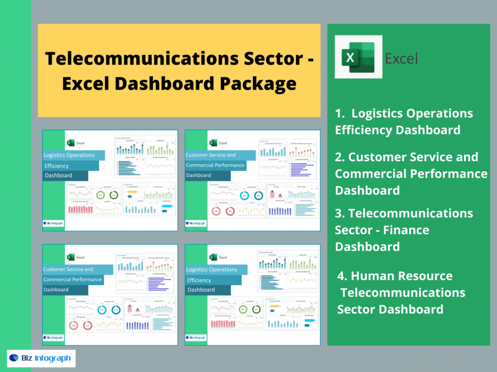
The 4 Dashboards Included in This Telecom Package
A complete telecom dashboard package should include these four dashboards in writing: Logistics Operations Efficiency Dashboard, Customer Service and Commercial Performance Dashboard, Telecommunications Sector – Finance Dashboard, and Human Resource Telecommunications Sector Dashboard. Together, they provide full operational and strategic visibility—covering service delivery efficiency, commercial performance, finance KPIs, and workforce metrics for telecom companies.
For ready-to-use Dashboard Templates: