Introduction to Sales Budget vs Actual Dashboards
What Is a Sales Budget vs Actual Dashboard?
A Sales Budget vs Actual Dashboard is an interactive visual tool designed to compare sales projections against actual results. Built in Microsoft Power BI, this type of dashboard provides a real-time look at how well an organization is meeting its financial goals. The dashboard helps teams conduct detailed budget vs actual analysis by showing key financial data such as sales revenue, actual expenses, and cost of goods sold. This dashboard using Power BI supports better forecasting, improves accuracy, and empowers sales managers with quick, visual insights to make informed decisions.
Importance of Comparing Budget and Actual Sales
Comparing actual vs budget values allows businesses to spot variances, identify underperforming products or regions, and take corrective action. These insights are vital for course-correcting strategies and improving future planning cycles. A budget vs actual dashboard lets users examine the actual numbers against forecasts to see where expectations align with reality. In dynamic environments, this comparison ensures accountability and informs management on whether objectives are realistic or require adjustment. By integrating forecast data, decision-makers can also see trends over time and plan accordingly for upcoming quarters.
Why Use Power BI for Budget vs Actual Dashboards
Power BI provides a comprehensive platform for building scalable, flexible dashboards. With features like Power Query Editor, users can transform and model data for easy analysis. Power BI also supports automated data refreshes, multiple data sources like Excel or SQL, and offers extensive customization through dashboard features such as filters, slicers, and DAX measures. A dashboard in Power BI also allows for publishing and sharing interactive reports across departments, fostering collaboration. Many organizations start with a Power BI template or download free templates to accelerate deployment, benefiting from best practices already embedded in the structure.
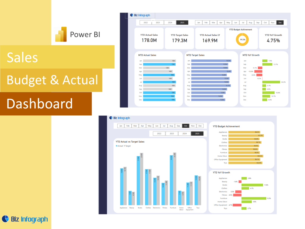
Key Components of the Dashboard
Core Metrics in a Sales Budget vs Actual Dashboard
Key metrics typically found in a sales budget vs actual dashboard include actual sales revenue, budgeted sales, variance, and variance percentage. Other important elements might include cost of goods sold, gross margin, and cumulative forecast accuracy. These metrics support in-depth variance analysis, which helps organizations evaluate sales performance relative to expectations. A well-designed dashboard will also include dynamic KPIs and conditional formatting to highlight performance gaps. These elements are essential to understanding the business context and aligning operational goals with strategic targets.
Visualizing Forecast, Budget, and Actual Sales Data
Effective dashboards visualize data using bar charts, line graphs, and cards to compare actual numbers with forecast data and budgeted goals. This visual layer helps users see trends over time and uncover patterns that might be hidden in tables. By combining actual dashboard in Power BI capabilities with clear visuals, users can easily digest complex data and communicate outcomes across teams. For example, integrating a budget vs actual report with interactive visuals enables sales teams to drill down by region, time period, or product type, improving strategic alignment.
Structuring an Effective Actual Dashboard in Power BI
Creating a well-structured actual dashboard in Power BI involves several best practices. Use Power Query Editor to clean and organize data across different sources. Design intuitive layouts using tiles and KPIs that align with stakeholder needs. Group related information—for instance, show budget, actual, and variance together—to simplify analysis. Include filters and dynamic slicers to allow users to customize their views. A typical dashboard should be easy to navigate, provide a comprehensive overview, and enable users to explore data without getting overwhelmed. Leveraging bi offers like interactive features, bookmarks, and tooltips enhances user engagement and drives data-driven decisions.
Building a Sales Budget vs Actual Dashboard in Power BI
Step-by-Step Setup of a Budget vs Actual Dashboard
To build a vs actual dashboard in Power BI, start by gathering relevant data sources like Excel spreadsheets, ERP exports, or databases. Use Power Query Editor to clean and combine your datasets. Next, create calculated columns and measures using DAX—for example, Variance = Actual Sales - Budgeted Sales. Load this model into your workspace and begin designing your visuals. Include key KPIs and charts such as monthly trends, variance bars, and cumulative progress lines. Use dashboard templates to save time and standardize your layout. Finally, publish the Power BI report and schedule data refreshes for ongoing accuracy.
Best Practices for Designing the Dashboard
Designing an effective budget vs actual dashboard starts with clear objectives. Focus on actionable insights and align visualizations with business questions. Avoid clutter—group related data and prioritize space for KPIs. Use color wisely to distinguish between budget, actual, and forecast metrics. Build with scalability in mind: structure your data model for easy updates and ensure your visuals remain responsive. Use bookmarks and filters to guide users through their journey. Incorporating best practices in layout, labeling, and interactivity ensures your dashboard delivers value and improves the efficiency of the reporting process.
Maintaining and Updating the Dashboard with Real-Time Data
Maintaining your dashboard in Power BI involves regularly validating data, adjusting visuals, and updating measures to reflect new goals or assumptions. Set up data refreshes using gateways or scheduled syncs to keep your reports live. Establish version control and documentation so your team knows the purpose and structure of each component. Monitor usage and solicit feedback to improve functionality over time. Leverage Power BI’s community and documentation for updates and optimization tips. With consistent care, your sales budget vs actual dashboard will remain a reliable tool for tracking performance and enabling strategic foresight.
The BI budget vs actual dashboard uses DAX and multiple data sources to visualize sales data, compare actual results with budget data, and data analysis key metrics through effective data visualization techniques. Interact with this Power BI business intelligence tool to explore trends over time, visualize budgeted figures with bar charts and KPI cards, and make informed decisions by identifying trends and improving financial performance using efficient data in a comprehensive view.
For ready-to-use Dashboard Templates: