Introduction to the Sales Budget vs Actual Dashboard in Excel
Purpose of a Budget vs Actual Dashboard in Excel
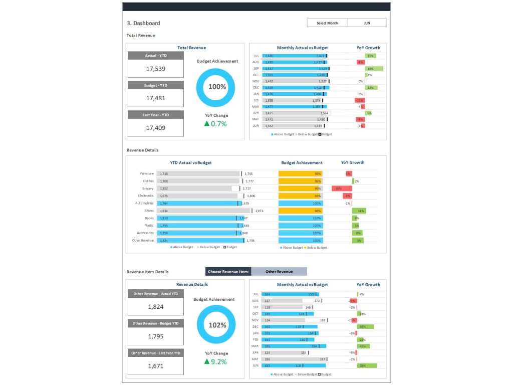
A Sales Budget vs Actual Dashboard in Excel serves as an essential tool for evaluating how your sales efforts align with financial expectations. It helps in comparing budgeted amounts and actual figures, identifying discrepancies in actual revenue, and measuring actual financial performance against targets. This type of vs actual dashboard in Excel allows teams to monitor performance across the current year and ensures visibility into whether actual results reflect a positive variance or if adjustments are necessary. These dashboards support both budget and last year comparison, enabling sales and finance leaders to detect trends and make decisions based on data, not assumptions. Businesses often use this budget vs actual method to forecast, adapt, and succeed.
Importance of Tracking Actuals and Variance in Sales
Tracking actuals, especially in sales, provides vital insights into actual spending, revenue gaps, and sales performance over time. Without proper tracking, a business risks overspending or missing critical revenue targets. A well-structured budget vs actuals report shows how actual amounts stack up against expectations. This comparison with a budget is what drives variance analysis, helping stakeholders calculate variances with precision and understand where underperformance or overachievement exists. By comparing the actual and budgeted numbers through an interactive Excel layout, leaders can analyze progress monthly or quarterly and course-correct before fiscal issues arise.
Key Components of the Excel Dashboard
Using Excel Templates to Streamline Budget vs Actual Tracking
A variety of dashboard templates are available to build a sales budget vs actual dashboard in Excel, many of which come as a free budget vs actual excel template or spreadsheet template. These templates provide the structure for tracking, comparing, and presenting actual results versus plan, making the dashboard both dynamic and flexible. The best Excel spreadsheet dashboards include sections for actual revenue, sales targets, and budgeted amounts, allowing for a clean and scalable design. A high-quality actual template ensures data is properly aligned with business periods and budget categories. Using such tools, sales managers can avoid errors and maintain up-to-date insights without building from scratch.
Drop-Down Menus and Dynamic Columns for Easy Navigation
One of the most powerful Excel features is its ability to create interactive dashboards using drop-down menus, slicers, and dynamic column filtering. In a vs actual dashboard in Excel, drop-downs can filter by month, product, sales region, or department, enabling users to isolate and review key actual and budgeted comparisons. These elements make the dashboard more user-friendly and reduce the need for manual edits across multiple sheets. By configuring these features, you can pull real-time data and results from a central data source within the Excel spreadsheet, allowing for instant insight without clutter or confusion in the layout.
Integrating Charts for Clear, Visual Comparison
To interpret numbers more intuitively, it’s essential to visually present data using graph options like bar charts, line graphs, and combo charts. A well-designed dashboard in Excel will include a clear visualization of actual vs budget trends, making sales performance insights accessible at a glance. Charts help distinguish between actual results, planned budgets, and revenue detail, which is crucial for financial analysis and strategic planning. Using Excel templates, businesses can build visual dashboards that adapt to filters and display dynamic changes—making comparison with a budget more efficient, digestible, and meaningful for stakeholders and executives alike.
Variance Analysis and Financial Insights
How to Calculate Variances Between Budget and Actual Sales
One of the primary functions of this dashboard is to calculate the variance between planned and actual outcomes. Variance is the difference between budgeted amounts and the actual results. A positive variance indicates performance that exceeds expectations, while a negative one calls for investigation. The Excel formula typically used is:=Actual - Budget
which is followed by calculating the percentage difference to highlight material deviations. Variance analysis in this context helps identify gaps in sales performance, underperforming regions, or aggressive budgeting errors. Adding color-coded visual cues in the dashboard layout ensures these variances are noticeable and actionable for any user, especially in a financial analysis context.
Applying Excel Formulas for Efficient Financial Analysis
Excel provides powerful tools for conducting financial analysis using formulas such as IF, SUMIFS, VLOOKUP, INDEX-MATCH, and conditional formatting. These functions automate data extraction and help compare actual financial performance against the budget efficiently. For instance, using SUMIFS allows the aggregation of actual spending across multiple criteria (e.g., department, month). In a budget vs actuals dashboard, formulas also help with flagging outliers or calculating year-to-date results. Implementing these correctly within your dashboard templates improves the accuracy of your reports and helps ensure insights are driven by up-to-date and well-structured data.
Gaining Visual Insight Through Chart-Based Comparison
Combining formulas with charts creates a compelling way to visually explore sales and financial performance. Line charts are ideal for showing trends over time, while bar or column charts can break down monthly or quarterly actual revenue compared to planned values. When building a dashboard template, integrating these visuals enhances understanding and allows for real-time tracking of actual vs projections. Color-coding, data labels, and annotations further support quick decision-making. Ultimately, these charts enable you to compare budgeted and actual figures side-by-side in a format that’s simple to interpret—even for non-financial users.
Building and Customizing the Dashboard
Step-by-Step Guide to Creating an Excel Dashboard Template
To create a Sales Budget vs Actual Dashboard in Excel, start by gathering your data sources, such as actual template files, budget data, and forecast spreadsheets. Create a structured spreadsheet template with clearly labeled tabs—Data, Calculations, Dashboard, and Charts. Use pivot tables or dynamic tables to consolidate actual and budgeted amounts. Apply necessary formulas to calculate variances, and incorporate drop-down filters for interactivity. Add charts for revenue detail, and finalize your layout with proper formatting and conditional color schemes. Once done, this Excel dashboard becomes your go-to solution for monthly or quarterly financial analysis, streamlining both planning and performance reviews.
Tips for Structuring Columns and Displaying Data Visually
When building the dashboard layout, clarity is key. Structure your columns by category: budget, actual, variance, and percentage variance. Align months or quarters across the top, and use vertical rows for product lines, regions, or sales channels. Include a comparison with a budget column that instantly reflects deviation. Use Excel’s formatting tools to apply color gradients and icons that represent positive variance or underperformance. Add a graph section using bar or line charts that updates dynamically based on filters. Structuring the sales dashboard this way ensures clean navigation and immediate insights without overwhelming the user.
Enhancing Decision-Making with Actual vs Budget Insights
The ultimate goal of a budget vs actual dashboard template in Excel is to drive smarter decisions. By comparing actual financial performance to forecasts, businesses can adjust marketing spend, change sales strategies, or reprioritize inventory. Having access to real-time data and results enables management to act promptly. With every update, the dashboard offers insights on actual spending, revenue growth, and budget efficiency, supporting both high-level decisions and granular team reviews. Whether you’re a small business or a large enterprise, this kind of interactive, formula-powered dashboard becomes an indispensable asset in your financial toolkit.
For ready-to-use Dashboard Templates: