Understanding the Expense Budget vs Actual Dashboard in Power BI
What is an Expense Budget vs Actual Dashboard template in Power BI?
An Expense Budget vs Actual Dashboard in Power BI is a powerful dashboard example designed to help finance professionals and decision-makers compare budgeted figures against actual expenses across multiple dimensions such as time, department, and cost centers. By leveraging the capabilities of Microsoft Power BI, this management dashboard offers interactive features, allowing users to drill down into specific categories like actual income and expenses or actual revenue streams. The dashboard in Power BI provides a centralized platform for visualizing budget data, with key metrics such as variance, monthly budget, and department-level budget utilization clearly displayed. It simplifies budget management by tracking actual figures in real time, helping finance teams make informed decisions and optimize resource allocation.
Benefits of Using Power BI for Budget vs Actual Analytics
Building a budget vs actual dashboard using Power BI template provides several benefits. It enables users to consolidate data from multiple data sources, including Excel dashboards, Google Sheets, Xero dashboard, and CRM dashboards, into a single Power BI report. The dashboard provides clear insights by comparing actual vs budget figures, identifying budget allocation gaps, and offering data visualization features like bar charts, variance indicators, and KPI widgets. The analytics dashboard helps users track and analyze actual sales and actual income and expenses, ensuring accurate forecasting. With Power BI service, teams can collaborate on budget planning while maintaining transparency and consistency across reports.
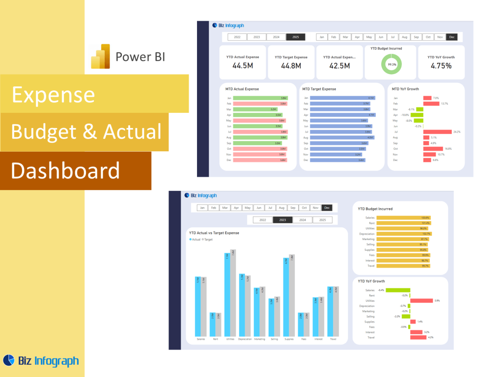
Key Metrics and Visuals in the Expense Budget vs Actual Dashboard
A well-designed expense budget vs actual dashboard in Power BI incorporates critical key metrics such as monthly budget, actual figures, variance, budget utilization percentage, and revenue vs budget. The dashboard design includes KPI dashboard components like gauges, sparklines, and variance charts, which enable users to quickly grasp performance at a glance. By using Power BI’s analytics capabilities, the dashboard helps finance teams identify patterns, anomalies, and trends over time, including budget tracking across multiple departments. The template also integrates with Excel or Google Sheets, supporting prebuilt dashboard templates for ease of use. Microsoft Power BI enables the creation of real-time, interactive dashboards that promote data-driven decision-making.
Creating and Customizing the Expense Dashboard Using Power BI Templates
The Power BI dashboard template simplifies the process of creating a comprehensive budget vs actual dashboard. Users can start with prebuilt templates from Microsoft, Google Sheets templates, or spreadsheet templates and customize them with Power Query to fit their specific budget management needs. The template supports budget planning, expense tracking, and monthly budget spreadsheet, profit and loss spreadsheet, financial performance, KPIs, integration, ensuring seamless data flows. Dashboard offers features like variance tracking, performance dashboards, and sales budget vs actual dashboards, helping teams make informed decisions by converting data into actionable insights. Using a prebuilt dashboard layout or template helps ensure best practices, reduces development time, and guarantees consistency in reporting.
Best Practices for an Effective Expense Budget vs Actual power BI Dashboard
To build an effective Expense Budget vs Actual Dashboard in Power BI, teams should follow best practices such as standardizing data sources, validating actual sales and budget data, and using consistent KPI dashboard designs. Incorporating budgeted figures, actual dashboards, and variance analysis in the same visual space improves clarity. Leveraging Power BI service enables collaboration, while dashboard examples and reporting templates provide inspiration and benchmarks for success. A well-structured dashboard should include filters for monthly budget, actual sales, and expense categories, as well as integration with analytics dashboards, finance dashboards, and sales dashboards to present a holistic view of the organization’s financial health.
For ready-to-use Dashboard Templates: