Introduction to Expense Budget vs Actual Dashboards
What is an Expense Budget vs Actual Dashboard?
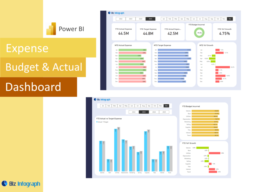
An Expense Budget vs Actual Dashboard is an interactive tool that allows finance and operations teams to track and analyze spending performance across departments, time periods, and categories. Built as an actual dashboard using Microsoft Power BI, Excel, or Google Sheets, it visually compares budgeted figures against actual expenses to monitor progress and maintain fiscal control. By summarizing both budget data and actuals, the dashboard serves as a comprehensive source of truth that enhances financial performance visibility. Whether created using a dashboard template or custom-built with SQL and Power Query, it supports faster, more strategic decision-making.
Why Use Power BI to Track Expenses vs Budget?
Using Power BI to monitor budget vs actual data enables real-time insight into your organization’s financial health. Unlike static spreadsheets, Power BI dashboards allow for interactive exploration of trends by department, monthly budget, and actual figures. Built-in calculation capabilities through DAX formulas and integrations with various data sources enable teams to identify areas of overspending and underutilization. With filter features, users can select specific periods or cost centers, optimizing the dashboard’s use across business units. This capability enhances transparency, accountability, and alignment with financial goals.
Benefits of Visualizing Expense Data with Dashboards
Visual dashboards built in Power BI, Excel, or Google Sheets enhance financial awareness by turning raw spreadsheet data into actionable insights. Visual components like column charts, gauge indicators, and graph elements allow for easy comparisons between budgeted figures and actual expenses. The dashboard provides an overview of performance at a glance, helping executives and accountants make informed decisions and optimize spending strategies. This visibility into income and expense flows supports better accounting practices and ensures every department remains within financial limits while achieving profit targets.
Key Components of an Expense Tracking Dashboard
Essential KPIs and Metrics for Monitoring Expenses
A successful expense budget vs actual dashboard includes core KPIs such as total expenses, variance amount, variance percentage, and profit and loss status. These key metrics highlight how well the business is tracking against its financial plan. Adding real-time variance indicators using gauge visuals or column comparisons makes it easier to monitor actual vs projected values. Other kpis might include expense-to-revenue ratio, department-level budget utilization, and average cost per activity. These figures offer insight into day-to-day financial performance and allow leaders to act proactively when discrepancies arise.
Calculating Budget vs Actual Using DAX and Power Query
Building effective variance logic starts with preparing your budget data and actual expenses using Power Query for cleaning and transformation. Once your data sources are modeled properly, use DAX for calculating differences with formulas like Variance = Actual - Budget and Variance % = (Actual - Budget) / Budget. These simple yet powerful formulas automate calculation and update dynamically with new data inputs. Whether you’re using a spreadsheet, SQL database, or Excel file, the process remains scalable for complex business structures. Applying these calculations helps standardize reporting and ensures consistency across multiple teams.
Visual Elements: Charts, Tables, and Gauges for Clarity
A strong dashboard layout includes a mix of visuals like column charts, tables, gauge indicators, and comparison graphs. These elements make it easier to scan for anomalies and track patterns in actual revenue, actual expenses, and total income and expense flow. Interactive visuals enable users to filter by business unit, cost type, or time frame—making the dashboard both accessible and functional for different audiences. Whether you’re using a custom analytics layout or a prebuilt dashboard template, strong visuals help communicate financial trends clearly and facilitate stakeholder engagement.
Designing the Dashboard in Power BI
Choosing the Right Dashboard Template or Spreadsheet Source
Starting with a good dashboard template helps speed up development while ensuring best practices are followed. Templates from Microsoft, Excel, or Power BI repositories are pre-configured with visuals and calculation logic tailored to budget vs actual analysis. Teams can also use structured spreadsheet models or explore Google Sheets templates as a base, which can then be imported into Power BI. Choosing the right template depends on your goals—some templates focus on high-level dashboards, while others dig deep into monthly or departmental analysis. A strong starting point helps reduce errors and enables quick customization.
Organizing Data by Monthly Budget and Category
Effective dashboards are built around structured monthly budget tracking and expense categorization. Grouping data by type (e.g., marketing, operations, HR) and time period allows teams to easily detect unusual spikes or dips. Using Power Query and DAX, teams can create dynamic time intelligence measures to show period-over-period changes. Organizing your income and expense lines into a standard hierarchy also helps maintain consistency and improves data analysis. A well-organized data model lays the foundation for easy-to-read visualization and flexible reporting filters.
Customizing the Dashboard for Your Organization’s Needs
Customization is key to ensuring the dashboard aligns with organizational structure and strategy. Tailor KPIs, visual layouts, color schemes, and labels to reflect your company’s internal reporting language. For instance, you may want to track actual revenue versus marketing costs or actual expenses across cost centers. Add user-based filters to accommodate different departmental views, enabling each team to focus on what matters most. With Power BI’s custom visuals and interactivity features, every element—from the template to the dashboard’s behavior—can be adjusted to suit specific reporting needs.
Practical Use Cases and Applications
Use Cases Across Finance and Operations Teams
Finance teams use actual dashboards to support monthly reporting, audits, and quarterly business reviews. Operations teams rely on them to ensure department-level budget compliance and forecast alignment. For leadership, these dashboards serve as critical input in high-level strategy sessions and budget planning. Use cases also include vendor spend tracking, capital expenditure monitoring, and headcount-to-budget analysis. These dashboards support the full spectrum of business reporting and make actual vs budget management part of everyday workflow.
How to Update and Maintain Your Dashboard Over Time
Maintaining a budget vs actual dashboard means ensuring data refreshes run on schedule and that underlying data models remain valid. Using Power Query automation and consistent data structure ensures new actuals and budgeted figures load correctly. Set up alert thresholds and use version control for managing template updates. Teams should regularly validate key metrics and formulas to ensure alignment with updated accounting policies or structural changes. Ongoing maintenance guarantees the dashboard helps your team stay accurate, compliant, and data-driven.
Download Options and Integration with Excel or Google Sheets
Many teams still use Excel or Google Sheets for initial budgeting before importing data into Power BI. Fortunately, Power BI allows seamless integration with these formats. Once your dashboard is built, you can download reports for offline use or share them via Power BI Service. Export to spreadsheet remains a valuable feature for financial analysts who require data for detailed modeling. This interoperability supports the hybrid environments most finance teams operate in and allows for flexibility in reporting formats.
For ready-to-use Dashboard Templates: