Overview of the Energy and Utilities Finance Dashboard Package
Understanding Energy and Utilities Dashboards in the Utilities Industry
A modern utility dashboard plays a crucial role in the energy and utilities industry, giving financial teams and stakeholders a centralized data dashboard to monitor financial performance, energy use, utility bills, and long-term cost trends. This type of dashboard is built to support the complex operations of the energy sector, including power plants, utility providers, gas and coal operations, and renewable energy units seeking greener, more efficient workflows. Using real-time data and aggregated utility data, the dashboard gives decision-makers a single platform to track performance metrics, manage energy costs, and analyze financial efficiency across the organization. By consolidating data from multiple sources, the dashboard transforms disparate datasets into a reliable source of truth, enabling deeper financial analysis and consistent reporting. The dashboard also helps answer key questions about profitability, utilization, and savings opportunities, making it an essential tool for any provider wanting to identify trends and optimize performance.
Importance of Analytics and Business Intelligence for Energy Providers
In the competitive energy industry, energy analytics and business intelligence (BI) solutions are essential for utility providers looking to optimize operations and make data-driven insights accessible in real time. By embedding BI capabilities into an interactive dashboard, organizations gain a powerful tool that aggregates energy data, summarizes financial results, and highlights critical KPIs across operational and financial areas. This analytics-driven approach allows energy providers to maximize ROI, reduce energy costs, and improve financial efficiency across departments. BI dashboards facilitate both internal and external reporting by consolidating utility bills, energy prices, greenhouse gas (GHG) data, and performance metrics into one unified system. Because the platform is web-based and customizable, stakeholders gain actionable insights instantly, no matter where they are located. The dashboard is built to accommodate the growing volume of data across the industry, enabling more accurate forecasting and smarter long-term financial planning.
Key Questions the Dashboard Helps Answer with Actionable Insight
A best-in-class energy dashboard is designed to answer key questions that matter most to financial and operational teams within the utilities industry. It provides clarity on how energy costs fluctuate, where savings opportunities exist, and which assets are underperforming. The dashboard displays real-time data that helps leaders evaluate whether current strategies deliver acceptable ROI and identify trends in usage, cost spikes, or operational bottlenecks. Utility providers can explore questions such as: How are energy prices affecting margins? Which power plants generate the highest returns? Are GHG targets being met? What does the financial analysis reveal about long-term sustainability? The dashboard gives complete visibility into critical KPIs, enabling stakeholders to optimize utilization, compare portfolio performance, and respond quickly to changes in the market. Built with advanced visualization and utility analytics, this dashboard also facilitates strategic planning by converting raw utility data into actionable insights.
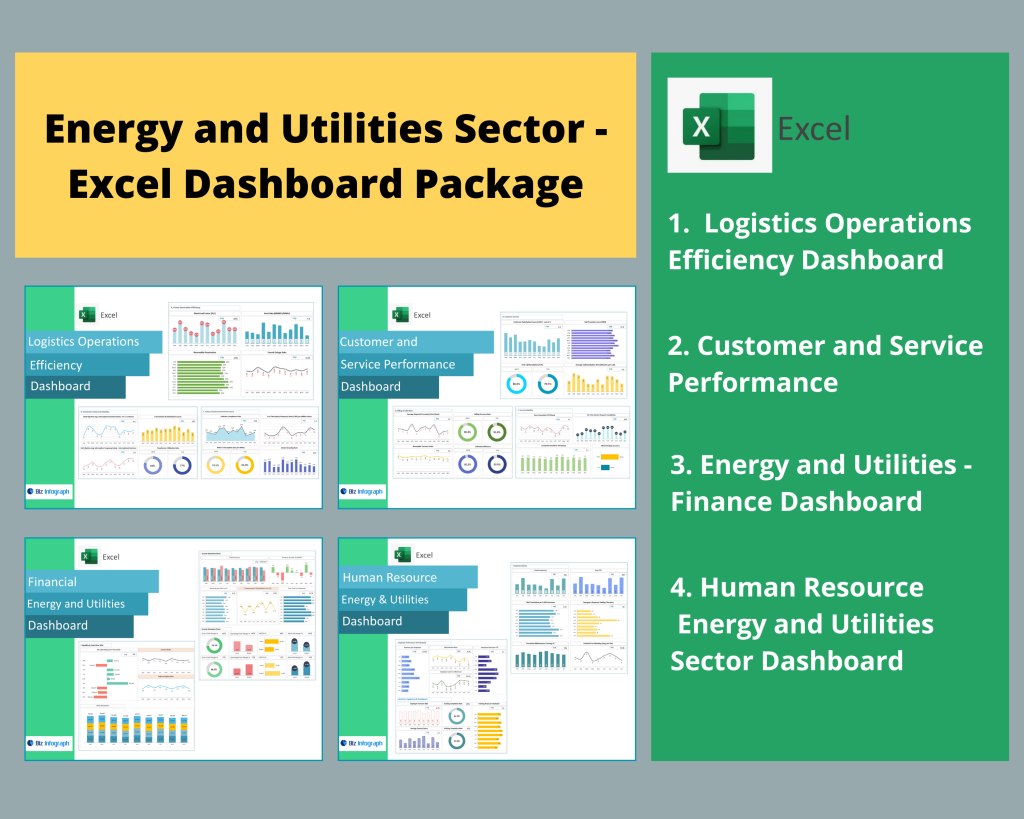
Core Features of the Utility Dashboard Spreadsheet
Essential KPIs, Metrics, and Financial Indicators to Track
A robust kpi dashboard for the energy and utilities industry tracks a wide range of key performance indicators and financial metrics that help organizations maintain control over costs, revenue, and operational efficiency. The dashboard allows teams to monitor energy use, utility bills, operational expenses, revenue per asset, and GHG emission goals. It also includes critical KPIs such as plant utilization, real-time cost per kilowatt-hour, energy prices, and financial return metrics for each part of the portfolio. The dashboard displays these metrics in a structured format, making it easier for analysts to identify trends, benchmark performance, and evaluate long-term financial outcomes. Utility data is summarized and aggregated into clear, interactive visualizations, enabling executives and operational leaders to gain a comprehensive view of energy costs and financial health at a glance. This combination of financial analytics and operational KPIs helps organizations make informed decisions that improve financial stability and sustainability.
Data Visualization Techniques for Utility Data and Energy Data
With the growing complexity of energy data, high-quality data visualization is essential for interpreting trends, comparing performance across power plants, and managing energy costs more efficiently. The dashboard is built using best-in-class visualization techniques that transform disparate utility datasets into intuitive charts, graphs, and benchmark comparisons. These visualizations help users interpret changes in energy use, assess operational risks, and gain actionable insights from both financial and operational KPIs. They also reveal hidden patterns in energy consumption, cost fluctuations, and asset-level utilization. The system can embed visuals that compare gas and coal performance, renewable vs. non-renewable efficiency, and real-time financial results. By turning raw utility data into visually compelling stories, the dashboard facilitates better reporting, clearer communication, and faster decision-making across the entire utilities industry. This enhanced visibility ensures that stakeholders can optimize energy operations while supporting greener, more sustainable goals.
Interactive Dashboard Capabilities for Better Decision-Making
The interactive dashboard provides dynamic tools for utility providers to engage with their data in real time and make data-driven decisions quickly. Built with responsive components and advanced BI features, the dashboard allows users to drill into performance metrics, compare KPI results across facilities, monitor real-time energy use, and explore financial analytics with just a few clicks. Stakeholders can sort, filter, and benchmark utility performance data internally and externally. This level of interactivity helps identify areas where savings opportunities are greatest, where operational inefficiencies exist, and which assets contribute best to long-term financial performance. Because the dashboard is web-based, utility teams can access it anywhere, ensuring alignment across departments. Whether analyzing cost anomalies, reviewing GHG reductions, or forecasting future utility bills, the platform facilitates strategic decisions by giving users the tools to understand trends and optimize utility management initiatives.
Dashboard Design and Customization
Customizable Energy Dashboards for Different Utility Portfolios
A fully customizable energy dashboard helps organizations adapt financial analytics and performance tracking to their specific portfolio—whether they manage a single power plant or a diverse suite of assets across gas, coal, hydro, solar, or wind. The dashboard is built to accommodate unique business models, allowing decision-makers to configure KPI dashboards, restructure layouts, and embed specialized visualizations tailored to their operational and financial needs. Users can aggregate utility data from multiple regions, customize benchmarks for each facility, and summarize key insights in easy-to-read formats. The flexibility ensures that teams can adjust dashboards as the portfolio expands, supporting long-term financial planning and optimizing energy performance. With a web-based design and seamless integration of real-time data, organizations gain the ability to monitor their assets at scale while maintaining financial efficiency and operational quality across the utilities industry.
Embedding BI, Visualization, and Analytics Tools into the Dashboard
Energy providers can embed BI tools directly into the dashboard, creating a unified system that supports advanced data visualization, deeper financial analytics, and automated monitoring across the energy and utilities industry. By combining embedded BI with utility analytics, organizations can display dashboard examples, track critical KPIs, benchmark performance, and analyze cost drivers more effectively. The dashboard is designed for integration with internal databases, third-party energy systems, and external data sources, allowing teams to aggregate information into a single platform that serves as their source of truth. Embedded visualizations reveal trends in energy prices, utilization rates, operational efficiency, and ROI across power plants. This embedded BI capability enables better oversight, improves financial decision-making, and enhances transparency across all stakeholder groups involved in managing energy.
Creating Best-in-Class Dashboard Examples for the Utilities Industry
Leading utility providers rely on best-in-class dashboard examples that demonstrate how financial analytics, utility analytics, and real-time operational monitoring can work together to support both short-term and long-term goals. These examples showcase how a dashboard can summarize utility bills, benchmark energy use, monitor GHG emissions, and evaluate performance across a diversified energy portfolio. They also highlight how dashboards can facilitate greener initiatives by tracking sustainability metrics in real time. Each dashboard case is designed to help users identify trends, interpret financial outcomes, and gain actionable insights into energy costs and operational inefficiencies. These examples not only inspire better dashboard design but also guide utility teams on how to optimize performance, enhance transparency, and support strategic financial planning.
Leveraging Analytics Across the Energy and Utilities Industry
Using Utility Analytics to Benchmark Performance and Sustainability
Utility analytics play a crucial role in benchmarking performance across the energy and utilities industry. With the ability to aggregate data from multiple sources, the dashboard allows teams to compare utilization rates, financial performance, and sustainability progress across different power plants or utility assets. By interpreting performance metrics and CO2 or GHG emission trends, organizations can track progress on sustainability goals and evaluate how operational changes impact both short-term results and long-term financial stability. The dashboard provides insights into energy use patterns, identifies inefficiencies, and highlights savings opportunities—all essential for achieving greener, more efficient utility operations. Benchmarking also supports compliance reporting and helps teams communicate improvements clearly to internal and external stakeholders.
Business Intelligence Approaches for Transforming the Source of Truth
With robust business intelligence integration, the dashboard transforms raw utility data into a centralized source of truth for financial and operational teams across the energy providers. The dashboard displays consolidated information that previously existed in disparate systems, enabling teams to summarize and analyze outcomes holistically. BI helps utility teams gain actionable insights into cost drivers, financial risks, operational bottlenecks, and performance metrics. This consolidated BI approach also facilitates real-time monitoring and supports forecasting for utility bills, energy prices, and capital planning. By creating a unified data ecosystem, BI empowers executives, analysts, and field managers to make strategic decisions that drive ROI, strengthen financial health, and ensure resilience in the rapidly changing energy and utilities industry.
How Energy Providers Use BI to Drive Operational and Financial Insight
Energy providers use BI-driven dashboards to optimize operational efficiency, ensure financial stability, and identify trends that influence performance across the entire organization. BI helps aggregate energy data, interpret financial analytics, and evaluate cost-saving opportunities in real time. The dashboard also allows teams to monitor energy use patterns, forecast utility bills, and assess how changes in energy prices affect profitability. By embedding BI tools into the system, energy providers gain a deeper understanding of performance metrics, utilization trends, and operational risks. This makes it easier to improve ROI, enhance service delivery, and support long-term financial planning. Ultimately, BI-powered dashboards give utilities the competitive advantage needed to deliver better outcomes for both internal stakeholders and the communities they serve.
Getting Started With the Energy and Utilities Finance Dashboard
Accessing Interactive Demos and Dashboard Examples
Organizations can explore the system by accessing interactive demos showcasing real-time financial dashboards, KPI dashboards, and utility analytics examples. These demos illustrate how the dashboard displays energy use, utility bills, performance metrics, and financial forecasts across different portfolios. They also highlight how stakeholders can interact with visuals, drill into cost drivers, compare asset-level performance, and interpret trends instantly. Demos are ideal for evaluating the platform’s ability to aggregate utility data, summarize insights, and provide actionable financial information that supports strategic planning. They also help teams see how real-time data and interactive dashboard design contribute to faster, more confident financial decision-making.
How to Request a Demo and Explore Full Dashboard Capabilities
Energy providers interested in exploring the full capability of the dashboard can easily request a demo, which includes a walkthrough of the platform’s analytics, visualization tools, and financial analysis features. This demo reveals how the dashboard is built, how it aggregates data from multiple sources, and how it supports long-term financial planning. It helps organizations evaluate whether the dashboard can adapt to their financial needs, handle disparate datasets, and deliver data-driven insights that enhance operational and financial performance. Requesting a demo also allows stakeholders to assess customization options, interactive features, and embedded BI capabilities, helping them determine whether the solution aligns with their goals.
Implementing an Analytics-Driven Utility Dashboard for Long-Term Growth
An analytics-driven utility dashboard supports long-term financial growth by enabling utility providers to optimize performance, lower energy costs, and enhance operational resilience. Through real-time data visualization and advanced analytics, the dashboard helps organizations identify trends, discover savings opportunities, and make data-driven decisions that strengthen financial outcomes. It consolidates disparate utility data into a single platform, allowing stakeholders to evaluate ROI, forecast energy use, and monitor GHG emissions. By embedding BI capabilities and customizing KPIs, energy providers can align the dashboard with their strategic priorities and ensure continuous improvement. This long-term approach provides a strategic advantage in the evolving energy and utilities industry.
For ready-to-use Dashboard Templates: