CEO Dashboard Guide with Actual vs Budget Excel Dashboard for Leaders
Why every CEO needs an Actual vs Budget Excel Dashboard for decision-making
In today’s data-driven business environment, every CEO must rely on real-time insights rather than assumptions. A well-designed Actual vs Budget Excel Dashboard becomes the foundation of a CEO’s dashboard, offering a single source of truth for performance monitoring. This type of dashboard provides executives with quick access to reliable data across financial, operational, and strategic areas. It allows leaders to track cash flow, monitor high-level metrics, and analyze key performance indicators in one place. CEO dashboards help leaders move beyond traditional spreadsheet reporting by transforming complex data points into insights that are easy to understand. This enables informed decisions and helps leaders drive proactive strategies that support growth and stability.
Benefits of a CEO Dashboard using Actual vs Budget Dashboard Excel
The benefits of a CEO dashboard are significant, especially when built using an Actual vs Budget Dashboard Excel format. Dashboards provide executives with a clear overview of performance metrics, allowing them to compare actual results against targets. This helps mitigate risks by identifying gaps early and ensuring corrective actions are taken promptly. A CEO dashboard should include metrics that matter—such as revenue growth, profitability, and customer satisfaction—to support executive leadership decisions. By using management dashboards, leaders gain visibility across the organization, improving alignment between departments. Ultimately, dashboards enable CEOs to make smarter decisions, enhance operational efficiency, and drive growth using data-driven decision making.
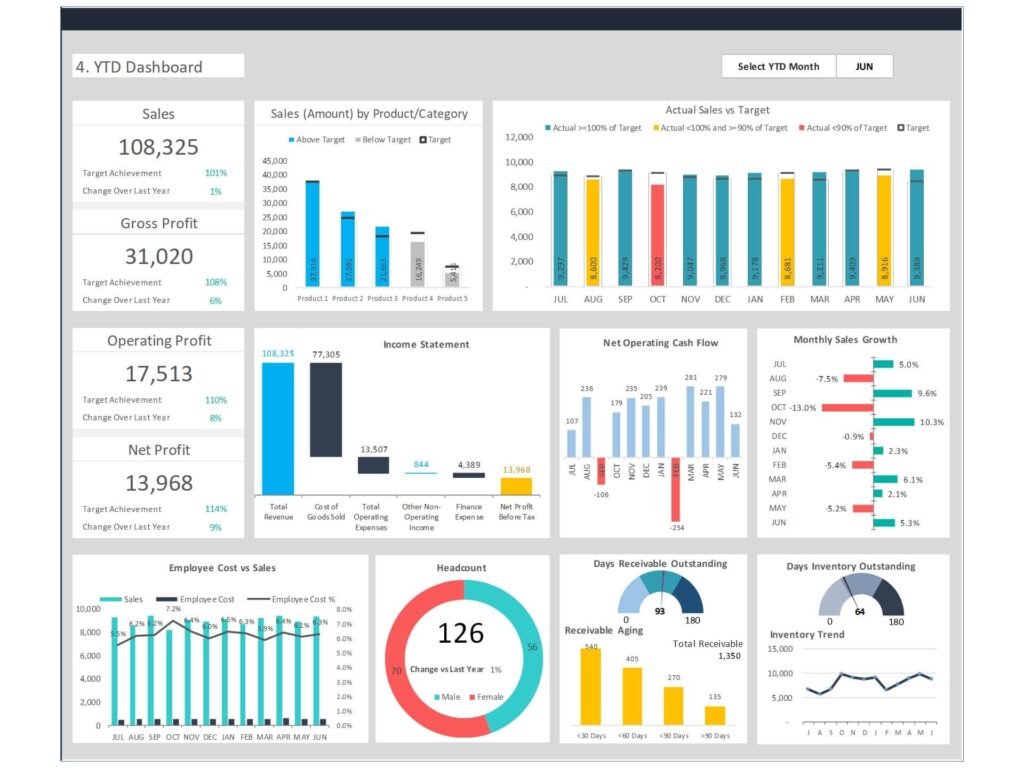
How to Build a CEO Dashboard with Actual vs Budget Excel Dashboard
Steps to build a CEO Dashboard using Actual vs Budget Excel Dashboard
To build a CEO dashboard, the first step is identifying the right data sources and defining key performance indicators. Using an Actual vs Budget Excel Dashboard, organizations can consolidate data from multiple sources such as finance systems, sales platforms, and operational tools. Once data is centralized, dashboards can be created to visualize performance indicators in a structured format. The dashboard is designed to provide insights into key metrics such as cash flow, revenue, and operational efficiency. Building your CEO dashboard involves selecting the right layout, adding KPI widgets, and ensuring data accuracy. When done correctly, dashboards provide a clear view of performance and help leaders make informed decisions quickly.
H3: Choosing the right dashboard and right metrics with Actual vs Budget Excel Dashboard
Choosing the right dashboard means focusing on the right metrics rather than overwhelming executives with too much information. A CEO dashboard should include critical metrics such as revenue, profit margins, customer experience, and employee engagement. These metrics provide a holistic view of business performance. The Actual vs Budget Excel Dashboard helps highlight variances, allowing leaders to analyze gaps between planned and actual outcomes. This approach ensures that dashboards provide meaningful insights rather than just data. By selecting the right dashboard solution and aligning metrics with business goals, organizations can create an effective dashboard that supports executive leadership and strategic decision-making.
Key KPIs in Actual vs Budget Excel Dashboard for CEO Reporting
Financial and performance metrics in Actual vs Budget Excel Dashboard
Financial performance is at the core of any CEO dashboard. An Actual vs Budget Excel Dashboard enables leaders to track financial metrics such as revenue, expenses, profitability, and cash flow. These metrics are critical for understanding the financial health of the organization. In addition to financial KPIs, performance metrics such as sales growth, operational efficiency, and customer satisfaction should also be included. By combining financial and operational metrics, dashboards provide a comprehensive view of business performance. This helps CEOs analyze trends, identify risks, and make data-driven decisions that support long-term growth.
KPI dashboard design using Actual vs Budget Excel Dashboard
A well-designed KPI dashboard is essential for executive reporting. The goal is to present key performance indicators in a way that is easy to interpret and actionable. Using an Actual vs Budget Excel Dashboard, organizations can create visualizations such as charts, graphs, and KPI tiles that highlight performance trends. Dashboard examples show that effective dashboards focus on clarity, simplicity, and relevance. The dashboard provides executives with insights into performance at both high-level and granular levels. By ensuring that KPIs are aligned with strategic objectives, dashboards enable leaders to track progress and drive performance improvements across the organization.
Interactive CEO Dashboard Using Actual vs Budget Excel Dashboard Power BI
Creating interactive dashboards with Actual vs Budget Excel Dashboard Power BI
Modern dashboards go beyond static reports—they are interactive and dynamic. Using Actual vs Budget Excel Dashboard Power BI, organizations can create interactive dashboards that allow executives to drill down into data, filter information, and explore insights in real time. Interactive dashboards enable leaders to analyze data across different dimensions, such as region, product line, or time period. This provides a deeper understanding of performance and helps identify trends and opportunities. With real-time data integration, dashboards provide up-to-date insights, ensuring that decision-making is based on the latest information. This is essential for modern CEOs who need to respond quickly to changing business conditions.
Dashboard examples for executives using Actual vs Budget Excel Dashboard Power BI
Dashboard examples demonstrate how Power BI can transform executive reporting. For instance, an executive dashboard helps track sales and marketing performance, operational metrics, and financial results in one place. By integrating data from multiple sources, dashboards provide a comprehensive view of the organization. These dashboards are designed to support strategic decision-making by highlighting key metrics and performance indicators. They also enable collaboration across the executive team, ensuring that everyone has access to the same information. By using Power BI, organizations can build modern dashboards that are scalable, flexible, and aligned with business intelligence best practices.
Using Actual vs Budget Dashboard Google Sheet for CEO Analytics
Benefits of Actual vs Budget Dashboard Google sheet for real-time analytics
The Actual vs Budget Dashboard Google Sheet is an excellent option for organizations that require flexibility and collaboration. Google Sheets allows real-time updates, making it easy for teams to share data and collaborate on dashboard development. This approach ensures that dashboards provide real-time insights and support timely decision-making. For smaller organizations or startups, Google Sheets offers a cost-effective dashboard solution that can be implemented quickly. It also integrates with other tools, enabling data from multiple sources to be combined into a single dashboard. This ensures that CEOs have access to accurate and up-to-date information at all times.
Collaboration and analytics using Actual vs Budget Dashboard Google sheet
Collaboration is a key advantage of using Google Sheets for dashboards. Multiple users can access and update the dashboard simultaneously, ensuring that data is always current. This is particularly useful for executive teams that need to review performance metrics regularly. The Actual vs Budget Dashboard Google sheet also supports data analytics by allowing users to create charts, pivot tables, and other visualizations. This makes it easier to analyze performance and identify trends. By enabling collaboration and data sharing, dashboards help organizations build a culture of data-driven decision making and improve overall business performance.
Best Practices for CEO Dashboard Using Actual vs Budget Dashboard Excel
CEO Dashboard should include the right KPIs and analytics
A CEO dashboard should include the most important KPIs and analytics that drive business success. This includes financial metrics, operational metrics, customer satisfaction, and employee engagement. By focusing on key metrics, dashboards provide executives with a clear and concise view of performance. It is important to avoid overloading the dashboard with too many data points, as this can make it difficult to interpret. Instead, focus on metrics that matter and align with business goals. By following best practices, organizations can create dashboards that are effective, actionable, and aligned with executive needs.
Improving executive dashboards with Actual vs Budget Dashboard Excel
Improving executive dashboards requires continuous refinement and optimization. Organizations should regularly review their dashboards to ensure that they remain relevant and accurate. The Actual vs Budget Dashboard Excel format allows for easy updates and customization, making it ideal for evolving business needs. Dashboards should be designed to provide insights that are easy to understand and actionable. By incorporating feedback from executives and using best practices in dashboard design, organizations can create dashboards that support better decision-making and drive business success.
How to Choose the Right Dashboard Platform
Comparing Actual vs Budget Excel Dashboard, Power BI, and Google sheet
Choosing the right dashboard platform depends on the organization’s needs. The Actual vs Budget Excel Dashboard is ideal for quick setup and flexibility, while Power BI offers advanced analytics and interactive dashboards. Google Sheets provides collaboration and real-time updates. Each platform has its strengths, and organizations should consider factors such as scalability, integration, and ease of use. By selecting the right platform, organizations can ensure that their dashboards provide maximum value and support effective decision-making.
Free trial and dashboard software options for CEO Dashboard
Before selecting a dashboard solution, organizations should consider testing different options through a free trial. This allows them to evaluate features, usability, and integration capabilities. Many dashboard software solutions offer free trials, enabling organizations to explore their capabilities before making a commitment. By testing different options, organizations can identify the best solution for their needs and ensure that their dashboards support business intelligence and data-driven decision making.
For ready-to-use Dashboard Templates: