

What if your Balanced Scorecard showed not just whether performance is on track, but what to do next? A balanced scorecard excel template can make that connection clear, but choosing useful KPIs and linking them to strategic goals takes more than filling in a spreadsheet. Measures can feel disconnected, or the workbook can become difficult to update, when definitions, owners, and review steps aren’t agreed up front.
A useful scorecard brings strategy, measures, owners, and review actions together in one clear structure. In this guide, you’ll learn how to organize Excel around the Financial, Customer, Internal Process, and Learning & Growth perspectives, then choose relevant indicators and targets for each. You’ll also see how to keep the layout practical to maintain and turn review findings into focused follow-up actions. With a well-organized spreadsheet, performance data becomes easier to understand, discuss, and use to guide decisions.
Key Takeaways
- See how a Balanced Scorecard connects strategic objectives to measures across complementary perspectives, rather than simply listing KPIs.
- Use a balanced scorecard excel template to organize objectives, KPIs, definitions, baselines, targets, actual results, owners, and status.
- Give each measure a clear source and reporting period so results are easier to interpret and review.
- Match your approach to your needs: Excel can suit a bounded scorecard, while dedicated software may better support complex collaboration and reporting.
- Build a practical review process by separating raw inputs from calculated results and presentation-ready views, then use findings to guide follow-up actions.
What a Balanced Scorecard Excel Template Should Help You See
A Balanced Scorecard helps you see whether the organization’s strategy is translating into results, and what may be driving those results. Rather than treating every metric as a separate signal, it connects strategic objectives with measures across complementary perspectives. The Balanced Scorecard Wikipedia overview provides further context on the framework’s history and use.
Quotable definition: A Balanced Scorecard connects an organization’s strategy to objectives and measures across financial, customer, internal process, and learning and growth perspectives, helping teams assess outcomes and the capabilities that support them.
That connection distinguishes a scorecard from three familiar reporting tools. A KPI list collects measures but may not show how they relate to strategic goals. A dashboard visualizes data but doesn’t automatically explain which objectives the indicators support or what action to take. A financial report focuses on financial performance, while a Balanced Scorecard places those outcomes alongside customer results and the operational and organizational drivers behind them.
The four Balanced Scorecard perspectives in plain English
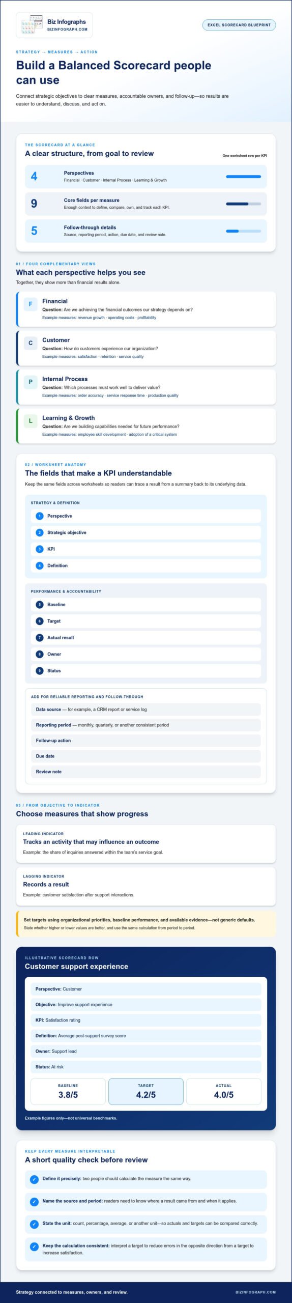
Each perspective answers a different strategic question. Together, they give teams a broader view than financial results alone.
- Financial: Are we achieving the financial outcomes our strategy depends on? Measures might include revenue growth, operating costs, or profitability.
- Customer: How do customers experience our organization? Satisfaction, retention, and service quality can indicate whether the value offered is meeting their needs.
- Internal Process: Which processes must work well to deliver that value? Teams might track order accuracy, service response time, or production quality.
- Learning and Growth: Are we building the skills, systems, and capabilities needed to perform in the future? Relevant measures could include employee skill development or adoption of a critical system.
The four perspectives are a useful starting structure, not a rigid formula. Organizations can adapt objectives and measures to fit their strategy, as long as the scorecard keeps a clear link between what they want to achieve and how they’ll assess progress. If a measure doesn’t help assess an objective in one of these perspectives, reconsider whether it belongs on the scorecard.
When an Excel scorecard is a practical starting point
A balanced scorecard excel template can work well for a focused team, a manageable set of measures, and a review process that can be maintained in a spreadsheet. Excel offers a familiar place to organize objectives and results, but a template can’t decide what matters strategically. Teams still need to agree on priorities, define how each KPI is calculated, and choose measures that reflect those priorities.
A professionally designed Excel dashboard template can reduce setup and formatting effort while keeping information easier to scan. For broader guidance on choosing a dashboard layout, explore the Excel dashboard templates guide.
What to Put in Each Section of a Balanced Scorecard Excel Template
A useful worksheet makes each measure understandable and actionable, not just visible. Set up one row per KPI, with columns for perspective, strategic objective, KPI, definition, baseline, target, actual, owner, and status. Add the data source and reporting period so readers know where the result came from and when it applies. For follow-through, include an action, due date, and review note. If you use more than one worksheet, keep these fields consistent so readers can trace a result from the summary back to its underlying data.
Quotable rule: Objectives explain what the organization intends to achieve, measures show whether it’s progressing, targets define the desired result, and owners make accountability clear.
Write definitions precisely enough that two people would calculate the measure the same way. For example, “customer retention” needs a stated calculation and timeframe; otherwise, teams may report different figures under the same label. Record the source, such as a CRM report or service log, and specify whether the result is monthly, quarterly, or another consistent period. Also state whether the measure is a count, percentage, average, or other unit, so the target and actual can be compared correctly.
Connect objectives to measures and targets
Begin with an objective, then ask what observable evidence would show progress. If the objective is to improve customer service, a leading indicator might be the share of inquiries answered within the team’s service goal; a lagging indicator could be customer satisfaction after support interactions. The first tracks an activity that may influence the outcome, while the second records a result. Choose targets using organizational priorities, baseline performance, and available evidence, not generic defaults.
Illustrative row: Customer perspective | Improve support experience | Satisfaction rating | Average post-support survey score | Baseline: 3.8/5 | Target: 4.2/5 | Actual: 4.0/5 | Owner: Support lead | Status: At risk. These figures are examples only, not universal benchmarks.
Clarify whether higher or lower values indicate better performance, and keep the calculation consistent across reporting periods. For example, a target for reducing errors should be interpreted in the opposite direction from a target for increasing satisfaction. That context helps prevent a target from looking meaningful while remaining difficult to interpret.
Add ownership, status, and follow-up fields
Name one accountable owner for each KPI, even if another person supplies the data. Agree on status rules before reporting begins. For instance, green could mean the measure meets target, amber signals an agreed level of risk, and red means it has missed the threshold. Set the thresholds to suit each measure; a single rule may not fit every KPI. Write the rules into the workbook so users apply them consistently.
A missed target should prompt a useful next step, not just a color change. Capture the action, responsible person, due date, and a short review note describing the issue or decision. At the next check-in, the team can see whether the action was completed and whether it affected performance.
To save time on worksheet setup and presentation, explore professionally designed Excel dashboard templates as a visual starting point, while keeping your measures and targets grounded in your strategy.
Excel Template or Strategy Software: Which Scorecard Approach Fits?
Choose the format that fits how your team gathers data, reviews progress, and acts on results. A balanced scorecard excel template can be a practical, flexible option for a contained process. Dedicated strategy software may be a better fit when scorecards span teams, data sources, and formal approval steps. Neither approach is universally best; the right choice depends on workflow complexity and the level of control your organization needs.
Compare the options across the work your scorecard must support:
- Setup: A spreadsheet can be adapted quickly for a focused scorecard. Software may take more initial configuration, particularly when objectives, access, and reporting workflows need to be structured.
- Collaboration: A shared workbook can work for a small group with clear editing practices. More users and linked scorecards can make coordination harder, while dedicated platforms may offer collaboration features suited to broader participation.
- Governance and auditability: Spreadsheets need deliberate ownership, version control, and formula checks. Software may provide more structured permissions, change histories, and evidence tracking, depending on the platform.
- Reporting: Excel can present a focused set of measures clearly. If reporting requires repeated consolidation across teams or frequent updates from multiple systems, software may reduce manual steps.
When a spreadsheet can support the review process
A spreadsheet can serve a focused team that tracks a manageable set of clearly defined measures and meets on an agreed schedule. For example, a department might update its measures before a monthly review, with one person responsible for workbook structure and a named owner for each KPI. A shared workbook and consistent process help keep updates coordinated. A straightforward setup is especially practical when the team can agree who enters data, who checks calculations, and which version is current.
Suitability also depends on how the workbook is shared and protected. Set editing permissions, agree where the current file lives, and avoid parallel copies that can produce conflicting results. The right setup depends on your organization’s access controls and working practices, not simply on the number of rows in the sheet.
Signs your scorecard may have outgrown Excel
Watch for multiple teams maintaining linked scorecards, recurring manual consolidation, or uncertainty about which workbook contains the latest figures. These are signs that maintaining the process may be taking attention away from reviewing performance.
A stronger case for dedicated software emerges when you need traceable evidence, governed access, repeatable approval workflows, or reporting that draws on many sources. Before switching, identify the specific friction to solve; a new platform won’t replace clear objectives or accountable KPI owners. For ideas on presenting measures interactively in Excel, see interactive Excel dashboard templates.
How to Build and Review a Balanced Scorecard in Excel
Build the workbook around a repeatable management process, not just a polished display. Start with strategy, then move from objectives to measures, targets, owners, and review actions. A balanced scorecard excel template can give this process a clear structure, but the team still needs shared rules for entering, calculating, and interpreting results.
- Choose strategic priorities. Identify the outcomes that matter most for the period you’re reviewing.
- Write objectives. Turn each priority into a clear statement of what needs to change or improve.
- Select measures. Choose indicators that provide useful evidence of progress toward each objective.
- Set targets and assign owners. Define the expected result and name the person accountable for tracking it.
- Schedule the review. Set a reporting rhythm that fits the measures, then use each review to decide what happens next.
Set up the workbook before entering performance data
Separate the workbook into clearly labeled areas: a scorecard data sheet for entries, a definitions area for KPI rules and sources, and a summary view for review-ready results. This separation makes the file easier to maintain and helps prevent presentation changes from disrupting source data.
Use consistent conventions across perspectives. Store dates in the same format, label units clearly, and apply agreed status definitions. Make input cells visually distinct from formulas, and protect critical calculations where appropriate. Keep calculated results separate from raw inputs, so reviewers can trace a displayed value back to its source. Before sharing the workbook, check that filters, formulas, and labels still work after adding or changing rows.
Check formulas and reporting rules
Before sharing results, test formulas against a few sample rows. Confirm that each calculation uses the correct target, reporting period, and direction of performance. For example, a higher completion rate may be favorable, while a lower error rate may be favorable. Status labels should follow the same agreed thresholds each period. If the calculation or rule changes, document the change so results remain interpretable over time.
Turn scorecard results into management actions
In a review, consider the variance alongside context, trends, and relevant evidence. An illustrative actual of 92% against a 95% target shows a three-percentage-point gap, but the number alone doesn’t explain its cause. Ask what changed, whether the trend is continuing, and what evidence supports the interpretation. Check whether the measure’s source or calculation changed before treating a shift as a change in performance.
Close the loop by recording the decision, next step, accountable owner, and review date. At the next meeting, revisit the action and assess whether it helped. A concise visual summary can make patterns easier to scan; for layout ideas, see this Excel dashboard template guide. To save setup and formatting time, explore Excel dashboard templates as a presentation starting point.
Choose a Balanced Scorecard Excel Template That Is Ready to Adapt
A useful template should make your scorecard easier to understand and maintain, not lock your team into someone else’s strategy. Before adapting a balanced scorecard excel template, check that its layout is editable, its fields are clear, and its visuals can accommodate your organization’s chosen perspectives and review rhythm. A polished dashboard can save setup and formatting effort, but your team must still decide which objectives and measures matter.
Evaluate usability before adapting a template
Scan the workbook as if you were reviewing it in a meeting. Can readers quickly connect each measure to an objective, see its target and actual result, and identify who owns it? The hierarchy should draw attention to summary insights first, with supporting data available without cluttering the main view.
Use this checklist to assess whether the structure is ready to work:
- Editable structure: Can you add, remove, or rename fields and rows to fit your scorecard?
- Readable hierarchy: Are key results easy to distinguish from definitions, notes, and detailed data?
- Clear fields: Are objectives, measures, targets, actuals, owners, and statuses labeled plainly?
- Adaptable visuals: Can charts, colors, and summary views be adjusted to suit your data and audience?
- Flexible review cadence: Can you use reporting periods that match how often your measures are updated and discussed?
Customize the scorecard without losing consistency
Replace example content with your organization’s own objectives, measures, owners, and targets. Then document each measure’s definition and calculation rule, including its data source and reporting period. This gives the next person who updates the workbook a consistent method to follow, even if responsibilities change.
Keep the visual system simple as you adapt it. Use the same status colors and labels throughout, make input areas distinct from calculated results, and avoid adding charts that don’t help readers understand progress. The design should support the discussion, not compete with it. A professionally designed Excel dashboard template can provide a strong visual starting point while leaving strategic judgment with your team.
Biz Infographs offers downloadable Excel dashboard templates designed to reduce manual design effort, with free lifetime updates. Updates support the product over time, while the objectives and measures in your scorecard remain yours to define and maintain.
Ready to streamline the setup and presentation? Explore Excel dashboard templates and adapt a suitable starting point to your scorecard.
Turn Your Scorecard Into a Practical Management Tool
A strong Balanced Scorecard connects strategic objectives to measures people can understand, targets they can assess, and owners who can follow through. A well-structured balanced scorecard excel template also makes reporting clearer by keeping definitions, data, and status rules consistent.
Choose Excel when your scorecard fits a manageable workflow, and consider dedicated software if collaboration, governance, or reporting needs become more complex. Either way, the real value comes from using review findings to agree on actions, assign responsibility, and check progress at the next review.
A clear, polished layout can save time on setup and formatting while keeping attention on the decisions that matter. Biz Infographs offers downloadable Excel dashboard templates, with free lifetime updates. Explore Excel dashboard templates and find a visual starting point for your work.
Start with the strategy, shape the scorecard around your team, and turn performance insights into confident next steps.
Frequently Asked Questions
What is a Balanced Scorecard Excel template?
A Balanced Scorecard Excel template is a spreadsheet structure for translating strategy into objectives and measures, commonly grouped into financial, customer, internal process, and learning and growth perspectives. A useful template also records KPI definitions, targets, owners, reporting periods, and follow-up actions. It gives teams a practical way to discuss strategic performance, but it can’t choose priorities or set appropriate targets for your organization.
What should a Balanced Scorecard template include?
Include the perspective, strategic objective, KPI name and definition, baseline, target, actual result, reporting period, data source, accountable owner, and status. An action field can capture decisions made during reviews. Keep the fields consistent across perspectives so results are easier to compare. Tailor measures and targets to your organization’s priorities and evidence rather than treating sample values or generic examples as universal benchmarks.
How do I create a Balanced Scorecard in Excel?
Start by clarifying strategic priorities, then group related objectives into perspectives. Choose measures that show progress, define each KPI and its data source, set organization-specific targets, and assign owners. Build the workbook with consistent input fields and calculations. Then establish a review cycle to discuss results, interpret gaps, agree on actions, and revisit progress. Clearly label any sample data as illustrative before sharing the scorecard.
Can I use Excel for a Balanced Scorecard?
Yes. Excel can be a practical starting point when your scorecard has a manageable scope, clear ownership, and an agreed update process. Keep definitions consistent, use version control, and protect important calculations where appropriate. As users, linked scorecards, governance needs, or evidence requirements increase, spreadsheet maintenance may become more demanding. Choose the tool that suits your workflow rather than assuming one approach fits every organization.
What are the four perspectives of the Balanced Scorecard?
The traditional perspectives are financial, customer, internal processes, and learning and growth. Together, they help teams consider financial results alongside customer outcomes, operational performance, and capabilities that support future progress. Organizations can adapt the framework to fit their strategy, but they should explain any changes clearly. That way, readers can understand how the chosen perspectives, objectives, and measures connect.
How many KPIs should a Balanced Scorecard have?
There’s no universal KPI count for every organization. Choose a focused set that meaningfully tracks strategic objectives and can be updated reliably. Too many measures can make reviews harder to prioritize, while too few may leave important objectives unobserved. Before adding a KPI, define its purpose, owner, data source, target, and review frequency. If it doesn’t support a strategic objective, reconsider its place on the scorecard.
What is the difference between a Balanced Scorecard and a KPI dashboard?
A KPI dashboard displays selected measures to help users monitor performance, while a Balanced Scorecard connects measures to strategic objectives across complementary perspectives. The scorecard gives the measures strategic context; a dashboard can make selected results easier to scan. They can work together, with the scorecard guiding what to track and the dashboard presenting relevant data. Clear definitions and purposeful reviews make both more useful.