

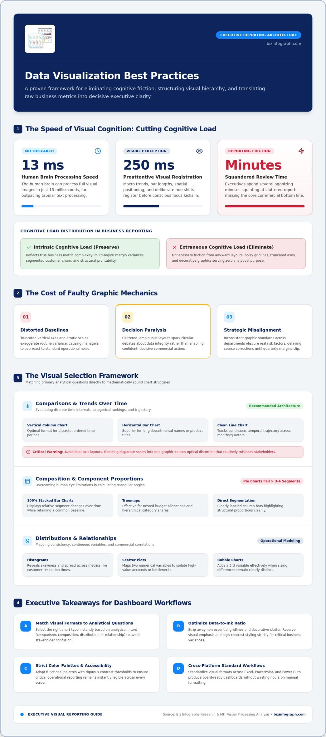
According to research from the Massachusetts Institute of Technology, the human brain can process visual images in just 13 milliseconds. Yet, how often do executives spend several agonizing minutes squinting at a cluttered report, completely missing the bottom line? Adopting modern data visualization best practices isn’t about designing decorative graphics; it’s about eliminating cognitive friction so leaders make decisions without hesitation. If you’ve ever wasted hours manually tweaking chart formatting only to watch stakeholders misinterpret your core message, you know how draining that disconnect feels.
You shouldn’t have to battle spreadsheet settings or visual clutter to present clear, polished insights. This definitive guide delivers proven chart selection frameworks, visual hierarchy principles, and accessibility standards that turn raw business metrics into executive-ready stories with minimal design effort. Here is your roadmap for transforming complex numbers into confident, action-driving clarity.
Key Takeaways
- Match visual formats directly to core analytical questions to select the right chart type instantly and avoid confusing stakeholders.
- Implement proven data visualization best practices to strip away decorative clutter, optimize the data-to-ink ratio, and highlight critical business variance.
- Adopt functional color palettes and strict contrast thresholds to ensure your reporting remains accessible and readable across every screen.
- Establish consistent reporting workflows across Excel, PowerPoint, and Power BI to produce executive-ready dashboards without hours of repetitive manual formatting.
Foundational Principles: Why Data Visualization Best Practices Dictate Business Impact
Every executive review ultimately hinges on clarity. When reporting teams ground their work in proven data visualization best practices, raw quantitative metrics instantly turn into actionable commercial insights. Instead of forcing leadership to decipher dense numerical tables, deliberate visual structuring guides attention directly toward bottom-line performance indicators, trimming meeting times and accelerating strategic alignment.
Understanding Cognitive Load and Visual Processing
Human perception separates incoming data into intrinsic and extraneous mental effort. Intrinsic load reflects the actual complexity of your business metrics, like multi-region margin variances or segmented churn rates. Extraneous cognitive load, by contrast, is the unnecessary friction introduced by awkward layouts, noisy gridlines, and decorative graphics that serve no analytical purpose.
By aligning your charts with core data and information visualization principles, you engage preattentive visual processing. Preattentive attributes like spatial positioning, bar lengths, and deliberate hue shifts register within 250 milliseconds. The viewer’s brain absorbs macro trends before conscious focus even kicks in, preserving valuable mental energy for strategic problem-solving.
The Measurable Cost of Misleading Chart Architecture
Faulty graphic architecture isn’t just an aesthetic issue; it triggers expensive operational mistakes. When visual mechanics fail, executive trust erodes quickly:
- Distorted baselines: Truncated vertical axes and erratic scales exaggerate routine variance, causing managers to overreact to standard operational noise.
- Decision paralysis: Cluttered, ambiguous layouts spark circular debates about data integrity rather than decisive action.
- Strategic misalignment: Inconsistent graphic standards across departments obscure real risk factors, delaying course corrections until quarterly margins slip.
Applying disciplined data visualization best practices ensures your reporting remains transparent and mathematically honest. When stakeholders grasp numbers effortlessly, they move forward with speed and total confidence.
The Visual Selection Framework: Matching Business Data to the Right Chart
Why do perfectly accurate financial calculations still fall flat in board meetings? Often, the analytical calculations are flawless, but the visual container fails. Selecting the right visual format isn’t a matter of personal artistic preference. It depends entirely on your primary analytical question: are you evaluating comparisons, compositions, distributions, or relationships?
Analyzing Comparisons and Trends Over Time
Standard vertical column charts work well for discrete time periods, but horizontal bar charts remain superior when evaluating categories with long departmental names or product titles. For continuous temporal datasets spanning months or quarters, clean line charts clearly track trajectory. Avoid dual-axis layouts whenever possible. Blending disparate scales into one graphic introduces optical distortion that regularly misleads viewers.
Displaying Composition Without Pie Chart Pitfalls
While pie charts remain common in corporate reporting, they break down rapidly when displaying more than three or four segments or comparing values with narrow differences. Human eyes struggle to calculate subtle differences between triangular angles.
- 100% Stacked Bar Charts: Ideal for showing relative segment changes over time while retaining a common baseline.
- Treemaps: Highly effective for displaying nested budget allocations and hierarchical category shares across multiple business units.
- Direct Segmentation: Simple, clearly labeled column bars that highlight structural proportions without visual distortion.
Mapping Distributions and Correlation Variables
When evaluating operational consistency, histograms reveal skewness and spread across continuous metrics like customer resolution times. For correlation queries, scatter plots map interactions between two separate numerical variables, isolating high-value accounts or operational bottlenecks instantly. Adding a third variable with bubble charts can work, provided sizing differences remain distinct and easy to compare.
Mastering chart architecture ensures every slide drives clear strategic direction. Adopting disciplined data visualisation colour and accessibility standards helps ensure every category and threshold is instantly distinct to all team members. If you want to skip manual formatting headaches entirely and apply proven data visualization best practices instantly, exploring engineered Excel dashboard templates gives you an executive-ready foundation right out of the box.
Visual Hierarchy and Decluttering: Maximizing the Data-to-Ink Ratio
Clutter is the enemy of executive comprehension. When presentation slides and spreadsheets get packed with non-essential design elements, decision-makers waste mental energy filtering out noise. Mastering modern data visualization best practices requires stripping away decorative excess so core operational performance stands out immediately.
Implementing the Data-Ink Ratio in Daily Reporting
Pioneered by statistician Edward Tufte, the data-ink ratio measures the proportion of graphic pixels dedicated directly to non-redundant numbers. Maximizing this ratio is simple: if a pixel doesn’t convey unique information, delete it. Follow this routine to prune every visual:
- Erase container borders and shadows: Dark borders and drop shadows box in data without adding analytical value.
- Mute heavy gridlines: Replace harsh black lines with faint, light-gray guide rules, or remove them entirely to let data points breathe.
- Direct-label series lines: Eliminate disconnected color legends by placing category names right beside their respective trendlines, ending the eye-tracking ping-pong game.
Applying Gestalt Principles for Instant Grouping
Strategic visual hierarchy relies on human perceptual psychology. Gestalt principles dictate how an executive’s eye naturally organizes individual chart elements into unified concepts:
- Proximity: Placing secondary variance metrics directly adjacent to primary trendlines links them automatically in the viewer’s mind.
- Similarity: Applying identical shapes and neutral colors signals that disparate visual marks belong to the same operational category.
- Enclosure: Framing related sub-metrics within a very subtle, soft-shaded card creates logical boundaries without adding heavy dividers.
Eliminating Misleading 3D Effects and Chartjunk
Few formatting choices undermine corporate credibility faster than pseudo-3D effects, moiré patterns, and decorative clip art. Angled cylinders, tilted bar charts, and extruded slices introduce optical perspective distortion, making identical quantitative values look noticeably different depending on their foreground placement. Always keep your graphics flat, crisp, and dimensional-free. Sticking to disciplined data visualization best practices ensures your audience evaluates authentic operational performance rather than optical illusions.
Strategic Color, Typography, and Accessibility in Business Reporting
Color in executive reporting is a functional instrument, not decoration. When applied haphazardly, a rainbow palette dilutes focus and forces stakeholders to decode meanings instead of discussing strategy. Thoughtful data visualization best practices dictate a disciplined approach: rely heavily on muted slate grays for baseline context, reserving a single vibrant accent color to guide the eye straight to your primary variance.
Deploying Functional Color Palettes: Sequential, Diverging, and Qualitative
Every dataset demands a specific color logic based on numerical intent:
- Sequential: Uses stepping intensities of a single hue to express ordered quantitative volume, such as scaling regional ARR from soft mist to deep navy.
- Diverging: Anchors a neutral midpoint to emphasize positive and negative deviations from a business target, like tracking margin overperformance versus shortfall.
- Qualitative: Employs distinctly separated, desaturated hues strictly to distinguish categorical groups like product divisions, never to imply rank or value.
Designing for Visual Accessibility and Contrast Compliance
Approximately 8% of men and 0.5% of women navigate color vision deficiencies, predominantly red-green insensitivity. Relying on default traffic-light formatting risks blinding key decision-makers to critical risks. Swap red and green for high-contrast blue and orange pairings that stay distinct under any visual impairment.
Adhering to standard WCAG Level AA thresholds requires a minimum 4.5:1 contrast ratio for chart typography and labels, alongside a 3:1 ratio for graphical bars and lines against backgrounds. Never let color stand alone. Always dual-encode critical metrics using direct values, varied line weights, or subtle texture fills so clarity remains intact across every display.
Typographic Clarity and Actionable Chart Titles
Generic headers like “Q3 Regional Revenue” waste prime slide real estate. Replace passive titles with active takeaway conclusions: “Western Region Revenue Grew 24% Driven by Enterprise Renewals.” Pair these headlines with legible sans-serif fonts such as Aptos or Segoe UI, placing measurement units, currency codes, and data source timestamps in smaller, lower-contrast subtext below.
Building accessible, perfectly balanced reports by hand every week consumes valuable time. To maintain flawless visual standards across your executive presentations without manual graphic tweaks, explore professionally structured PowerPoint infographic templates engineered to elevate your reporting instantly.
Operationalizing Visual Standards Across Presentation and Dashboard Workflows
Establishing corporate design guidelines on paper is straightforward; embedding them into daily analyst habits is where most organizations falter. Across decentralized finance, operations, and marketing teams, report creators lose hundreds of hours annually rebuilding recurring charts from scratch. Without standardized systems, presentations devolve into mismatched styles, disjointed fonts, and conflicting color palettes that confuse leadership.
Structuring Scalable Excel and Power BI Dashboard Layouts
High-performing dashboards rely on an inverted-pyramid hierarchy that guides the executive eye naturally:
- Top Band: Display high-level summary KPI cards that reveal critical operational targets at a glance.
- Middle Panel: Feature primary comparison trendlines, categorical rankings, and period-over-period variance metrics.
- Bottom Section: Provide granular transaction tables alongside dynamic slicers for on-demand root-cause analysis.
Adopting professionally built Power BI dashboard templates provides this layout architecture out of the box, ensuring your reporting pipelines reflect disciplined data visualization best practices instantly.
Translating Analytical Data into Executive PowerPoint Decks
Presenting numbers live requires a completely different visual tempo than exploratory analysis. While a dashboard accommodates multi-metric filtering, an executive slide deck demands radical restraint. Limit each slide to communicating exactly one strategic conclusion. Isolate your primary takeaway using high-contrast callout containers and clear narrative callouts. Utilizing pre-built PowerPoint infographic templates enables team members to deliver polished, boardroom-ready visuals rapidly without wrestling with manual alignment tools.
Accelerating Business Delivery Through Pre-Engineered Frameworks
Manual formatting is a massive drain on commercial productivity. Analysts should invest their time interpreting numbers and modeling forward-looking scenarios, not resizing column widths or re-centering text labels. Equipping your departments with professionally engineered Excel dashboard templates guarantees that data-ink ratios, accessible contrast scales, and standardized typography remain consistent across every file. Providing ready-to-use digital assets empowers your analysts to deliver executive-ready clarity on schedule, every single reporting cycle.
Elevate Your Reporting from Raw Numbers to Decisive Impact
Clear business reporting isn’t an accident. It’s the direct result of deliberate design choices. By matching analytical questions to the right chart formats, pruning non-essential clutter, and applying accessible color scales, you transform routine spreadsheets into decisive strategic assets. Implementing these foundational data visualization best practices ensures your leadership team grasps critical performance metrics instantly, shifting conversations from questioning data to driving growth.
You shouldn’t have to waste hours tweaking cell borders, re-centering labels, or wrestling with slide alignment. Pre-configured, professionally engineered layouts let you deliver polished, executive-ready presentations across Excel, PowerPoint, and Power BI in a fraction of the time. When you eliminate manual formatting hurdles, you free yourself to focus on what truly matters: uncovering strategic insights that move the business forward. Ready to streamline your workflow? Explore professional dashboard and presentation templates at Biz Infographs and command your next executive review with total confidence.
Frequently Asked Questions
What are the most critical data visualization best practices for business reporting?
The most critical data visualization best practices focus on reducing cognitive load and maximizing clarity. This means matching chart architecture directly to analytical questions, maintaining a disciplined data-to-ink ratio by removing non-essential borders and gridlines, and applying functional, high-contrast color palettes. Executive reporting also requires action-oriented chart headlines that state the primary takeaway immediately rather than passive labels that force readers to guess the point.
How do I choose the correct chart type for my business data?
Start by defining your core analytical objective across four categories: comparison, composition, distribution, or relationship. Use horizontal bar charts for discrete categorical comparisons with long labels, and continuous line charts for temporal trends. Reserve 100% stacked bars or treemaps for composition queries rather than overcrowded pie charts. For correlation and distribution questions, turn to scatter plots and histograms to highlight patterns and operational outliers without optical distortion.
Why should business analysts avoid using 3D charts in executive presentations?
Three-dimensional charts introduce perspective distortion that makes accurate quantitative evaluation nearly impossible. Tilting or extruding bars and pie wedges alters the perceived area and angle of data points, causing foreground values to look artificially larger than identical background elements. Flat, two-dimensional graphics preserve mathematical honesty. They let decision-makers evaluate precise operational variance quickly without optical illusions distracting from the underlying business metrics.
What is Edward Tufte’s data-ink ratio and how is it calculated?
Edward Tufte defined the data-ink ratio as the proportion of graphic ink or pixels dedicated entirely to displaying non-redundant quantitative information. It is calculated by dividing total data-ink by the total ink used across the entire graphic. In digital business reporting, you maximize this ratio by deleting decorative drop shadows, dark container outlines, heavy background fills, and redundant legends, ensuring every pixel serves a clear analytical purpose.
How can I ensure my charts and dashboards are colorblind accessible?
Avoid traditional red-green status indicators, which confuse the roughly 8% of men with color vision deficiencies. Instead, deploy accessible palette combinations like blue and orange or deep teal and vermilion. Always support color changes with dual-encoding methods such as text annotations, distinct line styles, or differing geometric symbols. Adhere to standard WCAG contrast guidelines by maintaining a minimum 3:1 ratio for graphical elements and 4.5:1 for body typography.
What is the difference between exploratory and explanatory data visualization?
Exploratory visualization is an open-ended analytical process where analysts use interactive filters, multi-layered dashboards, and complex plots to discover hidden correlations or anomalies. Explanatory visualization, by contrast, focuses entirely on communicating a specific, pre-determined insight to stakeholders. Executive presentations and board decks should always use explanatory design, stripping away extraneous exploration paths so decision-makers can digest the bottom line and agree on strategic priorities immediately.
How can I make my Excel charts look clean and professional quickly?
You can elevate raw spreadsheet visuals quickly by removing thick default borders, muting dark gridlines into soft gray guidelines, and swapping generic chart titles for active insight headlines. Rather than rebuilding these visual formatting rules manually for every spreadsheet, adopting pre-engineered Excel dashboard templates instantly applies proven data visualization best practices. Pre-built layouts automate professional typography and clean data-ink proportions, saving you hours of tedious cell formatting.