

Why are you still fighting with manual alignment tools when your competitors are already closing the deal? It’s incredibly frustrating to see a brilliant value proposition get buried under a cluttered, hard-to-read table. You’ve likely spent entire evenings nudging shapes instead of using a professional comparison infographic template, only to end up with a slide that feels amateur. We agree that your time is far too valuable to be spent on tedious pixel-pushing and manual formatting.
This guide promises to help you master the art of visual storytelling by transforming complex data into clear, persuasive business decisions. You’ll discover how to move beyond standard tables and embrace high-end design that commands respect in the boardroom. We’ll preview the most effective visualization frameworks for 2026, showing you how to save hours of work while producing polished results that highlight your ROI. Whether you’re comparing product features or quarterly performance, you’re about to learn how to make your data look as sophisticated as the strategy behind it.
Key Takeaways
- Understand the psychology of choice and how visual comparisons reduce cognitive load for busy executives.
- Identify the ideal comparison infographic template for your specific data, whether you’re using a product matrix or a before-and-after slider.
- Learn to select the three to five most impactful metrics that translate raw data into clear value propositions.
- Master customization techniques that maintain brand consistency and font readability without compromising your data’s integrity.
- Leverage native PowerPoint and Excel tools to create professional-grade visuals without the need for custom design services.
Beyond Side-by-Side: Why Comparison Infographics Drive Business Decisions
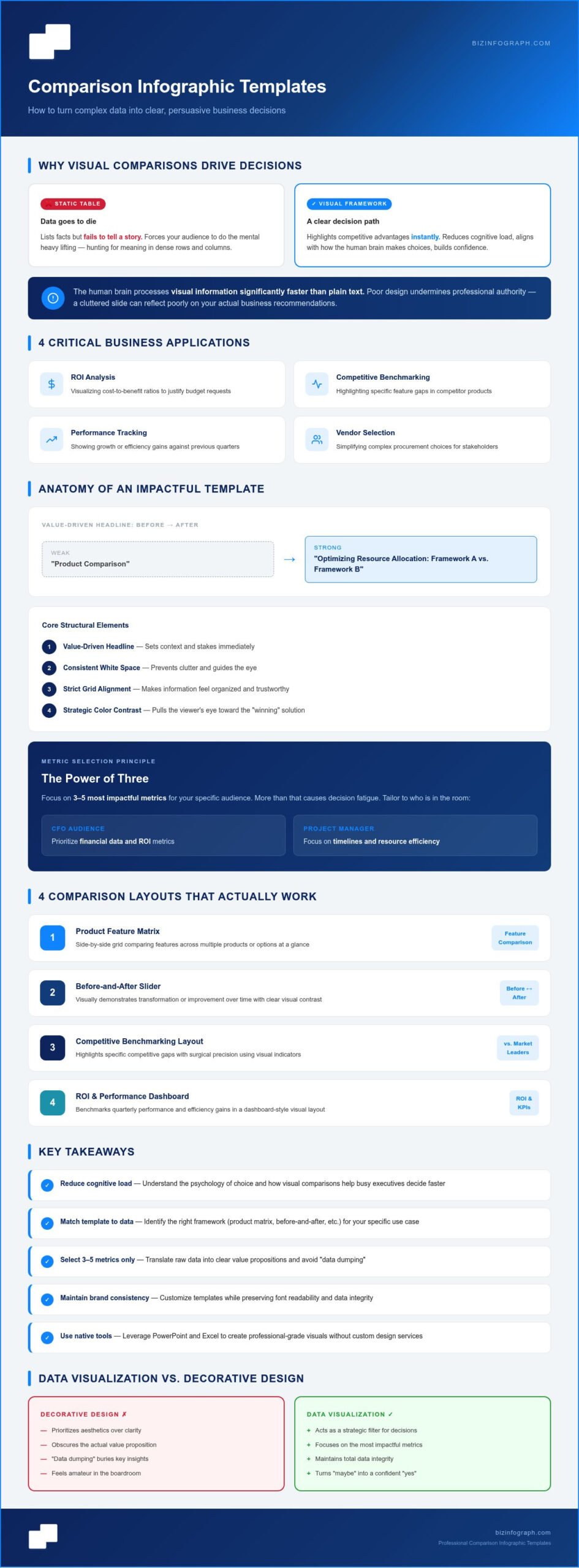
Have you ever watched an executive’s eyes glaze over during a data-heavy presentation? It usually happens when they’re forced to hunt for meaning within a dense table or a text-heavy slide. Using a professional comparison infographic template solves this by aligning with how the human brain actually makes choices. Instead of asking your audience to do the mental heavy lifting, you provide a clear visual path that highlights competitive advantages instantly. This isn’t just about aesthetics; it’s about reducing the cognitive load that often stalls high-level decision-making.
Static tables are where data goes to die. They list facts but fail to tell a story. In contrast, a dynamic visual layout allows you to benchmark products or analyze ROI with surgical precision. When design is poor, it undermines your professional authority. A cluttered slide suggests a lack of attention to detail that can reflect poorly on your actual business recommendations. By using a structured framework, you ensure your message remains the focus, not the formatting.
These frameworks are essential for several critical business functions:
- ROI Analysis: Visualizing cost-to-benefit ratios to justify budget requests.
- Competitive Benchmarking: Highlighting specific feature gaps in competitor products.
- Performance Tracking: Showing growth or efficiency gains against previous quarters.
- Vendor Selection: Simplifying complex procurement choices for stakeholders.
The Role of Visuals in Stakeholder Persuasion
Research indicates that the human brain processes visual information significantly faster than plain text. By applying fundamental infographic design principles, you can use contrast and strategic color placement to pull the viewer’s eye toward the “winning” solution. This approach builds immediate confidence. It establishes credibility through structured, professional-grade layouts that command respect in the boardroom. You aren’t just presenting numbers; you’re presenting a clear, authoritative path forward that feels both logical and inevitable.
Transforming Raw Data into Actionable Insights
The leap from an Excel spreadsheet to a high-impact PowerPoint slide is often the difference between a “maybe” and a “yes.” A well-crafted comparison infographic template acts as a strategic filter. It prevents the common pitfall of “data dumping,” where too much information obscures the actual value proposition. You’re able to focus on the most impactful metrics while maintaining total data integrity. If you’re looking to elevate your entire deck, mastering business presentation templates is the next logical step in your professional development. It’s time to stop nudging shapes and start driving results.
The Anatomy of an Impactful Comparison Infographic Template
How do you turn a generic slide into a high-stakes decision tool? It starts with a value-driven headline that sets the immediate context for your audience. Instead of a bland title like “Product Comparison,” try something that speaks to the result, such as “Optimizing Resource Allocation: Framework A vs. Framework B.” This small shift ensures your stakeholders know exactly what’s at stake before they even look at the data. A professional comparison infographic template provides the skeleton, but your strategic choices bring it to life.
The Core Structural Elements
A comparison infographic is a strategic asset for business clarity. At its heart, it’s a visual framework designed for weighing two or more variables with zero ambiguity. The most effective designs rely on consistent white space and strict grid alignment to prevent the “clutter” that often plagues standard PowerPoint slides. When elements are aligned perfectly, the eye moves naturally across the categories, making the information feel organized and trustworthy. You’re not just showing data; you’re demonstrating professional discipline.
When selecting your metrics, aim for the “Power of Three.” Focusing on the 3-5 most impactful metrics for your specific audience prevents decision fatigue. If you’re presenting to a CFO, prioritize financial data and ROI. If you’re speaking to a Project Manager, focus on timelines and resource efficiency. You can browse our collection of PowerPoint Infographic Templates to find layouts specifically optimized for these different business perspectives.
Data Visualization vs. Decorative Design
In the boardroom, “less is more” isn’t just a design trend; it’s a survival rule for complex data. Decorative design fills space, but data visualization enhances meaning. Choose icons that act as mental shortcuts. A simple shield icon for “security” or a lightning bolt for “speed” signals performance faster than a bullet point. Professional templates also ensure that these visual cues maintain their aspect ratio and resolution across various devices, so your presentation looks just as sharp on a mobile tablet as it does on a massive 4K projector.
Finally, don’t be afraid to guide the viewer toward the preferred choice. Subtly highlighting the “winner” with a slightly bolder border or a “Best Value” badge is an effective way to drive consensus. This isn’t about manipulation; it’s about using a comparison infographic template to clarify which option best meets the company’s strategic goals. By combining these structural elements, you transform a simple comparison into a persuasive narrative that wins approvals.
Choosing Your Framework: 4 Comparison Layouts That Actually Work
Selecting the right comparison infographic template is more than just a design choice; it’s a strategic decision that dictates how your audience perceives your data. You wouldn’t use a simple list to compare complex software features, just as you wouldn’t use a dense matrix for a quick before-and-after project update. Matching the framework to your specific business objective is the key to clarity. When you align your data with the correct visual structure, you transform a potentially confusing presentation into a source of personal pride and professional confidence.
Consider these four proven layouts for your next high-stakes deck:
- The Product Comparison Matrix: Your go-to for feature-heavy technical analysis, allowing stakeholders to see exactly where one solution outpaces another.
- The Before-and-After Slider: A powerful visual narrative of progress, perfect for demonstrating project impact or leading change management initiatives.
- Pros and Cons Lists: The essential framework for transparent risk assessment and balanced decision-making.
- The Competitor Benchmark: A high-energy layout specifically designed for sales and marketing teams to prove market superiority and ROI.
The Feature Matrix for Technical Analysis
When building a technical matrix, the choice between checkmarks and numerical data depends on the depth of the analysis. Checkmarks work best for binary feature availability; they’re fast for the brain to process. Numbers are vital for performance specs like speed, capacity, or cost. Handling “N/A” values requires care. Don’t leave blank spaces that look like design errors. Instead, use a neutral gray icon or a simple dash to maintain the visual flow. For multi-product comparisons involving three or more items, ensure your primary solution is always positioned on the far left or highlighted with a distinct color to keep the viewer’s focus on your recommendation.
Strategic Benchmarking for Sales Teams
Sales presentations demand high-impact visuals that highlight competitive differentiators instantly. By using professional PowerPoint infographic templates, you can move away from cluttered tables and toward layouts that make your value proposition the hero of the slide. Incorporate “Best Value” or “Recommended” callouts to guide the prospect toward the ideal package. This isn’t just about showing features; it’s about creating a persuasive environment where your solution is the obvious choice. Ensure your benchmark data remains prominent, avoiding excessive background graphics that might distract from the core message. Using a high-quality comparison infographic template ensures your sales deck looks as sophisticated as the solution you’re selling.
Best Practices for Customizing Templates Without Losing Data Integrity
Customizing a comparison infographic template is where many professionals lose their way. You start with a clean, high-end design, but as you add corporate colors and specific data points, the visual clarity can begin to crumble. Maintaining data integrity means ensuring that your aesthetic choices support the numbers rather than obscuring them. It’s about striking a perfect balance between looking “on-brand” and remaining functionally accurate. When done correctly, this transformation becomes a source of personal pride and professional confidence.
Readability is non-negotiable in a high-stakes environment. If your stakeholders can’t read the category labels from the back of the boardroom, your presentation has already failed. Establish a strict font hierarchy by using bold, clear headers for your primary categories and legible sans-serif fonts for supporting data. Once you’ve finished your layout, apply the “Squint Test.” Close your eyes halfway and look at the slide. If the primary message or the “winner” isn’t immediately obvious through the blur, your design is likely too cluttered. Avoid the over-design trap by removing any icon, line, or shadow that doesn’t directly contribute to the viewer’s understanding.
Color Theory for Business Comparison
Colors aren’t just for decoration; they’re powerful psychological cues that drive executive decisions. In performance reporting, red and green carry immediate weight, signaling risk or success before a single word is read. Use high-contrast palettes to differentiate competing data sets clearly. However, always prioritize accessibility. Ensure your color choices meet WCAG compliance so that color-blind stakeholders can still distinguish between variables. This level of detail demonstrates that you’re not just a designer, but a thoughtful strategist who values inclusive communication.
Streamlining Data Entry and Updates
Efficiency is the hallmark of a true productivity partner. Professional templates allow for rapid data swaps without breaking the underlying grid or alignment. For those managing complex, live datasets, linking your Excel dashboard templates directly to your infographic slides ensures your visuals update in real-time. This saves hours of manual re-formatting and prevents the common errors that occur during manual copy-pasting. By using a robust comparison infographic template, you ensure that your presentation remains as accurate as the source data itself. Ready to shine in your next meeting? Download our premium PowerPoint infographics and start building persuasive, high-impact slides in minutes.
Why Biz Infographs Comparison Templates Outperform Standard Design Tools
Why settle for generic web-based graphics when you can have a professional comparison infographic template built specifically for the boardroom? Most design tools are created by graphic artists who prioritize aesthetics over business logic. At Biz Infographs, our templates are crafted by business experts who understand the nuances of data design. You’re getting more than just a layout; you’re getting a strategic framework that’s been stress-tested for professional utility. We’ve focused on high-impact visualization that requires minimal design effort from your end, allowing you to focus on the strategy behind the numbers.
Our commitment to your success extends beyond the initial download. We offer exceptional lifetime value through a one-time purchase model that includes free lifetime updates for all assets. This ensures your visual library stays current as business trends evolve, without the burden of recurring subscription fees. You’ll benefit from:
- Professional Grade: Logic-driven layouts designed for executive-level decision making.
- Fully Customizable: Total control over every shape, color, and text element.
- Time-Saving Automation: Built-in structures that allow for rapid data population.
- Lifetime Updates: Continuous access to improved versions of your purchased templates.
The Advantage of Native Software Formats
Why are PowerPoint-native files superior to web-exports for professional presentations? When you use a web-based tool, you’re often stuck with static images or clunky interfaces that don’t play well with your existing deck. Our templates offer total editability within the software you already use every day. You can change colors to match a specific client’s branding or adjust a grid to fit a new data point in seconds. This seamless integration with your existing business workflow means you don’t have to learn a new platform to get best-in-class results. It’s about working smarter, not harder.
Designed for the Modern Professional
We believe that high-quality design should be accessible to everyone, regardless of your technical skill level. Our goal is to transform the common struggle of slide design into a source of personal pride. Instead of feeling frustrated by manual alignment or cluttered tables, you’ll feel empowered to create visuals that truly command attention. We want to be your productivity partner, providing the tools you need to “shine” in front of your audience. When you present with confidence, your data becomes more persuasive, and your recommendations carry more weight. Ready to elevate your next presentation? Explore our collection of high-impact comparison templates today and see the difference that professional-grade design makes.
Transform Your Presentations into Strategic Decision Tools
Are you ready to stop struggling with manual formatting and start leading with visual clarity? Mastering a comparison infographic template isn’t just about making your slides look better; it’s about empowering yourself to communicate value with total confidence. By choosing the right framework and applying professional customization techniques, you ensure your data remains the hero of every meeting. You’ve learned how to reduce cognitive load for executives and how to maintain brand consistency without losing accuracy.
Join the 10,000+ professionals worldwide who trust Biz Infographs to deliver best-in-class results. Our templates are fully optimized for PowerPoint, Excel, and Power BI, ensuring they fit perfectly into your existing workflow. Plus, you’ll enjoy free lifetime updates on all your assets, providing lasting value as your career grows. Browse Professional Comparison Infographic Templates and discover how effortless high-impact design can be. It’s time to shine in front of your audience and turn complex data into your greatest competitive advantage. You have the expertise; now you have the tools to prove it.
Frequently Asked Questions
What is a comparison infographic template?
A comparison infographic template is a pre-built visual framework designed to weigh two or more variables side-by-side. It transforms dense, hard-to-read tables into high-impact stories that highlight competitive advantages. By using these templates, you reduce the cognitive load on your audience, allowing them to grasp complex ROI or product benchmarks instantly. It’s a strategic asset for any professional looking to drive faster, more informed business decisions.
Can I edit these templates in PowerPoint and Google Slides?
Yes, our templates are optimized for native PowerPoint use, which makes them highly compatible with Google Slides. You’ll have total control over every shape, color, and text field. Since we don’t use proprietary software or locked elements, you can easily adapt the design to fit your corporate branding. This versatility ensures you shine in front of your audience, regardless of which presentation platform your organization prefers.
How do I choose between a vertical or horizontal comparison layout?
Your choice depends on the volume of data and the presentation medium. Vertical layouts are ideal for mobile-first reports or long lists of features for just two products. Horizontal layouts are the standard for boardroom presentations because they utilize the widescreen aspect ratio effectively. Most professionals find that horizontal grids allow for a more natural side-by-side comparison of three or more items, making competitive differentiators easier to spot.
What are the most important elements of a comparison infographic?
The most effective infographics include a value-driven headline, 3-5 impactful metrics, and consistent visual cues like icons or badges. You must also prioritize white space to keep the data readable. A well-structured comparison infographic template provides the grid alignment needed to maintain professional aesthetics. By focusing on these core elements, you ensure your primary message is clear at a glance, even from the back of the room.
How many items can I compare in a single infographic template?
For maximum impact, we recommend comparing three to five items at once. While some matrix-style templates can handle more, adding too many variables often leads to “data dumping” that confuses stakeholders. If your analysis requires comparing a larger set, try grouping them into categories or using multiple slides. This approach maintains the professional quality of your presentation and prevents your audience from experiencing decision fatigue.
Do I need graphic design skills to use Biz Infographs templates?
You don’t need any graphic design experience to achieve professional-grade results. We’ve already handled the tedious tasks like manual alignment and grid creation. All you need to do is download the file, swap the placeholder text with your data, and you’re ready to go. We’ve designed these tools as a productivity partner, helping you save hours of manual effort while producing polished, persuasive slides.
Are these templates compatible with Excel data?
Absolutely, our products are built for seamless integration with Excel data. You can quickly transfer your figures into our PowerPoint layouts or use our specialized Excel charts and dashboard templates for more data-heavy reporting. We also offer automation templates designed to reduce manual entry, ensuring your visualizations stay accurate and up-to-date with minimal effort. This workflow allows you to focus on analysis rather than formatting.
How do I ensure my comparison infographic is accessible?
Accessibility starts with high-contrast colors and legible font hierarchies. Don’t rely on color alone to distinguish between data sets; use clear labels and distinct icons to ensure everyone can follow your logic. It’s also important to use alt-text for images if you’re sharing the file digitally. These steps ensure your data is inclusive and professional, reflecting your commitment to clear communication for all stakeholders.