Why Energy and Utilities Dashboard package Matter for Reporting
How utility dashboards improve energy management reporting
In the energy and utilities industry, reporting is not just a compliance task—it is a decision-making system. Utility providers and facility management teams must monitor energy use, costs, outages, and operational efficiency across multiple sites and business units. A strong utility dashboard transforms complex utility data into a clear reporting format that leadership can act on. When an energy management dashboard is used across the entire organization, it becomes a single platform to summarize energy usage, track critical KPIs, and identify inefficiency early. Instead of manually compiling spreadsheets and utility bills, dashboards provide automated graphs and benchmark comparisons. Utility teams can monitor energy consumption, detect abnormal interval data spikes, and communicate results to internal and external stakeholders with confidence.
Turning energy data into accurate KPI analytics
Energy reporting is only valuable when based on accurate energy data. Organizations collect energy data from meters, interval data systems, utility bills, renewable energy sources, and operational records. A dashboard helps unify these data sources into a reliable data dashboard. Once consolidated, analytics can generate KPI dashboards that provide insights into energy usage trends, unit cost changes, and GHG emissions. This allows energy providers and decision-makers to make informed decisions quickly—such as reallocating energy loads, scheduling maintenance, or optimizing energy procurement. Energy analytics dashboards reveal patterns such as increased consumption during peak demand or inefficient operations in specific facilities. By visualizing performance metrics in real-time data views, dashboards deliver actionable insights that support cost-effective energy management and better reporting governance.
What Makes a Best-in-Class Energy Dashboard Package
Key features of a customizable energy management dashboard
A best-in-class energy management dashboard must be designed for operational use, not just presentation. A strong dashboard package includes customizable energy dashboards, interactive visuals, and KPI widgets that show consumption, costs, and service performance. The dashboard is built to support benchmarking across sites, departments, and time periods. It must also provide customizable reports so each stakeholder—finance, operations, sustainability teams—can view their specific KPIs. Many organizations require embedding a dashboard into internal systems so reporting is always visible without switching tools. A strong solution can integrate with a specific accounting system, allowing better utility cost allocations. Whether implemented in Tableau® or Power BI, the dashboard should be intuitive the software experience—user-friendly, transparent platform-based, and easy to modify.
Best KPIs for energy providers and utility reporting
Energy providers and utility teams need KPI dashboards that reflect real operational outcomes. Essential KPIs include energy consumption, peak demand, unit cost ($/kWh), total energy costs, renewable energy contribution, outages, response time, and customer service performance. Sustainability tracking requires KPI displays for greenhouse gas / GHG emissions and the ability to visualize GHG emissions across facilities. A strong dashboard provides insights into energy by comparing actual performance to baseline targets. It should highlight savings opportunities such as load-shifting, reduced peak demand, and elimination of waste. Utilities can also track KPIs like cost per customer, billing accuracy, and complaint resolution speed. These KPIs create a complete reporting system for energy and utilities dashboards and support strategic energy management initiatives.
How dashboards visualize performance and reduce waste
Dashboards are effective because they turn raw data into visuals that drive action. Through data visualization—graphs, trend lines, heat maps, and KPI tiles—a dashboard helps teams quickly identify trends, anomalies, and inefficiencies. For example, a dashboard displays unusual interval data spikes, indicating possible equipment malfunction or energy waste. Utility teams can then investigate immediately and cut the waste. By tracking energy use against targets, dashboards help manage energy and optimize consumption. This supports control the spend objectives by highlighting where energy costs rise unexpectedly. Dashboards also provide actionable insights into operational efficiency improvements, helping the organization shift toward cost-effective energy management while improving reporting transparency to stakeholders.
Energy Consumption & Efficiency Dashboard
Track energy usage KPIs and identify waste
The Energy Consumption & Efficiency Dashboard is the foundation of energy management reporting. It tracks energy usage, energy use intensity, peak demand, consumption trends, and unit cost KPIs. This dashboard summarizes energy usage across facilities and provides benchmarking—allowing managers to compare performance between buildings or departments. A dashboard helps detect inefficiency by showing patterns such as rising energy consumption without a corresponding increase in production or occupancy. Utility data from meters and interval data sources can be embedded into the dashboard to provide real-time monitoring. This template is especially valuable for facility management teams because it connects operational performance to energy efficiency goals. When organizations track KPIs consistently, they can identify savings opportunities and reduce unnecessary energy costs.
Cut the waste and control the spend with analytics
Energy and Utilities dashboard template is designed to support action: cut the waste and control the spend. By applying analytics and trend detection, the dashboard reveals when costs rise due to peak demand charges, equipment inefficiency, or unexpected consumption spikes. For example, if HVAC systems run outside operational hours, the dashboard provides insights into energy waste and enables corrective action. It also supports optimizing energy procurement by analyzing consumption by time-of-use. When energy costs increase, decision-makers can quickly see which facility or department drives the change. A KPI dashboard can even help prioritize energy efficiency projects by showing ROI potential. Ultimately, energy analytics transforms reporting into operational improvement by turning raw utility bills and energy data into data-driven insights.
Utility Operations & Outage Reporting Dashboard
Utility dashboard KPIs for outage and reliability reporting
A utility dashboard must measure reliability and service delivery. This template tracks outages, downtime minutes, restoration time, service interruption frequency, and maintenance response effectiveness. For the energy and utilities industry, these KPIs are essential for operational accountability and regulatory reporting. Dashboards provide a clear reporting view for internal and external stakeholders, showing the organization’s performance and system resilience. A dashboard displays outages by region, facility, or equipment class and helps teams identify recurring failure points. When monitoring reliability KPIs, utility providers can proactively schedule infrastructure upgrades and reduce disruption risk. This improves operational efficiency and enhances trust with stakeholders by offering transparent and accurate performance reporting.
Energy management dashboard for response performance
Outage response performance is directly tied to customer satisfaction and operational reputation. This template tracks response time, dispatch efficiency, work order backlog, and resolution speed. When embedded into a single platform, it centralizes operational workflows and highlights where delays occur—supplier delays, scheduling issues, or limited staffing. A dashboard provides utility teams real-time visibility into service response and enables managers to allocate resources more effectively. The dashboard helps evaluate effectiveness of response protocols and identify areas for improvement. For large organizations, embedding a dashboard into existing operational portals ensures leaders always have essential information available. Over time, these dashboards improve response efficiency, reduce downtime, and support better decision-making during critical events.
Cost Control & Budget KPI Dashboard
KPI reporting for spend control and cost drivers
Energy cost management is a strategic priority for utilities and facilities. This dashboard template focuses on cost drivers: energy costs by facility, per unit cost trends, fixed vs variable charges, and operational expense patterns. Utility bills often include complex structures—demand charges, peak penalties, and seasonal pricing. A dashboard provides clarity by converting billing details into digestible cost KPIs. Managers can monitor budget vs actual energy spending and identify where overspending occurs. Dashboards also highlight cost-effective opportunities such as reducing peak demand or optimizing equipment schedules. By presenting financial KPIs alongside energy usage analytics, decision-makers gain a complete view of cost performance. This KPI reporting approach supports control the spend strategies and improves cost forecasting accuracy.
Accurate energy data for forecasting and budget planning
Budget planning requires accurate energy data and strong forecasting. This dashboard template integrates historical utility data, seasonal patterns, and operational workload to forecast future energy consumption and costs. Forecasting is crucial for utilities and organizations with multiple facilities because energy costs can swing significantly due to weather, demand, or operational changes. The dashboard provides predictive views that help decision-makers plan budgets and allocate energy efficiency investment. It can also factor in renewable energy contributions, carbon pricing implications, and greenhouse gas reporting targets. When forecasting dashboards are built on validated data, organizations make informed decisions confidently. This improves financial discipline and helps utility teams plan resource allocation effectively across the entire organization.
Executive Energy Management Overview Dashboard
Executive KPIs for utilities and energy management
Executives need a concise overview dashboard that summarizes overall performance in one screen. This dashboard template provides KPI widgets for energy usage, energy costs, outages, response efficiency, customer satisfaction, renewable energy share, and GHG emissions. A dashboard provides a quick high-level view and then allows drilldowns by facility or region. This is best-in-class energy reporting because executives do not want operational detail unless something requires attention. With a clear graphic format, leaders can monitor critical KPIs monthly and evaluate whether goals are being achieved. Executive dashboards improve strategic decision-making by linking energy management outcomes to business performance, sustainability reporting, and stakeholder expectations.
Reporting dashboards for stakeholders and decision-making
Energy and utilities reporting often has multiple stakeholders: boards, regulators, customers, investors, and internal leadership. This dashboard template is designed to communicate essential information in a digestible and transparent platform format. It includes customizable reports so different stakeholders receive tailored insights. For example, regulators may require outage frequency and response performance reporting, while executives may focus on cost control and sustainability. Dashboards provide data visualization to support credibility, showing trends and KPIs clearly. The dashboard helps organizations communicate performance and progress toward energy efficiency targets. With BI tools like Tableau® and Power BI, dashboards can be embedded into portals and shared securely. This strengthens decision-making because the same data-driven insights are visible across stakeholder groups.
How to Implement and Customize the Dashboard Templates
Dashboard customization steps and data sources
Implementation begins with identifying data sources: utility bills, energy meters, interval data, operational logs, customer service systems, and sustainability reporting databases. Once data is gathered, dashboards must validate data to ensure accuracy—especially when comparing facilities and benchmarking. A customizable energy dashboard should allow modification of KPI thresholds, time ranges, facility filters, and reporting views. Many organizations embed dashboards into web-based platforms so users can access insights without technical tools. The dashboard package should support integration with business intelligence systems and specific accounting systems for cost allocation. Good customization improves adoption because teams can tailor dashboards to their operations and reporting requirements. With proper configuration, dashboards help monitor energy performance continuously and produce consistent reporting.
Request a demo: how to evaluate dashboard packages
Before selecting a dashboard package, organizations should request a demo to evaluate fit and usability. A demo should show how dashboard software centralizes data, displays KPI widgets, supports customizable reports, and provides actionable insights. Ask whether the dashboard is built for real-time data integration, how it handles multiple facilities, and whether it supports embedding a dashboard into portals. Also confirm whether it supports accurate energy data validation and audit-friendly reporting. Evaluate the interface—intuitive the software experience matters for user adoption. The best demo will showcase dashboard examples, including energy consumption dashboards, outage reporting dashboards, and finance dashboards. This allows decision-makers to assess whether the solution supports cut the waste and control the spend objectives, while improving efficiency and sustainability reporting.
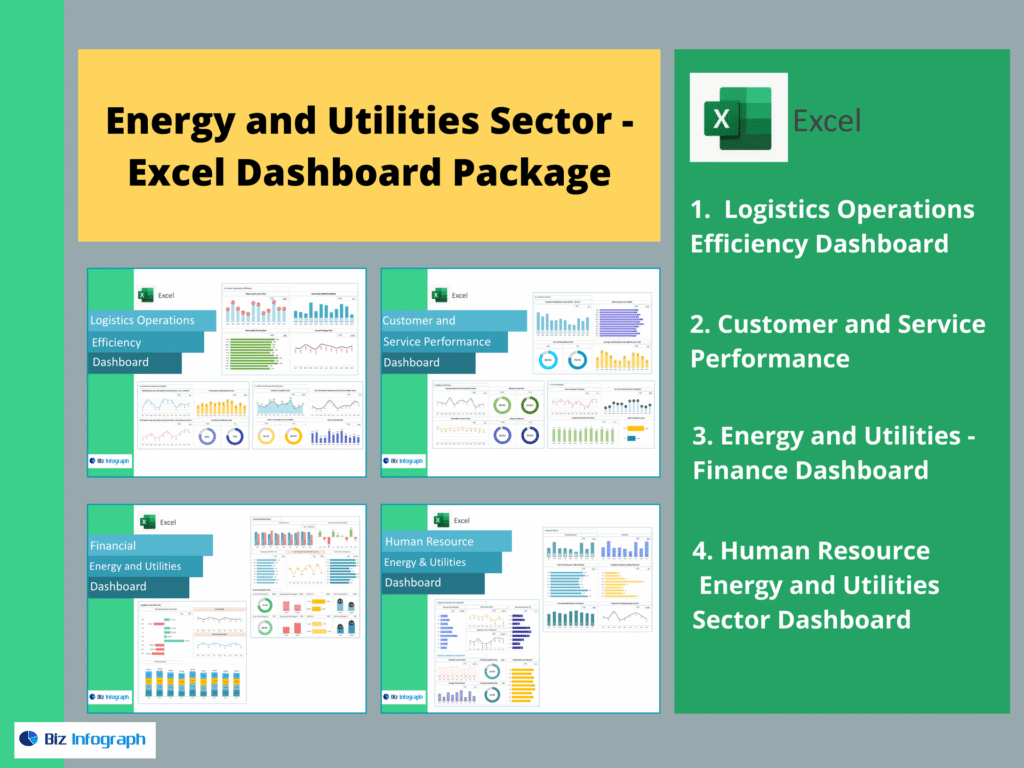
The 4 Dashboards Included in This Package
A complete Energy & Utilities Dashboard Package should include: Logistics Operations Efficiency Dashboard, Customer and Service Performance, Energy and Utilities – Finance Dashboard, and Human Resource Energy and Utilities Sector Dashboard. Together, these dashboards centralize operational and financial reporting, support stakeholder communication, and deliver actionable insights across energy management, service quality, cost control, and workforce performance.
For ready-to-use Dashboard Templates: