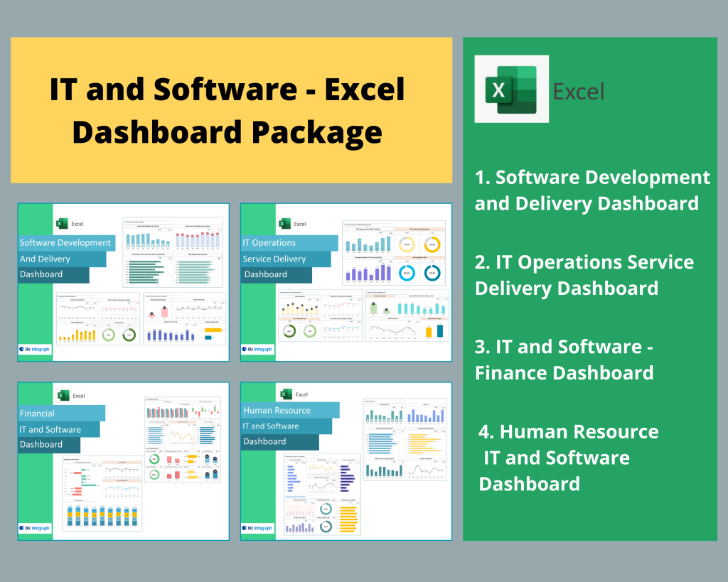
Introduction to IT & Software Dashboard Package
What Is a Dashboard in IT & Software Management?
A dashboard is a digital interface that consolidates and visualizes key information and data across IT operations, software performance, and project management. It allows users and data teams to monitor KPIs, track workflows, and identify trends through data from various sources. In an IT context, a management dashboard serves as a centralized tool that connects multiple data sources like cloud applications, servers, and software analytics platforms. With modern dashboard software, organizations can easily visualize your data, monitor uptime, and track performance metrics in real time. The actual dashboard transforms raw IT data into meaningful insights for faster, data-driven decisions.
Importance of Using the Best Dashboard Software for IT Insights
Selecting the best dashboard software is essential for IT and software companies aiming to enhance data monitoring and operational efficiency. The right dashboard software not only consolidates data from different sources but also provides real-time data visibility to support proactive decision-making. Tools like Microsoft Power BI, Tableau, and other dashboard software tools enable teams to transform data into visual reports that highlight patterns in data. A dashboard package with advanced governance features and self-service tools empowers both data scientists and non-technical users to explore data and analyze your data with minimal coding. Choosing one of the best dashboard solutions ensures security, scalability, and clear insights from your data.
How a Dashboard Package Simplifies IT Performance Tracking
An integrated dashboard package is the foundation of efficient IT performance tracking. It combines software applications, data modeling, and dashboard templates to help teams turn your data into actionable visual insights. With built-in data refresh capabilities and seamless data source connections, a comprehensive dashboard package supports real-time reporting across different IT systems. These dashboard software and tools are designed to consolidate data, highlight system anomalies, and provide a clear overview of performance. Whether for data teams or executives, a dashboard builder helps users visualize data effectively without manual data aggregation, enabling smarter management and analytics and business intelligence outcomes.
Understanding Dashboard Software
Key Features of Dashboard Software for IT Teams
Modern dashboard software provides IT teams with an array of features of dashboard design that improve efficiency and data transparency. Core capabilities include data source connections, data refresh automation, and self-service tools that allow users to explore data independently. A dashboard software transforms raw metrics into compelling data stories by offering interactive visuals and configurable filters. Additionally, no-code dashboard functionality enables non-technical users to create dashboards without relying on developers. The inclusion of data warehousing, data analytics, and data governance ensures that information remains consistent and secure. For IT departments, these tools help teams understand your data, optimize processes, and quickly act on powerful data insights.
How Dashboard Tools Integrate with Various Data Sources
One of the greatest strengths of dashboard software tools is their ability to integrate data from various sources into a single data platform. Whether connecting to cloud data, cloud service, on-premise servers, complex data, APIs, or spreadsheets, dashboard software makes it easy for users to connect data across all systems. Through automated data collection, transformation, and synchronization, these tools designed for IT professionals ensure seamless data using workflows. Popular platforms like Microsoft Power BI and Tableau allow integration with data sources like Azure, SQL Server, Google Analytics, and CRM systems. This consolidated approach ensures consistent dashboard reporting and supports deeper data discovery for technical and non-technical users alike.
Importance of Data Refresh and Real-Time Updates
In the IT world, data refresh and real-time data updates are critical for accuracy and responsiveness. A modern dashboard with automated refresh capabilities allows data teams to continuously sync data available from operational systems. This ensures that the displayed metrics and KPIs are always current. Dashboard software tools like Power BI offer scheduled refresh options and cloud data synchronization for instant updates. IT professionals benefit from dashboard software that supports data monitoring, helping detect system errors or performance dips instantly. These dashboard software and tools eliminate the manual effort of pulling raw data, enabling continuous visibility and proactive decision-making through live data across platforms.
Exploring the Best Dashboard Software Options
Overview of the Top 10 Dashboard Software in 2025
The top 10 dashboard software options in 2025 combine flexibility, scalability, and integration power. They include Microsoft Power BI, Tableau, Looker Studio, Domo, Qlik Sense, Zoho Analytics, Sisense, Klipfolio, ClicData, and Databox. Each offers distinct features of dashboard performance, from data source connections to no-code dashboard capabilities. These dashboard software and tools allow IT teams to visualize your data, data analysis, create custom KPIs, and analyze data from different sources in real time. As software applications evolve, the focus is shifting toward automation, AI-based data discovery, and dashboard reporting that simplifies data science workflows. Choosing from these business dashboards helps organizations unlock insights from your data faster.
Microsoft Power BI – The Leading Dashboard Tool
Microsoft Power BI remains one of the best dashboard software platforms, widely adopted across industries. It combines data modeling, data warehousing, and cloud data integration to help users analyze your data seamlessly. Power BI acts as a dashboard builder that allows users to connect data from ERP systems, Excel, SQL, and APIs. With intuitive self-service tools, users can create interactive dashboards that visualize your data and generate compelling data stories. Its data refresh feature keeps reports up-to-date, making it one of the software that allows both technical and non-technical users to explore data effectively. For many, Power BI is one of the best dashboard platforms available today.
Tableau – The Interactive Dashboard Software for Data Visualization
Tableau is a dashboard software powerhouse known for its ability to visualize data and present patterns in data through dynamic visual storytelling. It’s designed for both data scientists and business users to explore data with minimal setup. This dashboard software transforms complex raw data into clear, interactive visuals. Tableau supports data from various sources, including cloud data, SQL databases, and CRM platforms, ensuring comprehensive data monitoring. Its advanced data modeling and dashboard builder interface allow real-time interaction and drill-down analysis. For IT and software businesses, Tableau serves as a modern dashboard solution that delivers powerful data visualization and actionable insights.
Comparing Power BI vs Tableau for IT Dashboards
When comparing Microsoft Power BI and Tableau, both stand out as dashboard software tools designed for analytics and business intelligence. Power BI excels in data source connections and integration with Microsoft’s data platform, while Tableau offers superior interactive dashboards and data discovery capabilities. Power BI provides cost efficiency, strong data refresh automation, and deep integration with cloud data, making it ideal for enterprises invested in Microsoft ecosystems. Tableau, on the other hand, provides a more visually rich dashboard builder experience and flexibility for data scientists to transform data creatively. Choosing between them depends on whether your focus is data science visualization or enterprise integration.
Building Interactive Dashboards for IT & Software Teams
How to Create Interactive Dashboards Using Power BI
Creating an interactive dashboard using Microsoft Power BI involves connecting data from different sources, cleaning raw data, and using data modeling to structure specific data fields. Power BI’s dashboard builder enables data teams to transform data and build responsive visual reports that help users to connect data efficiently. Through no-code dashboard capabilities and drag-and-drop visuals, teams can display data in charts, KPIs, and trend lines that highlight patterns in data. The platform’s data refresh ensures real-time data availability, allowing continuous performance tracking. These tools help businesses analyze your data, detect bottlenecks, and understand your data better across multiple systems.
Designing Custom Dashboards for IT Operations and Monitoring
IT operations rely heavily on dashboard reporting for system uptime, network activity, and incident tracking. With dashboard software tools like Power BI or Tableau, teams can visualize data from various data sources such as monitoring tools, helpdesk systems, and performance logs. A dashboard package for IT monitoring consolidates this data across departments into one actual dashboard, helping teams respond faster to issues. Using dashboard templates and data modeling, developers can create customized business dashboards that track KPIs like server load, system downtime, and ticket resolution time. This combination of data using and automation transforms how IT professionals understand your data in real time.
Examples of Marketing Dashboards for IT Product Analytics
A marketing dashboard for IT software companies provides visibility into lead generation, campaign performance, and customer behavior. Built using dashboard software and tools like Power BI or Tableau, it can consolidate data from CRMs, social media, and ad platforms. These business dashboards help teams analyze your data, identify patterns in data, and visualize your data through clear, engaging visuals. With data refresh automation, metrics stay up to date, supporting accurate decision-making. By using dashboard templates and self-service tools, marketing teams can build no-code dashboards that reveal which campaigns drive conversions, enabling them to turn your data into measurable ROI.
How to Choose the Best Dashboard Software for Your IT Needs
Factors to Consider When Selecting a Dashboard Tool
When choosing a dashboard tool, organizations should evaluate features of dashboard solutions like data refresh, integration capability, and data source connections. The right dashboard software should enable data discovery, support real-time data, and provide easy access for all users and data teams. Scalability, governance features, and self-service tools are equally important for maintaining secure data across departments. Assess whether the dashboard software makes it easy to share data, build actual dashboards, and manage specific data without coding. A dashboard package with these attributes allows IT departments to explore data and improve dashboard reporting efficiency across their organization.
Evaluating Dashboard Package Features and Scalability
A robust dashboard package should include essential components like data modeling, data warehousing, and analytics and business intelligence functions. Look for software that allows you to integrate data from different sources, apply data science models, and automate data refresh processes. Scalable dashboard software tools grow alongside your business, supporting additional data platform connections as your needs evolve. Advanced dashboard software transforms raw IT metrics into powerful data insights for better decision-making. Whether for data scientists or business users, scalable tools help teams turn your data into meaningful actions, aligning technology performance with business outcomes.
Ensuring Seamless Data Source Connectivity and Security
For IT organizations, secure and reliable data source connections are non-negotiable. The best dashboard software ensures that users to connect data from multiple data sources like databases, CRMs, ERP systems, and cloud data repositories. Through robust encryption and governance features, these dashboard software tools protect sensitive information and data. Additionally, ensuring compliance through data and automate access controls prevents misuse or duplication. Whether through Microsoft Power BI or other top 10 dashboard software, having a dashboard package that maintains integrity, automates data refresh, and supports multi-level permissions ensures that your dashboards are both reliable and secure.
Benefits of an Integrated IT & Software Dashboard Package
Unified Data Visualization Across Projects and Departments
An integrated dashboard package enables IT and software companies to consolidate data across multiple departments—development, operations, marketing, and finance—into a single management dashboard. By combining data from various sources, it provides a unified view of key performance indicators. The dashboard software transforms raw metrics into intuitive visuals that display data for better understanding. This dashboard software makes it easy for users and data teams to collaborate, share data, and align goals. Whether monitoring system uptime or product adoption rates, such dashboard software tools help organizations visualize your data, recognize patterns in data, and optimize performance at every level.
Automated Data Refresh and Performance Tracking
Automated data refresh is a cornerstone feature of modern dashboard software and tools. It ensures real-time data accuracy without manual intervention. When integrated with a data platform or data warehousing system, the dashboard software pulls data from different sources, performs data modeling, and updates dashboards automatically. This process allows continuous data monitoring and immediate visibility into IT performance metrics. Dashboard software transforms this raw data into actionable reports that enhance operational agility. Automation within the dashboard package frees up the data team to focus on insights rather than repetitive data collection, ensuring timely and precise dashboard reporting.
Improved Decision-Making Through Real-Time Insights
A dashboard package equipped with advanced data processing and real-time data visibility empowers managers to make informed, agile decisions. The dashboard software makes it easy to analyze your data, uncover patterns in data, and generate compelling data stories that align with strategic goals. Through integrations with data sources like CRMs, ticketing systems, and performance logs, users gain a complete view of data across IT and business functions. Modern dashboard solutions such as Power BI and Tableau help turn your data into visual intelligence, supporting both data scientists and executives. The result: faster responses, better forecasting, and truly data-driven leadership.
Conclusion
Why the Right Dashboard Package Is Essential for IT Success
Investing in the right dashboard software is critical for IT and software organizations striving for operational excellence. The best dashboard software transforms raw data into actionable insights, enabling proactive system management and improved performance tracking. A well-designed dashboard package consolidates data using multiple sources, offering real-time data visibility and streamlined dashboard reporting. These dashboard software tools help IT leaders understand your data, identify patterns in data, and make data-backed decisions that enhance productivity. With software that allows seamless data source connections, teams can maximize visibility, ensuring every dashboard contributes to better efficiency and strategic growth.
How to Get Started with Power BI or Tableau Dashboards Today
Getting started with Microsoft Power BI or Tableau is simpler than ever, thanks to dashboard templates and no-code dashboard builders. Begin by connecting your data sources like ERP, CRM, or cloud data systems. Then use data modeling to structure specific data fields and visualize your data through interactive charts, KPIs, and reports. Both platforms include data refresh automation and self-service tools that allow users to connect data and customize visuals effortlessly. These dashboard software and tools are among the top 10 dashboard software options for IT professionals seeking to turn your data into insights from your data effectively and quickly.
For ready-to-use Dashboard Templates: